
Ukiyo-e Prompts: Writing "ukiyo-e" Isn't Enough, Say It's a Picture That Was Printed
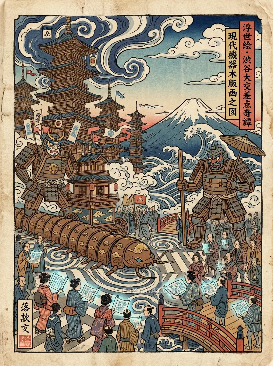
Put ukiyo-e in a prompt and the model will certainly give you kimono, Mount Fuji and waves. Zoom in, though, and the gradients are smooth, the shadows are three-dimensional, and the lines look like vector strokes. The subject is Japanese, but the method is digital.
The look of ukiyo-e comes from its craft: carved blocks, one block per color, pressed onto paper. So when writing the prompt, think one layer further. Don't only describe what is drawn; describe how the thing was printed.
1. Outlines: Varied Weight Is What Makes Them Look Carved
Shibuya crossing, sent back to Edo asks for bold, striking hand-carved ink lines, and in the image above, the folds of the clothing and the edges of the colossus's armor all carry a visible knife quality. Write only black outline and the lines often come out at an even width, which drops you straight back into vector illustration.
A few phrasings that work: hand-carved ink outlines, bold expressive lines, visible carved hatch marks. The woodblock night of the moon rabbit also offers a move worth borrowing: the carved marks are concentrated on the hillside while the rabbit's body is mostly empty paper, so the subject's edge ends up cleaner. Carved marks don't have to cover the whole picture; wherever you put them, the eye goes there.
2. Limited Color: Write the Pigment Names
"Vintage palette" covers too much ground. The Edo case pins the pigments down to Prussian blue, vermilion and soft ochre, and also bans digital gradients, so the colors in the final image are very concentrated.
Dragons and tigers locked in battle, where the empty space lets you breathe first is even more extreme: almost only indigo and orange-red, over a cream paper ground. One color goes to the dragon and the other to the tiger, so the relationship between the subjects needs no extra explanation. A rule of thumb to remember: the fewer the colors, the more it looks like a print. Two to four is enough; any more and the model slides toward painting.
3. Empty Space: Paper Is a Color
The subtraction of ukiyo-e: empty space costs more than lines compresses the recipe into five variables: subject, outline, palette, texture and composition, where composition is written only as "flat plus elegant empty space." What the empty space saves is more than layout; it lets people see the paper.
Flat perspective needs to be stated outright as well, for instance flattened perspective. Otherwise the model habitually supplies depth and volumetric light, and that sense of volume runs opposite to a woodblock print. You can read this alongside lines, texture and empty space in prints; the logic holds for other print types too.
4. Misregistration: A Little Flaw Brings Realism
This is the step most often skipped. Traditional multi-color printing takes many passes, and each block can shift slightly, so small gaps or overlaps often appear between the color areas and the ink lines. The Edo case writes "slight color misregistration" and "pigment bleed," then adds one more line: it should look like a physical print, not a digital painting.
The ukiyo-e woodblock print of a canal in autumn rain uses the phrase hand-printed registration texture, which also works well. For the paper side you can add words like wood grain and paper fiber. One or two of these flaws is enough; write more and the image looks dirty, or turns into a deliberate distressed-effect filter.
5. When You Don't Have to Follow the Rules
Not every image with ukiyo-e elements needs to go this far. A silver-dragon, long-sleeved geisha dancing on a floating stage is written as traditional woodblock aesthetics mixed with modern dark fantasy, and what comes out is a digital painting with volumetric light and glowing particles. It has little to do with woodblock printing anymore, but the picture is complete in its own right.
The difference is what you want. For good-looking Japanese fantasy, writing it this way is fine; for a print that looks like it could really have been printed, go back to the four points above. Decide your goal first, then decide whether to write the craft words. For how medium words shape the output, see also how to write illustration medium into a prompt.
A Template You Can Adapt Directly
```
A Japanese ukiyo-e woodblock print of [subject and scene], [aspect ratio: 3:4 vertical].
Hand-carved ink outlines with varied line weight, flattened perspective, generous empty paper space.
Limited palette of [two to four pigments: Prussian blue, vermilion, soft ochre], flat color blocks, no digital gradients, no volumetric light.
Visible wood grain and paper fiber, slight color misregistration, subtle pigment bleed, as if physically hand-printed rather than digitally painted.
[as needed: No text, no seal, no logo.]
```
When using it, change only the first line and generate one to see. If it still looks like a digital illustration, it's usually that the color limit wasn't tight enough, or the model added lighting again: move the no volumetric light line earlier, then cut one more color.