
Watercolor, Woodblock, or Crayon: Writing the "Medium Feel" Into Illustration Prompts
The cheapest, and least useful, way to write an illustration prompt is to drop in a style name: watercolor style, print style, crayon style. The model recognizes these words, but what you usually get back is a photo with a filter slapped on — the colors are right, the medium feel isn't.
What the on-site cases that read unmistakably as "painted" have in common is that they write down the physical trace the medium leaves, not the medium's name.
Paper is the first layer of information
In Crabapple branch on light brown paper, there's only one scene variable: a light brown paper background. That one line sets the whole tone of the painting — the pink-white petals sit on paper leaning toward yellow, instead of the kind of watercolor that seems to float on a screen.
Omotesando travel sketch is more direct, specifying "clean sketchbook paper, with a faint layer of paper grain underneath." That grain is the only evidence that the whole image reads as hand-drawn rather than printed.
The transferable lesson: any prompt claiming to be "hand-drawn" should account for the paper first. White paper, kraft paper, a sketchbook page, xuan paper — each decides how the color lands differently.
Write brushwork as an action, not an adjective
The oil painting of two parrots doesn't say "oil painting style" — it specifies impasto brushwork, paint you can see piled up in visible strokes, feathers "built up" stroke by stroke. A verb does far more work here than an adjective.
Crayon illustration on a white background does the opposite, turning the medium's weakness into an advantage — crayon's roughness happens to block out over-polish. The white background isn't empty space, it's giving the color room to work.
Put them side by side and it's clear: oil painting needs "built-up strokes" written out, crayon needs "grain and roughness," watercolor needs "bleeding edges." Write "XX style" and the model can only guess which one you mean.
Negative space isn't emptiness, it's part of the medium
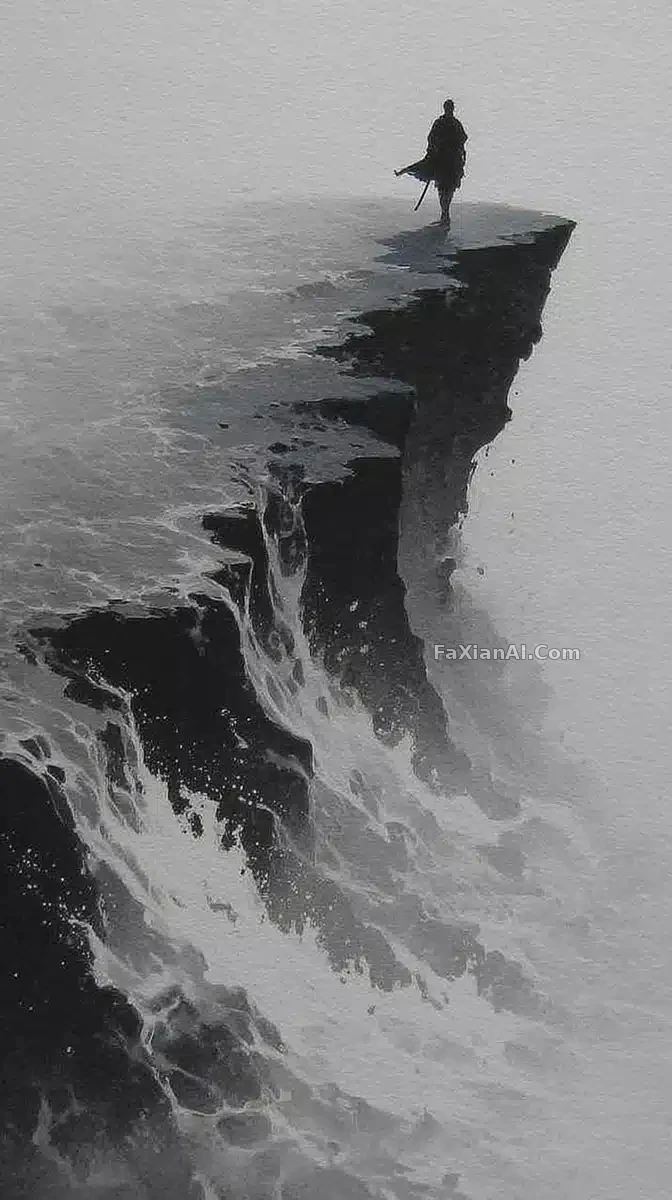
The ink wash of a lone cliff above a sea of clouds is roughly seventy percent empty. That's not an unfinished painting — ink wash as a medium concentrates its force in a handful of ink strokes to begin with, and the blank space is there to let them breathe.
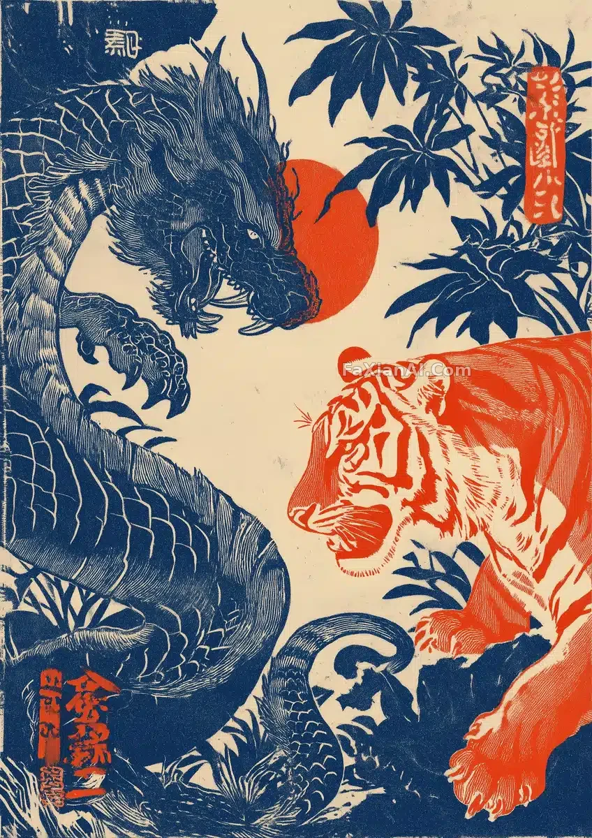
Woodblock prints work on the same logic. The dragon-and-tiger piece deliberately writes the jungle background as sparse, with the blue plants "kept to a minimum." The whole tension between the dragon and tiger depends on that emptiness holding it up — pack the background in, and the light and dark fight each other until the image falls apart.
The same blank space is a mistake in a photo and a technique in a print or an ink wash. So a prompt in this category needs to explicitly state the ratio or density of negative space, or the model defaults to its usual habit of "more information is better" and fills everything in.
Density is the other extreme
The gongbi piece of Xishi rinsing silk runs the opposite direction. The gold thread isn't decorative trim — it treats every fold of the brocade as a skeleton to render; the carp in the water and the scattered lychee shells are incidental touches, not the subject, but they anchor the whole scene.
Gongbi's medium feel comes from density and the certainty of its lines — every line is drawn clean, none of it dashed off carelessly. If a prompt only says "fine detail," what usually comes back is a blur of details stuck together; write "gold thread outlining every fold of the robe," and the model knows exactly where the detail should live.
Write the "imperfection" out explicitly
The crux of the piece redone entirely as a hand-drawn doodle is one phrase: "deliberately imperfect" — outlines a little crooked, coloring a little outside the lines. Those two flaws are exactly where the handmade feeling comes from; too tidy and it reads as fake instead.
This holds across many media. Crayon needs to go outside the lines, woodcut needs rough edges, watercolor needs a bit of runaway bleed. The model defaults toward "neat" — leave it unsaid, and that texture disappears.
Finally, order
The Omotesando piece also specifies painting order: pen first to block in the street's skeleton, watercolor wash follows to fill in. Reverse the order — wash first, then lines on top — and the whole image goes flat.
In a mixed-media prompt, which step comes first is a real variable, just as worth writing down as light position or aspect ratio. The wall-of-watercolor-cats piece shows another form of control: a bracketed list of candidate patterns and builds, letting the model draw randomly from it for each cat, so a thousand cats don't end up as copy-paste clones.
A checklist before you write
- Did you account for the paper (white paper / kraft paper / sketchbook / xuan paper)?
- Is the brushwork written as an action (pile up, sweep, bleed, carve)?
- Is negative space or density explicitly stated?
- Is the "imperfection" specifically written out?
- For mixed media, is the order specified?
Midjourney and newer-generation models differ quite a bit in how they handle this kind of prompt — see why Midjourney's prompts can be so short for a comparison. To turn these elements into a reusable skeleton, how to write a structured prompt offers a template.