
Print Grain Is Not Noise: How Cyanotype, Woodcut, and Overprinting Write Different Distinctions
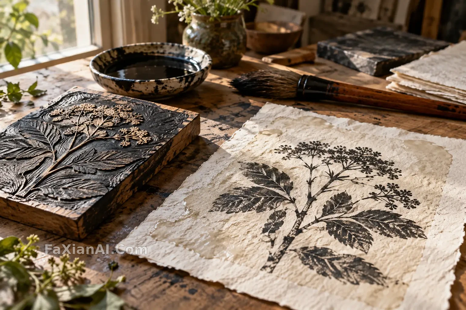
Writing "retro printmaking" easily yields a familiar paper texture: faded colors, worn corners, and the same grain spread across every area. But what truly makes a medium recognizable is how the image is organized. Cyanotype, woodcut, and two-ink overprinting do not rely on the same kind of edge.
Cyanotype Starts with Contact Relationships
The existing Sardine and Moon Cyanotype organizes fish and a circular form into strong contours; this batch's Fern Leaf and Lace layers two fine structures together. The latter is harder because both leaves and fabric have pores. The prompt must keep the fern's main axis intact and let the lace recede to the edges, so the deep blue ground does not shatter into white dots without hierarchy.
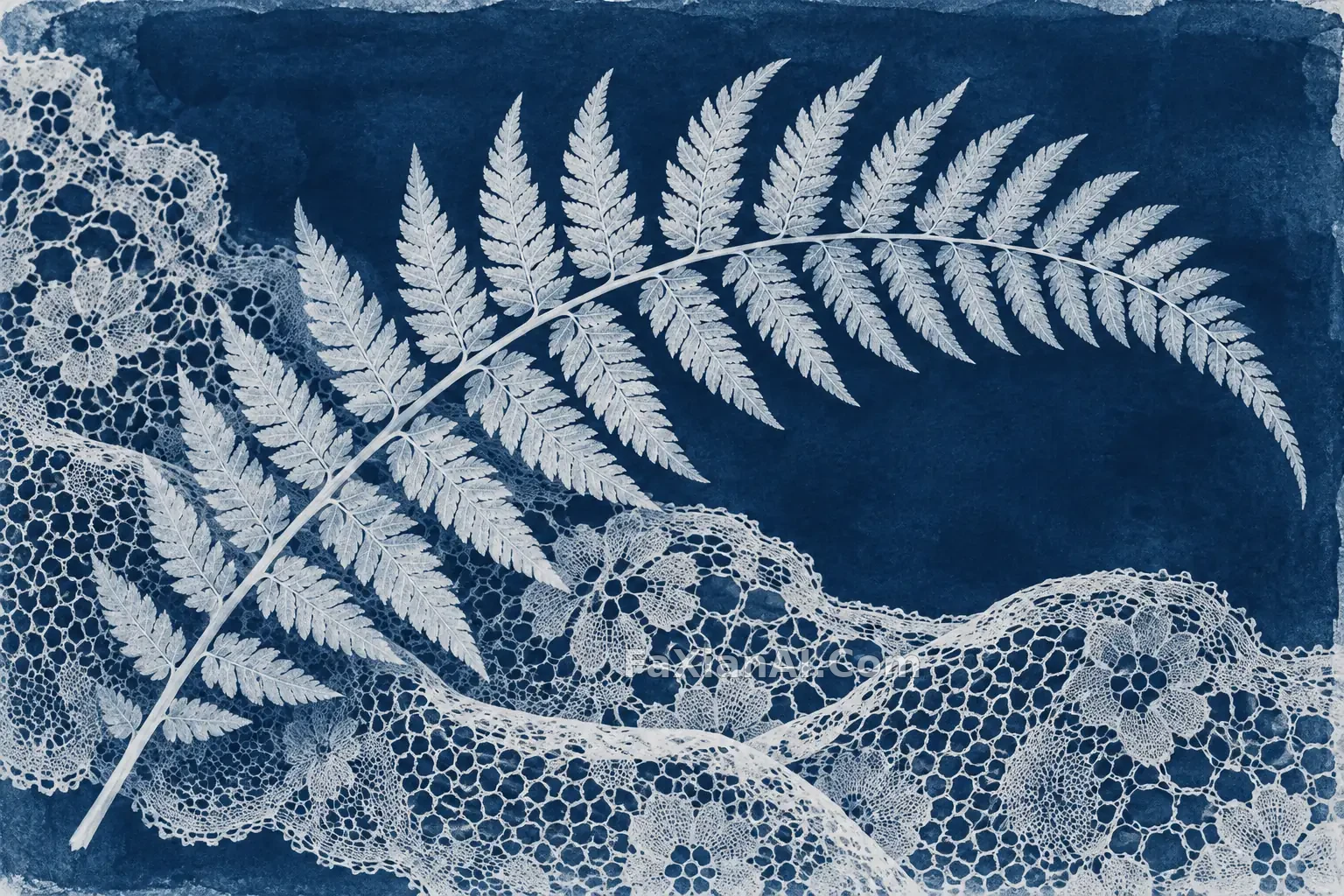
A cyanotype-style image is not the same as an ordinary photo plus blue. You can specify white silhouettes like contact prints, uneven blue on the paper surface, and clear object boundaries, but do not write irregular exposure as overall blur.
Woodcut Lets Incisions Explain Form
Rooster under the Fig Tree presses both tail feathers and leaves into large black areas, then distinguishes them with a few incised lines. Rust red only carries the echo between fruit and comb. Compared with it, the otter gate scene also needs to explain mechanical relationships; it cannot bluff its way through with only beautiful thick lines.
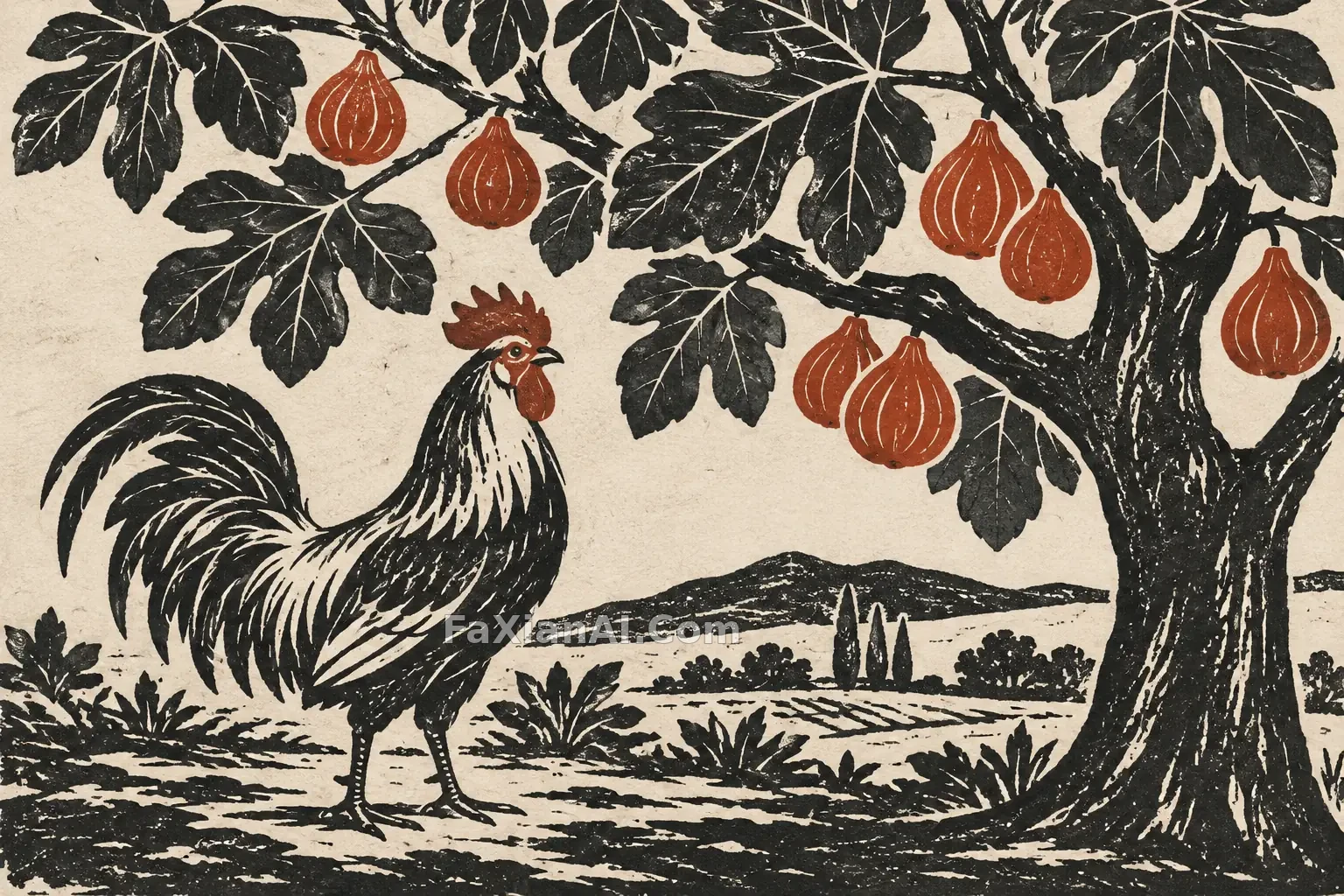
Prompts can assign directions separately to bark, feathers, and flowing water. Lines that follow volume look carved; scratches all in the same direction across the whole image only look like a texture layer overlaid on top.
Overprint Misregistration Needs a Limit
The interest of two-ink overprinting comes from limited colors and slight misalignment, not arbitrary color leakage. The beet stall uses magenta for fruit and awning, moss green for leaves and street scene, and leaves the background to paper white. Assign color responsibilities first, then add a small amount of misregistration, and the image will be more stable than directly writing "strong grain."
If you want to use these media for spatial narrative, compare the existing Paper-Layer Library: it builds depth through overlapping edges, which is a different method from woodcut's flat light and dark. For more trade-offs in paper-layer space, see Materials and Lighting in Miniature Scenes.
After compression, review the finest leaf veins, overprint edges, and gaps between incised lines. Once they stick together, even if the file is smaller, the media distinctions will disappear.