
Pixel Art Prompts: Get the Grid, Palette, and Outlines Right for Crisp Results
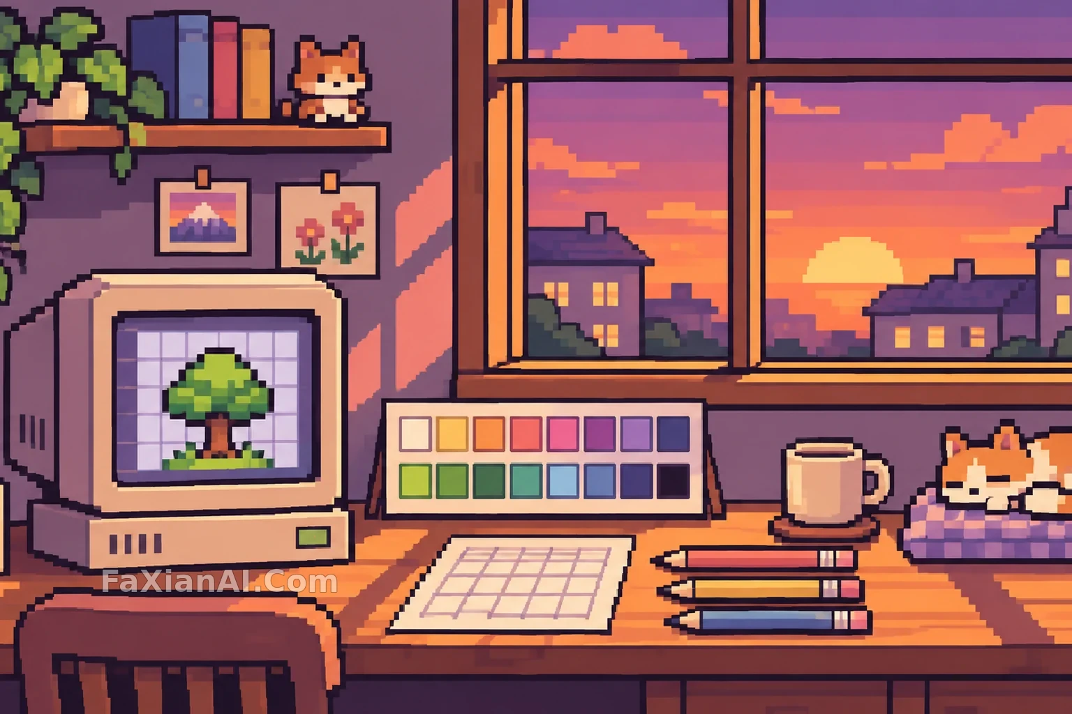
Put “pixel art” and “8-bit” in a prompt, and the result often looks off: it passes for pixel art from a distance, but zoom in and the edges are blurry, the colors run through dozens of gradients, and the pixel blocks aren’t even the same size. It looks more like an ordinary illustration that’s been shrunk and blown back up, without the crispness that makes pixel art work.
Good pixel art depends on constraints: a fixed grid, a countable number of colors, and every pixel in the right place. The prompt’s job is to spell out those constraints one by one.
1. Keep the Pixel Grid Consistent and Disable Anti-Aliasing
Models tend to smooth edges by default. That’s a habit they’ve picked up from drawing ordinary images. Pixel art calls for the opposite, so you need to say so explicitly.
Pixel Lantern Lighting the Way Home keeps it direct: “distinct square pixel edges” and “no blur or smooth anti-aliasing.” The first half tells the model what to do; the second tells it what to avoid. Red-Scarf Knight Walk Cycle says the same thing in English: hard pixel edges,no anti-aliasing blur。
For the hero image above, the prompt specifies “a clear, consistent pixel grid, with no anti-aliasing or blur.” The word “consistent” is worth including: sometimes a model uses small pixels on the subject and large ones in the background, mixing two resolutions in one image and making the result look fake.
The prompt for A Glowing Seedling Tray in a Greenhouse at Night is short, but one phrase gets right to the point: distinct pixel clusters. Its editor’s note also points out that real pixel art can’t just be an ordinary illustration with a grid laid over it.
2. Give the Palette a Number
Phrases like “retro tones” and “nostalgic colors” leave too much room for interpretation. The model can still reach for dozens of colors. A number works better.
The lantern prompt specifies a “limited 16-color palette,” while the little knight uses a “limited 24-color palette.” Around 16 colors gives you that classic retro game look, with distinct jumps between color blocks; 24 to 32 colors allow for finer shading and work well for full-body character art. The hero image uses about 16 colors, so the palette card has exactly two rows of swatches, and the colors in the scene match the card.
The editor’s note for the little knight mentions a practical benefit, too: with fewer colors, the palette is less likely to blur pixel edges when the image is made into a GIF. If your pixel art is headed for an animation or a game, limiting the color count is more than a stylistic choice.
If you’re converting a photo or an existing image into pixel art, Retro Pixel Art Game Scene Conversion spells out the key variables: deliberately lower the resolution and simplify the palette. The further you push both, the stronger the arcade feel. At the same time, preserve the subject’s defining features so it’s still recognizable after conversion.
3. Specify the Outlines and Light Direction
Pixel art characters and objects usually stand out from the background thanks to a dark outline. “A dark 1-pixel outline” is more specific than “a clear outline”: it tells the model both the thickness and the color.
You also need to specify the light direction, because pixel art builds light and shadow in discrete color steps rather than smooth transitions. Ask for “light from the upper left, with two or three color steps for shading,” and the model can put lighter colors on the same side of each form and darker colors on the other, giving the whole image consistent lighting. Leave the direction out, and you can easily end up with one object lit from the left and another from the right.
Monochrome Pixel Demon Captain Sprite takes another route: black and white only, with a little dithering to create transitions. The most important phrases in its prompt are strong silhouette and detailed but readable: the silhouette needs to stand out, and the details need to remain recognizable. The solid black background also saves you the trouble of cutting the character out.
One More Line for Avatars, Character Art, and Sprites
For avatars, the eyes are the first thing to get muddy. Pixel Avatar After a Night Run specifically asks for “a clear facial outline and eyes, with uniformly sized pixels,” leaving the rest to blocks of color. Avatars are small, so as long as the eyes read clearly, the face holds together.
For full-body character art, specify the pose and where the props go, then add a cast shadow to ground the character. You can list the clothes and props one by one. A pixel art grid has limited room, and each item needs a clear place of its own; the vaguer the description, the more likely everything is to blur together.
For sprites, the key is keeping frames aligned. The little knight prompt says that “the feet stay on the same ground line in every cell, and the head moves up and down by only one pixel.” That keeps the character from sliding around when the frames are assembled into an animation. For more on what to lock across multiple panels, see Prompts for Four-Panel Grids, Nine-Panel Grids, and Storyboard Strips. The complete animation workflow is in GPT Image 2.6 GIF Prompts.
A Template You Can Adapt
> Pixel art [scene / full-body character art / avatar], [landscape / portrait] orientation, [8-bit / 16-bit / 32-bit] game style. [Describe the scene in one or two sentences; list props individually]. Clear, consistent pixel grid with uniformly sized pixels, no anti-aliasing or blur; limited palette of approximately [16 / 24 / 32] colors, dark 1-pixel outlines, light coming from [the upper left / outside the window], two to three color steps for shading. [Background: solid color / simple scene]. No text, UI, or watermark.
Fill in the color count and light source first, then add the content. For game assets, choose a solid background. For a character design collection, pair it with Character Turnaround Prompts: establish the full-body character art first, then create the front, side, and back views.