
How to Write Collectible Figure Prompts: Scale Numbers, Material Finish and Back-Side Craftsmanship — Which Words Make It Read as a Real Figure
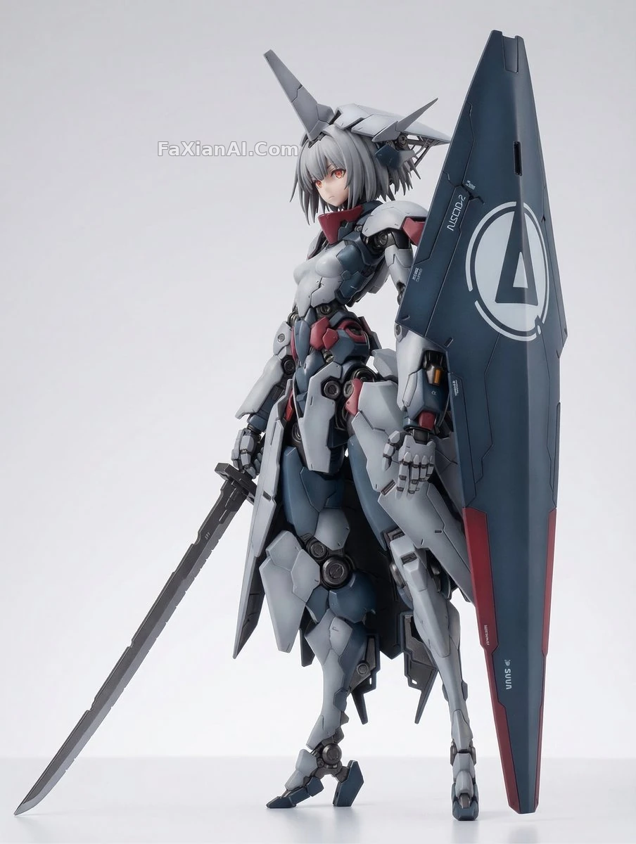
The difference between a figure image and an ordinary character image is obvious at a glance, but when it comes to the prompt, a lot of people only add a single "figure" or "collectible." What comes out is still a character illustration, with a base tacked on at best. What actually makes an image read as "a physical object you could buy and take home" is a different set of words: scale, production traces, material layers, and the display environment.
The cases under the site's figure category vary widely, from a 1/7-scale mecha girl to a palm-sized chibi, from a baseball bobblehead to a miniature scene sealed in a glass bottle, yet their prompts are remarkably consistent on these points.
1. Scale and Model Number Are the ID Card — Don't Change a Single Digit
The prompt for the mecha girl knight figure is short, but two of its numbers are hard: 1/7 scale, and the model label Re : No.2 Vorstraß Einheit. It also slips in the old plastic-kit question of whether the assembled parts and the gate runners can be reconciled. A runner is the plastic strip that connects injection-molded parts as they come out of the mold; writing it in pushes the model to render "a part before it leaves the factory" instead of "a drawn character."
Scales like 1/7, 1/8 and 1/12 are hard specs in the figure world: they determine roughly how tall the finished piece is, and how fine the detail should get. Write 1/7 in the prompt and the model gives you something close to a 25 cm sense of mass, with matching line density; leave it out and you get only "a small statue." The back of the shield from the same series is even more direct: the whole point of that prompt is that the craftsmanship on the back and underside of the shield has to hold up to being turned over. Anyone can draw the front; whether the back and underside got made is what separates a figure from a character sheet.
2. Write Materials Down to "What It's Made Of," Not "It Looks Refined"
The prompt for the hyperreal CGI figure render is long, but its structure is clear: first it names the rendering pipeline (physically based rendering, Octane quality), then swaps every surface for a real material — fabric gets weave and drape, metal gets wear, scratches and oxidation, skin is a synthetic matte finish. Then comes a separate passage for fixing the fingers, and another for the hair, with the scalp visible at the roots and translucency at the tips.
What's most worth learning from this prompt is that it names the most common failure points of AI figure images outright: melted knuckles, duplicated body parts, floating elements, 2D artifacts. Instead of writing "detailed" or "high quality," just say "a natural number of fingers, plausibly connected joints." Models respond far better to negating a specific error than to affirming an abstract adjective.
Material layers come in tiers too. The felt toy template locks down just one thing across the whole prompt: felt material, with subject, accessories, expression, location and lighting all left as bracketed variables. The floating organza dress uses clay-material finish in Midjourney to set the tone for the entire render; once the clay look goes on, the dress changes from "a fabric effect" into "plastic cloth on an art toy." When writing materials, first decide what craft process this figure is made with — PVC, resin, clay, felt, paper — and then make every surface obey that process.
3. Chibi and Bobbleheads: Exaggerated Proportions, but the Hands and Feet Can't Go Soft
The prompt for the big-headed kid pushing up sunglasses has one thing many people miss: the denim overalls need realistic stitching, front bib pocket, metal buttons, rolled cuffs. A chibi's head-to-body ratio is already extreme, and the stitching and metal buttons on the clothes are the anchors that pull it back to "physical object." Without them the whole character turns into a smooth blob of cotton candy.
The baseball bobblehead goes the opposite way: it subtracts detail. The skin is smooth and matte with no pores, and the hair and beard are treated as sculpted masses, with carved grooves standing in for individual strands. What it wants is "the feel of a mass-produced collectible," and too much realism actually loses the toy feel. Put the two side by side and you'll notice that "realism" in a figure prompt is never a case of the more the better — it has to match the craft: a resin figure can take pores, while a bobblehead should be written in planes.
4. The Display Environment Supplies Scale; the Light Supplies "It's Really on the Table"
The beach figure in a glass bottle puts a 1/7-scale figure on a pocket-sized beach, then seals the whole thing into a glass souvenir bottle. The sand, shells and waves aren't decoration — they're scale references. A figure placed alone on a white background gives the viewer no idea how big it is; put a shell next to it and the size is instantly there. The last line, lighting and shadow falling across the figure exactly as they would on a real studio table, is the key to the whole prompt; without it, the light and shadow inside the bottle smear into a blur.
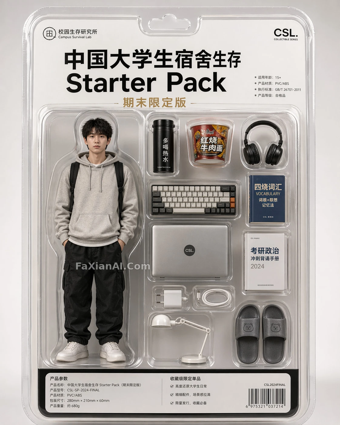
The college dorm limited-edition figure uses a different kind of reference: the packaging box. Inside a vacuum-formed blister tray, a thermos, instant noodles, earphones and a mechanical keyboard are laid out in their slots, the outer cardboard goes minimalist, and a block of text in one corner reads like a proper product spec sheet. This image is convincing because it looks like a product that's actually for sale, and its framing approach spells out that it copies the way top-tier art toy brands shoot product images.
For how to write the lighting of a product image, the post how to write light for product images has a more detailed breakdown.
The idea of a scale reference holds just as well for miniature scenes: giant object with a tiny construction crew is about using people to set scale, and scale isn't an adjective is about making the distant view and the small model hold up — the logic is the same as for figure images.
5. A Figure Template You Can Adapt Directly
A 1/7-scale collectible figure of [CHARACTER DESCRIPTION], production-line finish from a real toy company: [PVC / resin / clay / felt] material, crisp sculpted edges, visible panel lines and [paint layering / fabric stitching / metal wear] where appropriate. Hands anatomically correct with the right number of fingers, no fused joints, no floating parts. Standing on a [round black / clear acrylic] base with a small printed model number plate reading "[SERIES-00X]". Shot like a studio product photo: [white seamless / dark gradient] backdrop, soft diffused key light with a subtle rim light, realistic contact shadow under the base, slight depth of field. [Optional: one small scale-reference object beside the base, such as a coin or a seashell.] High resolution, no lettering except the plate, no watermark.
A Few Common Ways This Goes Wrong
1. Writing "figure" without scale or material. What comes out is an illustration with a base, with no physical-object feel.
2. Writing "ultra-detailed" without any fix-it items. Fingers, hair and symmetry are the three places that collapse most often, so name them.
3. A lone figure on a white background. With no reference object, the viewer can't tell how big it is, and the figure feel gets discounted.
4. Character consistency isn't locked. To make several figures of the same character, first settle the character sheet — getting all three views in one pass covers how to pin down what must be fixed; and to turn a real-person photo into a figure, the way prompts for turning photos into cartoon or anime handles preserving facial features can be used alongside.
The core of a figure image has never been "how much it looks like that character," but "how much it looks like something that was manufactured." Write all four — scale, craft, production traces and display environment — and the character can be swapped freely.