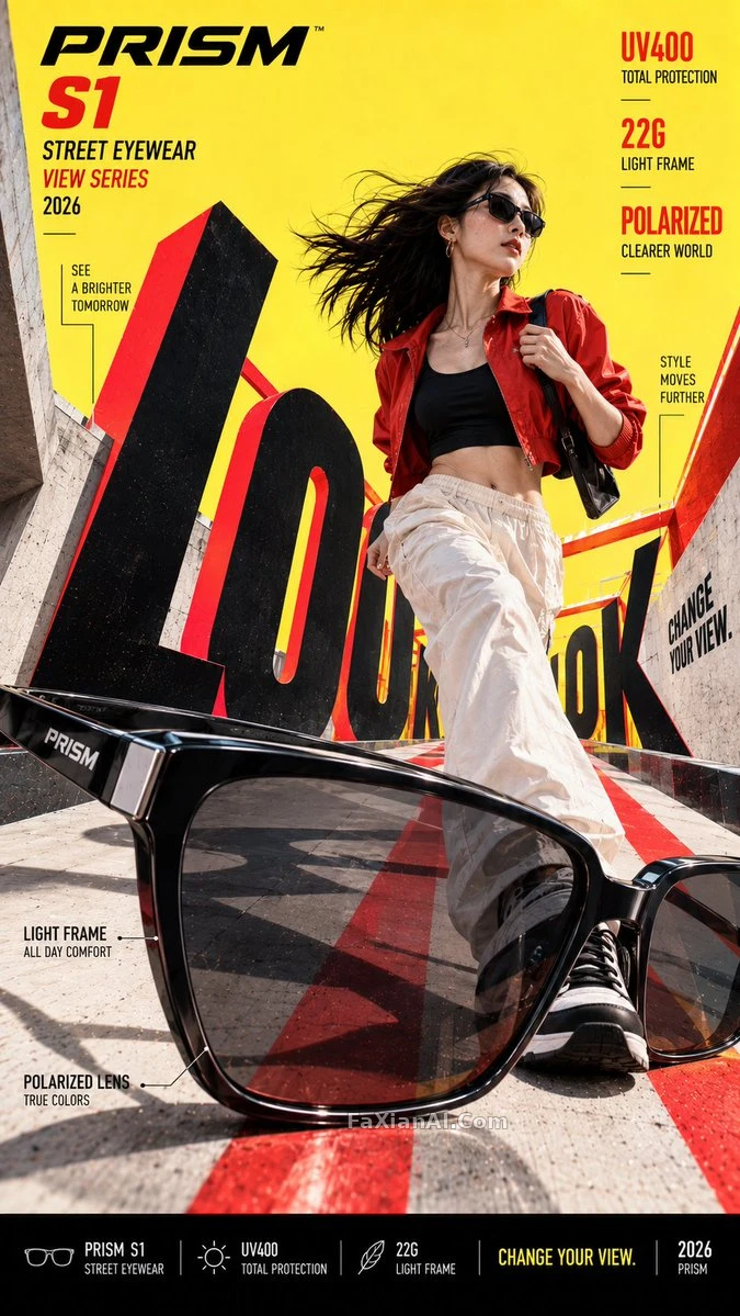
海報透視線,從產品本身的稜角長出來
不找配角襯場,產品自己的輪廓就是畫面的消失點
✍️ 這是個變數模板,核心規則是產品定義透視——輪廓、瓶身、鞋底這些實際結構線,直接拉成畫面的跑道或隧道;前景強透視配真實細節,換任何硬體產品都適用。
📋 提示詞 YAML 分段式1105 字元
Variables:
Brand: [BRAND NAME]
Product / Campaign: [PRODUCT OR CAMPAIGN]
Main Word: [SHORT WORD]
Subject: [PERSON / PRODUCT ONLY / BOTH]
Product Perspective Role: [FRAME / RAIL / CORRIDOR / VIEWFINDER / OTHER]
Perspective Type: [LOW ANGLE / SINGLE-POINT / TUNNEL / FRAME / OTHER]
Main Color: [COLOR]
Accent Color: [COLOR]
Campaign Details: [SLOGAN / SPECS / DATE]
Aspect Ratio: [9:16]
The product itself must become the origin point of the whole perspective system in this bold commercial campaign poster — not just a prop dropped into a perspective scene. Pull the direction, depth and vanishing point of the entire composition from its real geometry: edges, frame, lens, sole, bottle shape, handles, or whatever structural features it actually has.
Push the product forward in the foreground using strong, controlled forced perspective, while keeping its structure realistic, accurate, recognizable, and commercially believable.
From there, let the rest of the scene grow outward from the product, stretching its visual lines into a runway, corridor, frame system, tunnel, or other spatial structure…
📋 中文譯寫版 自然語言
變數:品牌:[BRAND NAME];產品/活動:[PRODUCT OR CAMPAIGN];主詞:[SHORT WORD];主體:[PERSON / PRODUCT ONLY / BOTH];產品透視角色:[FRAME / RAIL / CORRIDOR / VIEWFINDER / OTHER];透視型別:[LOW ANGLE / SINGLE-POINT / TUNNEL / FRAME / OTHER];主色:[COLOR];輔色:[COLOR];活動詳情:[SLOGAN / SPECS / DATE];寬高比:[9:16]。在這張大膽的商業活動海報裡,產品本身必須成為整套透視系統的起點——不是隨手放進一個透視場景裡的道具。整幅構圖的方向、深度與消失點都要從產品真實的幾何形態裡提取:邊緣、邊框、鏡頭、鞋底、瓶身造型、把手,或者它實際擁有的任何結構特徵。用強烈但可控的強制透視把產品推到前景最顯眼的位置,同時保持結構真實、準確、可辨認、商業上可信。接下來,讓畫面其餘部分從產品本身向外生長,把它的視覺線條延伸成一條跑道、走廊、框架系統、隧道,或其他空間結構……