Home › Design Assets › White Summer Script with a Wind Tail
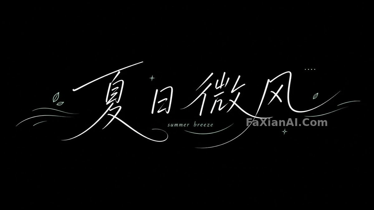
White Summer Script with a Wind Tail
Thin white handwriting drags a long arc across a bright field, with wind and weather tucked inside the letters.
✍️ That last line, "don't make it a heavy slogan font," is the steering wheel of the whole thing. Handwriting lives or dies by where the stroke tails drift and how far the spacing is staggered, not by color. Prompts for this kind of lettering should start with motion.
📋 Prompt Natural Language800 characters
Create a fresh summer lettering visual, 16:9, built around one theme. Start from a broad field of bright, theme-derived color, and write the main words in thin white handwriting. The strokes run smooth, with long arcs and tails that trail off like wind. Sprinkle in small English letters and thin decorative lines. Keep the middle of the frame open for the main characters, and let the glyphs shift slightly out of line with each other, so it reads as wind, weather, or a lifestyle brand. Colors are strongly saturated yet clean: a bright white script plus a few pale lines, giving an airy, clear feeling. What matters is the direction the strokes flow and the empty space around them; it must not turn into a heavy slogan typeface.
Text: [text: Summer Breeze]
Note: white text on a black background