
Seamless Pattern Prompts: Tileable Textures, Photographed Fabric, and All-Over Illustration Are Three Different Jobs
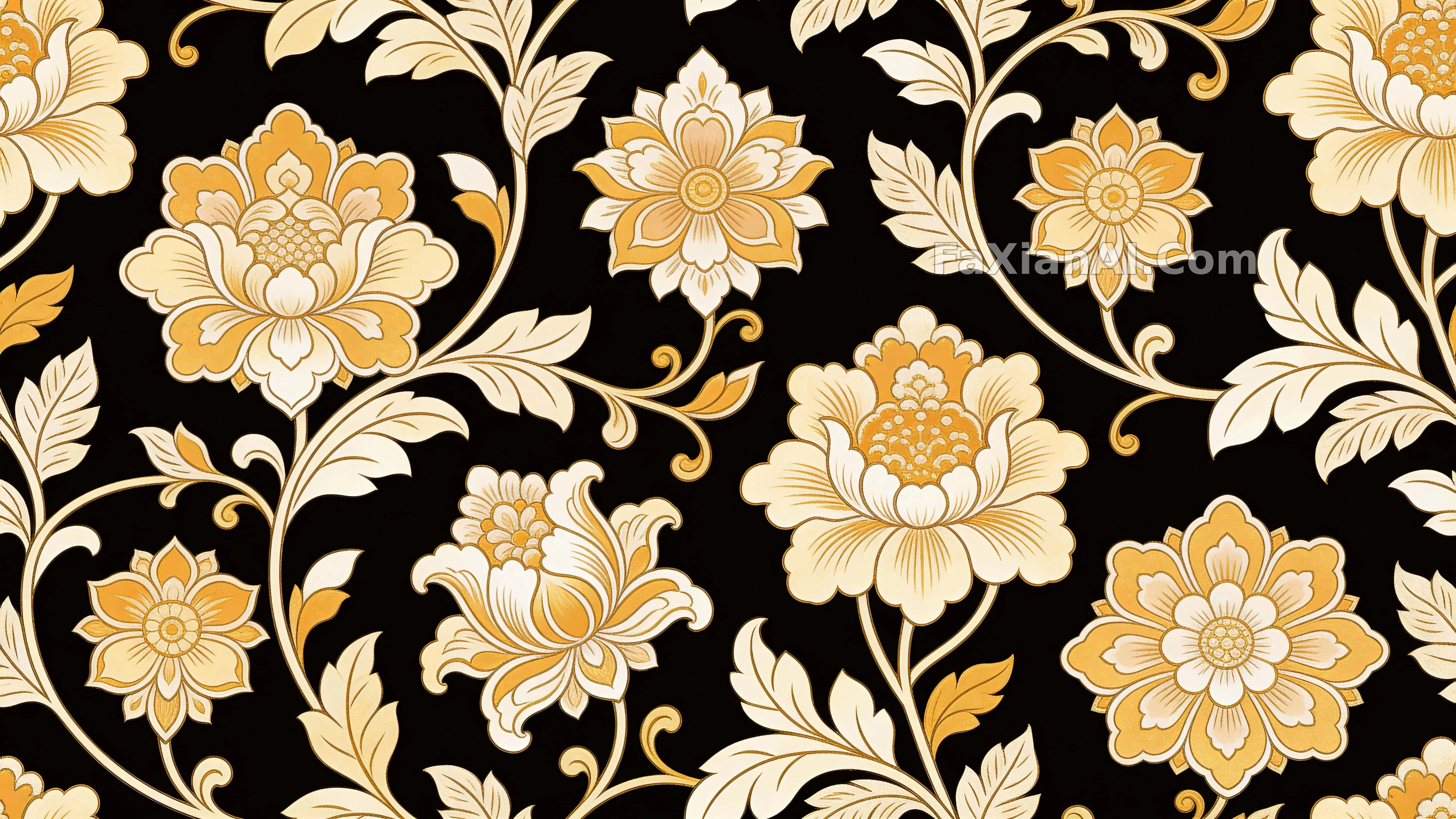
"Seamless pattern" might be the single most overused — and most commonly misused — phrase in pattern prompts. The problem isn't the phrase itself; it's that the person writing it hasn't decided what they actually want: a digital texture built to tile, a photograph of fabric that happens to read as a pattern, or just a screen packed full of decorative illustration. These three jobs call for almost opposite instructions, and writing one sentence like "a beautiful seamless pattern" leaves the model to pick one at random.
Here's the breakdown, using a few pattern cases from the site.
1. Decide the deliverable first: digital texture, photographed fabric, or all-over illustration
A digital texture needs to tile. The palm leaf vector pattern states this as plainly as it gets: leaf outlines have to stay clean, "Across every edge, the repeat should align perfectly," followed by a line ruling out texture and shading. It treats edge alignment as its own instruction rather than trusting the word "seamless" to do that work.
Photographed fabric wants the opposite — imperfection. The indigo fish-print textile and a companion contour-ring textile, both GPT Image 2.5 cases, call for uneven dye edges, irregular thread density, a crease in one corner, a raw edge showing on one side, low-angle side lighting. Every one of those would be a flaw in a digital texture; here they're what sells the realism. The second prompt goes so far as to write only "seamless-looking," without asking it to actually tile — which is exactly the right call.
All-over illustration just needs to fill the frame without gaps; whether it actually tiles is secondary. The all-over watercolor cat wall wants thousands of cats packed into a wall, with the emphasis on varying each cat's coloring, build, and expression — the seams themselves barely get a mention.

The transferable move: before writing anything else, state the deliverable in one line — "flat vector repeat tile," "photographed textile," or "all-over decorative illustration." Pick one, and let every texture word that follows track with that choice instead of mixing them.
2. Density and spacing shape the read more than the motif itself
For any repeating pattern, how packed it is is the first thing you notice.
The goldfish pattern goes for maximum fill: a cream background with round orange goldfish scattered at random, "densely packed." That reading suits a playful, whimsical direction — thin it out and the image just looks empty.
The forest green argyle wallpaper takes the opposite approach: "generous clear spacing between shapes," with deliberate gaps between the diamonds and gold limited to fine dotted lines and the occasional star accent. Argyle is already a rigid, regular motif — pack it tight as well and it turns into a stuffy old rug.
A third option shows up in an overlapping-oval abstract pattern, where the shapes interlock and overlap at the edges — the sense of density comes from how they overlap, not from the color count.
When you write it, spell out density with a concrete phrase: densely packed, evenly spaced with generous gaps, or overlapping and interlocking — pick one. Write just "pattern" and the model tends to default to a medium density that reads as bland.
3. A fixed color count beats writing "harmonious"
The black-and-gold floral pattern works off just three colors — soft gold, warm beige, muted ivory — plus one line: "restrained rather than loud." A pistachio geometric camo pattern does the same with just olive, gray, and brown.
Pattern compositions are naturally busy, and if color is left up to the model, you'll often end up with five or six clashing patches. Capping the palette at three or four named colors, with a base color called out explicitly, is the most reliable move — and it's usually easier to reuse that exact palette on a new motif than to mix a fresh one from scratch.
If the goal really is loud and busy, list every color instead of writing "colorful." The overlapping-oval pattern spells out pink, purple, blue, green, yellow, orange, and black one by one — busy, but never out of control.
4. Midjourney's --tile and a "written seamless" are not the same thing
The all-over watercolor cat prompt ends with `--tile`, Midjourney's tiling parameter, which processes the output's edges so they actually tile. Other models don't have that switch — they only have text to work with, phrases like "the repeat should align perfectly across every edge" or "no visible seam or break."
The difference: a parameter is a model-level constraint, while text is only a tendency. So when building a digital texture on a non-Midjourney model, check the result yourself afterward — copy the image into a 2×2 grid and look for broken lines or color blocks cutting off abruptly at the seams. No amount of well-written text substitutes for that check.
As for aspect ratio: textures usually go 1:1 or wide; all-over illustration can go vertical depending on use — the watercolor cat prompt uses 9:16. For which line in the prompt the ratio is most likely to be followed, see where to put the aspect ratio in a prompt.
5. A checklist before writing a pattern prompt
1. What's the deliverable: a tileable digital texture, photographed fabric, or all-over illustration?
2. What's the motif, and should variation be constrained (a cat's coloring, a leaf's species)?
3. Density: packed full, spaced with gaps, or overlapping and interlocking?
4. Color: a base color plus two or three named accents.
5. Texture: for flat vector work, state "no texture, no shading" outright; for fabric, write the weave, dye edges, and light direction.
6. Tiling: add `--tile` on Midjourney; on other models, write "edges align," then check by tiling a 2×2 yourself afterward.
7. Exclusions: no text, no logo — pattern work is especially prone to stray letters showing up.
For material description in general, paper cutouts, origami, woodcut, and cyanotype material prompts covers the same idea — texture has to land in visible, specific detail — and it applies just as well to fabric patterns.