Home › Photo Editing › Magazine-Graded Photo vs. Crayon Folk Illustration, Top and Bottom
Magazine-Graded Photo vs. Crayon Folk Illustration, Top and Bottom
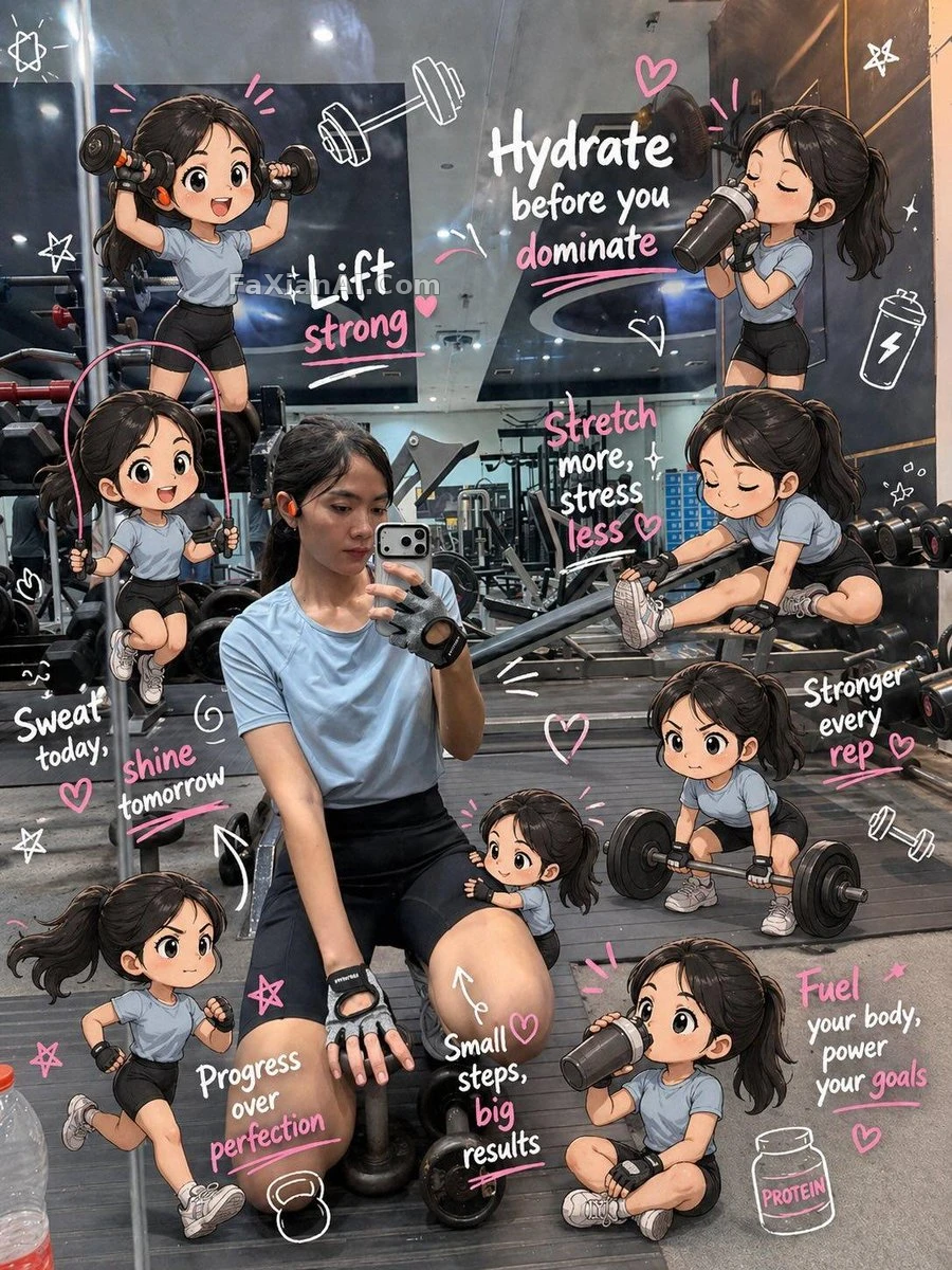
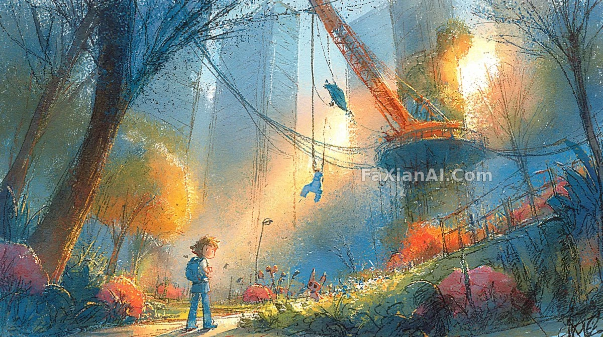
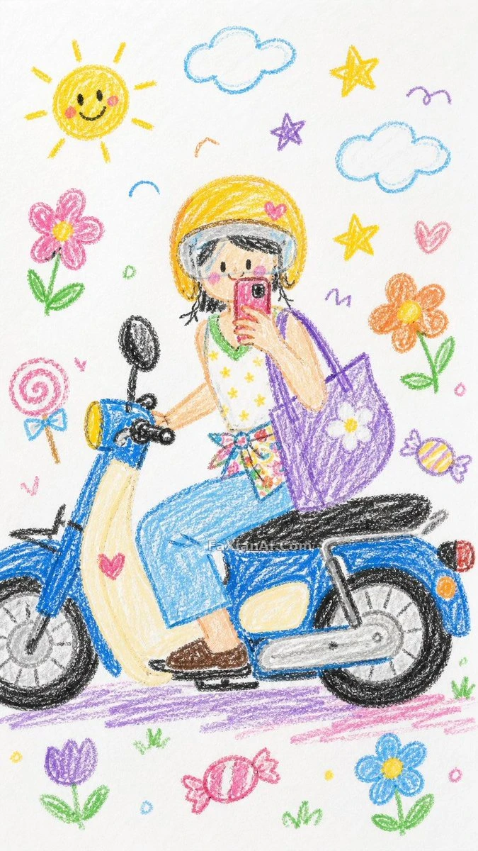
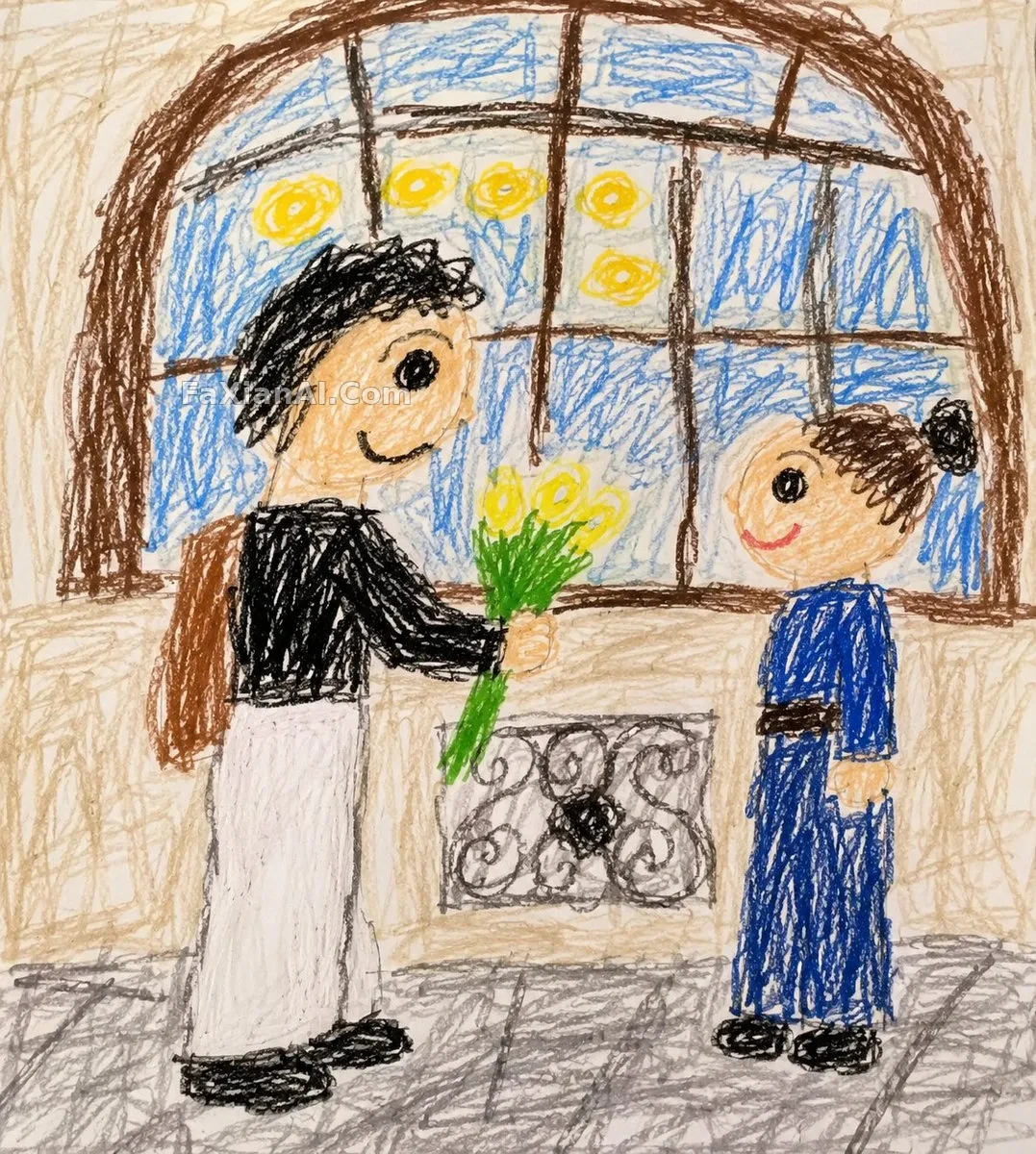
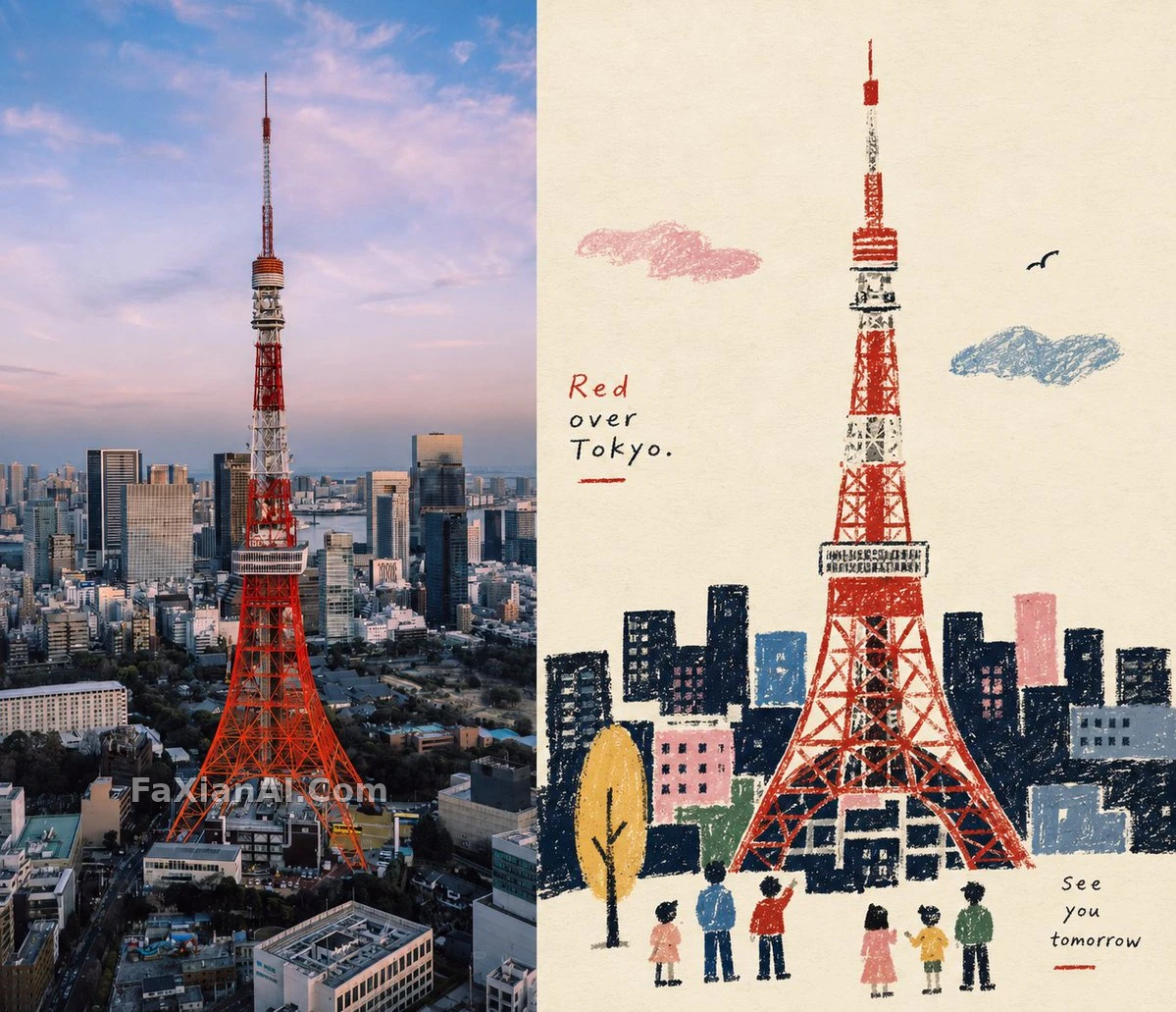
One photo split into two halves: the top magazine-graded, the bottom distilled into a crayon-textured folk storytelling illustration.
✍️ Where the crayon grain and paper show through can't be predicted, and a slightly crooked outline is actually right. The key is that the bottom half must be "limited palette," because with too many colors folk illustration turns into kids' drawing. The strict 1:1 top-bottom constraint is worth copying too; the comparison layout depends on it.
📋 Prompt Natural Language689 characters
Output a vertical 3:4 image. Lower half first: extract the most recognizable subjects and silhouettes from the original photo and re-draw them as a naïve folk-style storytelling illustration, with simplified silhouettes and large primitive color blocks, in crayon, oil pastel and thick pencil, grain and paper showing through, handcrafted clumsy outlines, a limited palette on warm white paper. Upper half: leave the original photo's subject, structure and texture intact, graded like an art magazine. The two halves split the frame strictly 1:1, 50% each. Visual character: naive silhouettes, flat space, crayon grain, restrictive colors, folk art symbols. Side-by-side layout, 7:6 ratio.