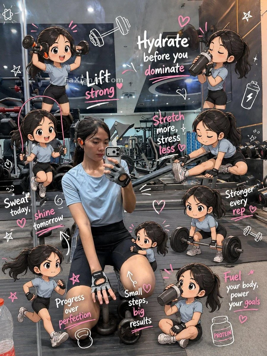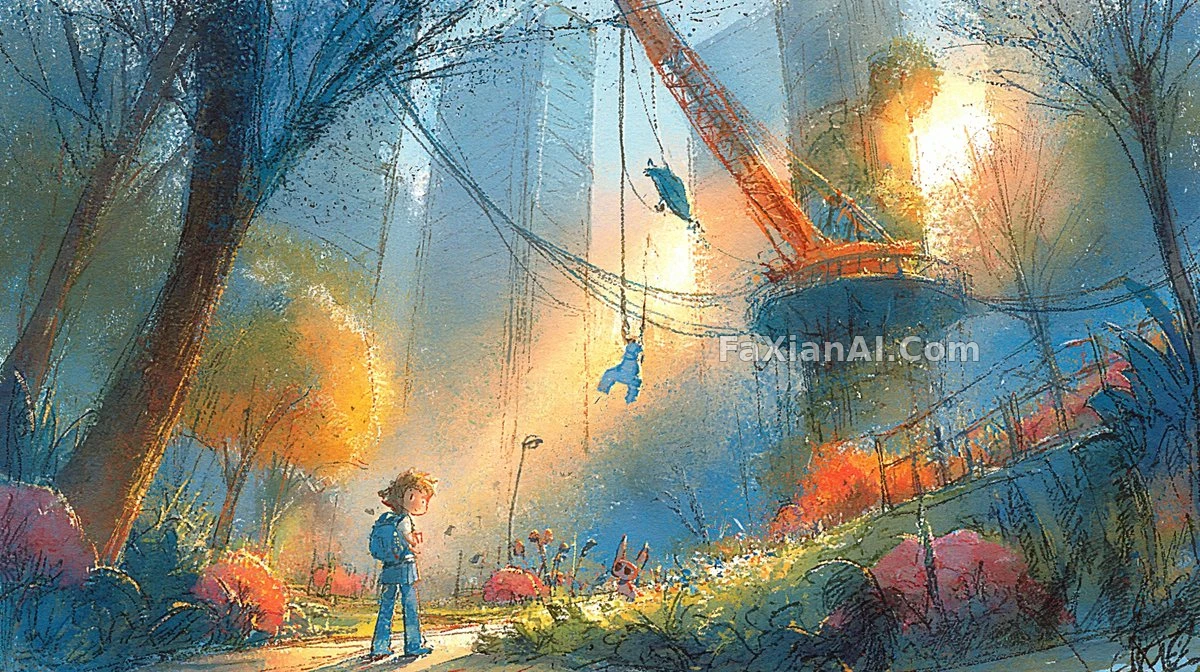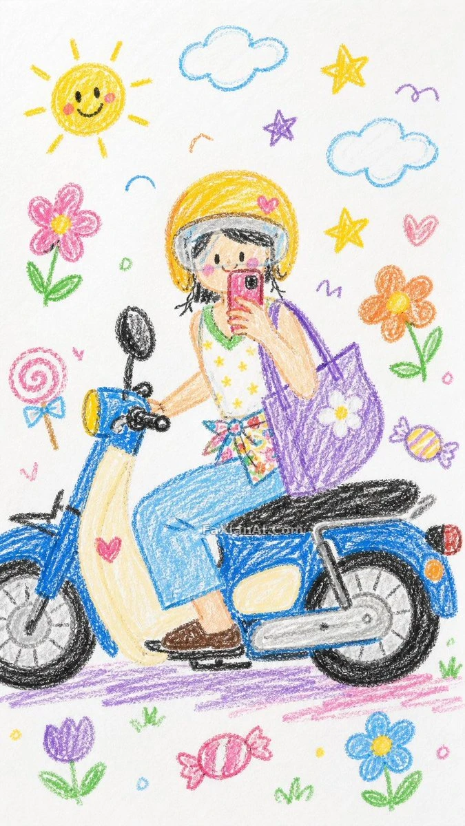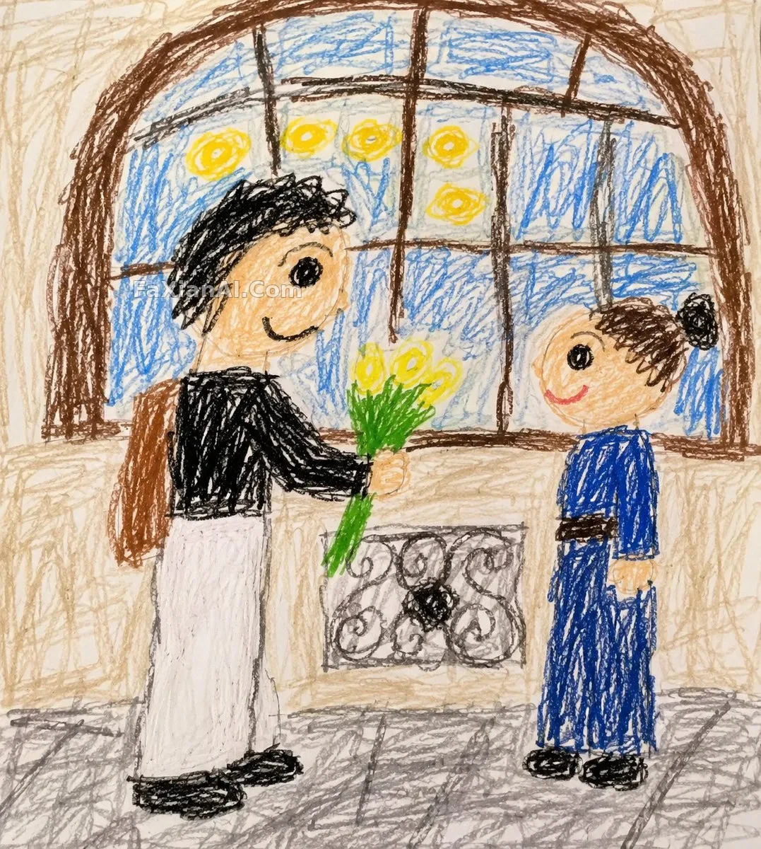
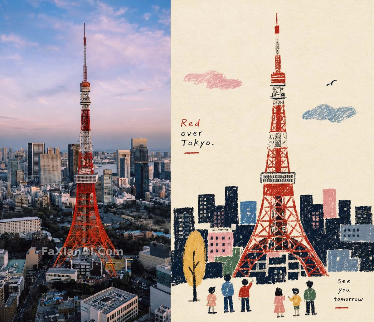
雜誌調色照片與蠟筆民間插畫上下對照
同一張照片分上下兩半:上半雜誌調色,下半提煉成蠟筆質感的民間敘事插畫。
✍️ 蠟筆的顆粒和紙透出來的地方沒法預測,歪一點的輪廓反倒是對的。要害是下半必須“限色”,顏色一多民間插畫就變成兒童畫。上下嚴格1:1的約束也值得抄,對照版式全靠它。
📋 提示詞 自然語言689 字元
Output a vertical 3:4 image. Lower half first: extract the most recognizable subjects and silhouettes from the original photo and re-draw them as a naïve folk-style storytelling illustration, with simplified silhouettes and large primitive color blocks, in crayon, oil pastel and thick pencil, grain and paper showing through, handcrafted clumsy outlines, a limited palette on warm white paper. Upper half: leave the original photo's subject, structure and texture intact, graded like an art magazine. The two halves split the frame strictly 1:1, 50% each. Visual character: naive silhouettes, flat space, crayon grain, restrictive colors, folk art symbols. Side-by-side layout, 7:6 ratio.
📋 中文譯寫版 自然語言
豎構圖3:4,上下嚴格按1:1分成兩半,各佔畫面的50%。上半部分保留原照片的主體、結構和質感,加上藝術雜誌式的調色。下半部分提取最有辨識度的主體和剪影,重構成帶民間風味的素樸敘事插畫,形體簡化為剪影和大塊原始色塊。質感使用蠟筆、油性粉彩和粗鉛筆,帶顆粒感和透紙效果,輪廓要有手工的笨拙感。配色是暖白紙上的有限色板。整體氣質:素樸剪影、平面空間、蠟筆顆粒、剋制配色和民間藝術符號。並排版式,7:6 比例。