
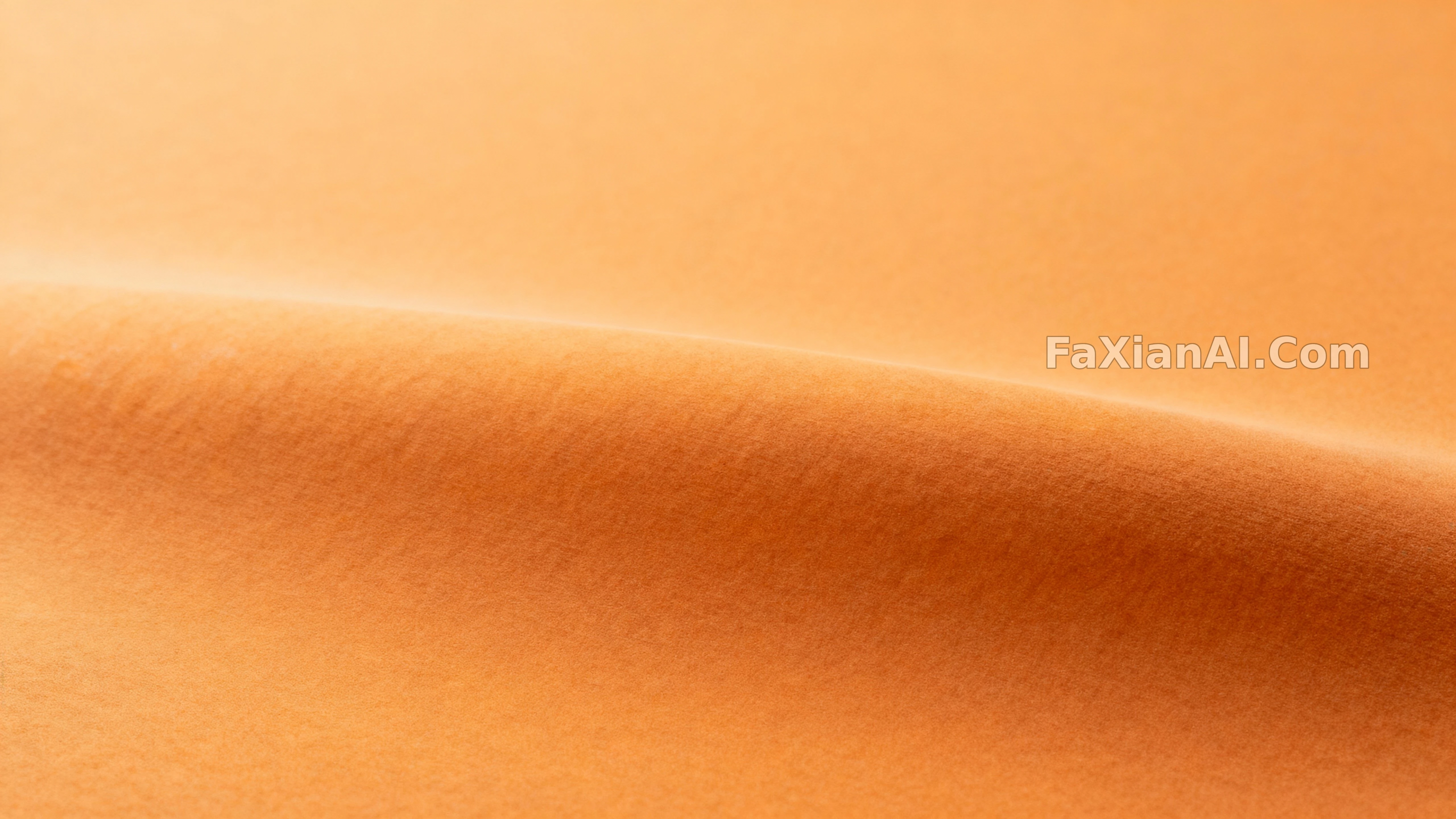
A Study in Pumpkin, Left Blank on Purpose
One gradient wash of pumpkin color fills the frame, corners deliberately left bare for text to stand on.
✍️ The value here is in the margins — all four corners are deliberately flattened and evened out, just to clear space for a headline. A monochrome gradient looks simple, but what actually needs tuning is the width of that safe zone — the trick ports straight over to any other color family.
📋 Prompt Natural Language949 characters
A soothing, modern field of pumpkin-adjacent color drifts from ochre toward burnt orange across matte planes — no literal pumpkin in sight, just faint micro-texture and the barest curvature cues hinting at volume. One plane stays in sharp focus while everything else settles into shallow relief, edges kept clean so the corners stay safe for text overlay. Lighting is even and gentle, wrapping the surface with a soft specular roll that keeps the planes separated; the grade leans into cinnamon and ochre with restrained contrast. Nothing populates the frame beyond the color itself — no props, no clutter, just maximum legibility — captured front-on with a normal lens and generous breathing room around the central swell of color. Treat it as a restrained photographic color study suited to backgrounds and hero headers: pumpkin tones, monochrome orange, minimal background, soft matte finish, commercial-wallpaper ready, with copy space built in.
Related Cases
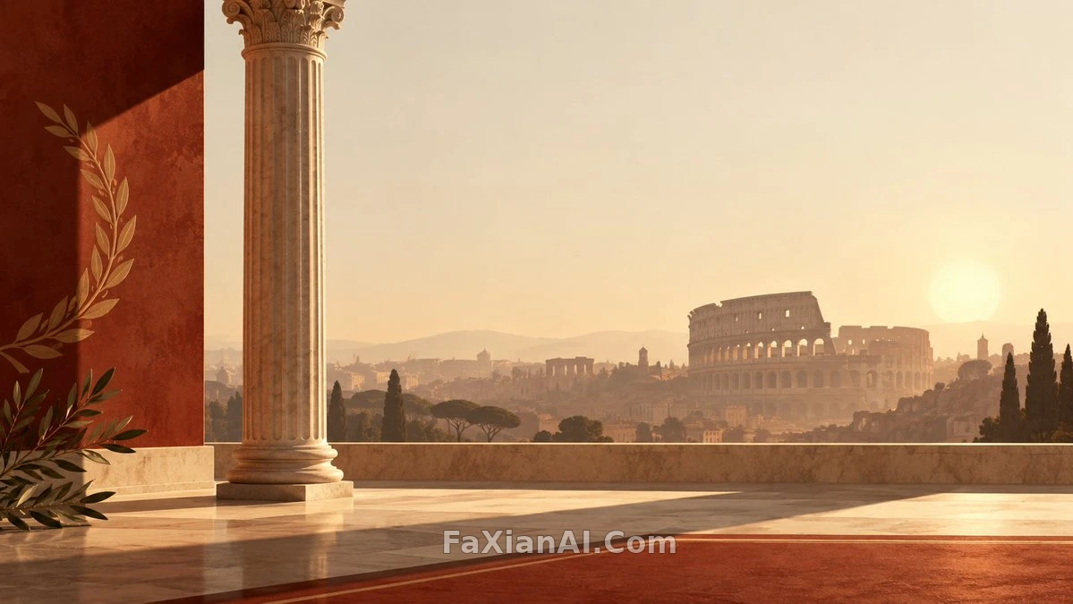 Went In Ready to Mock the Empty Space, Left Impressed
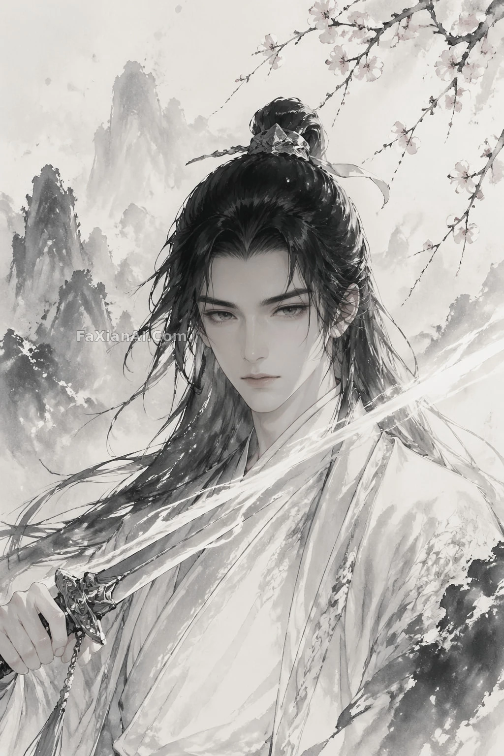 A Line of Sword-Light, Through Snow and Plum Blossoms
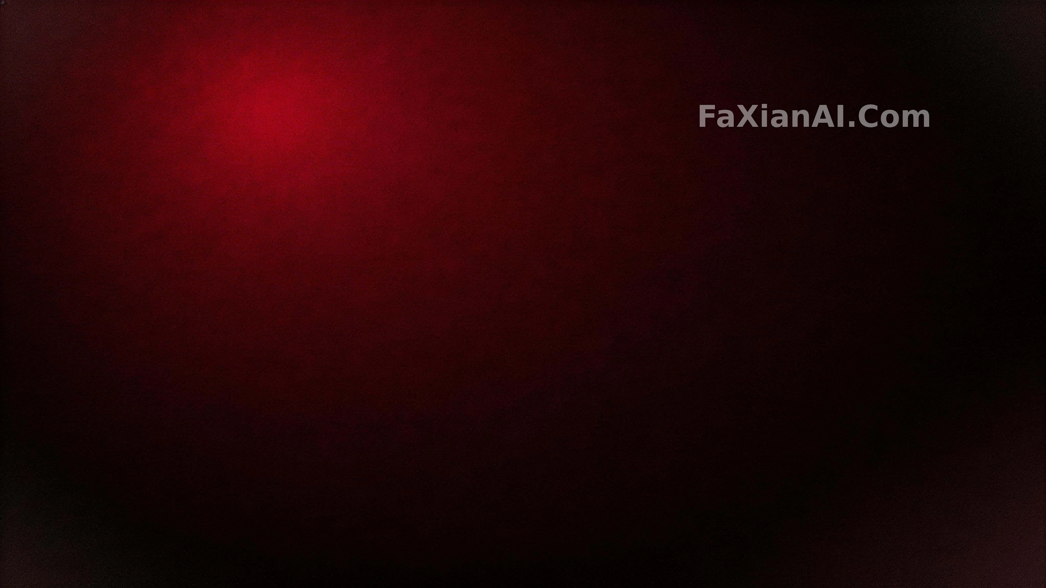 Deep Crimson Fading to Near-Black, All From One Light
 A Blush-Peach Gradient Drifting Toward the Upper Right
 One Pixel-Thin Line Holding Up a Black Screen
 One Pane of Frosted Glass, Carrying the Whole Background