南瓜色系的留白色块研究
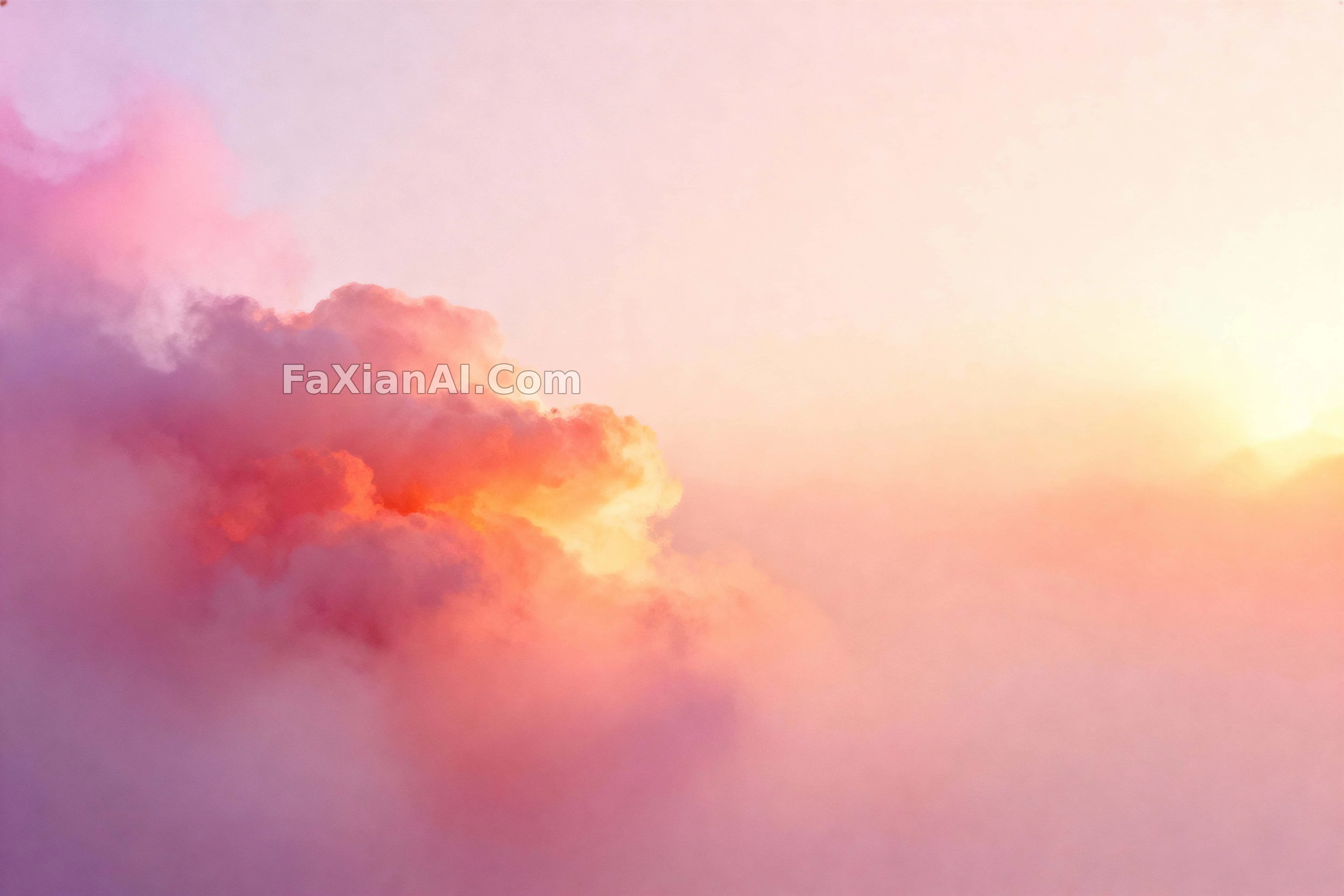
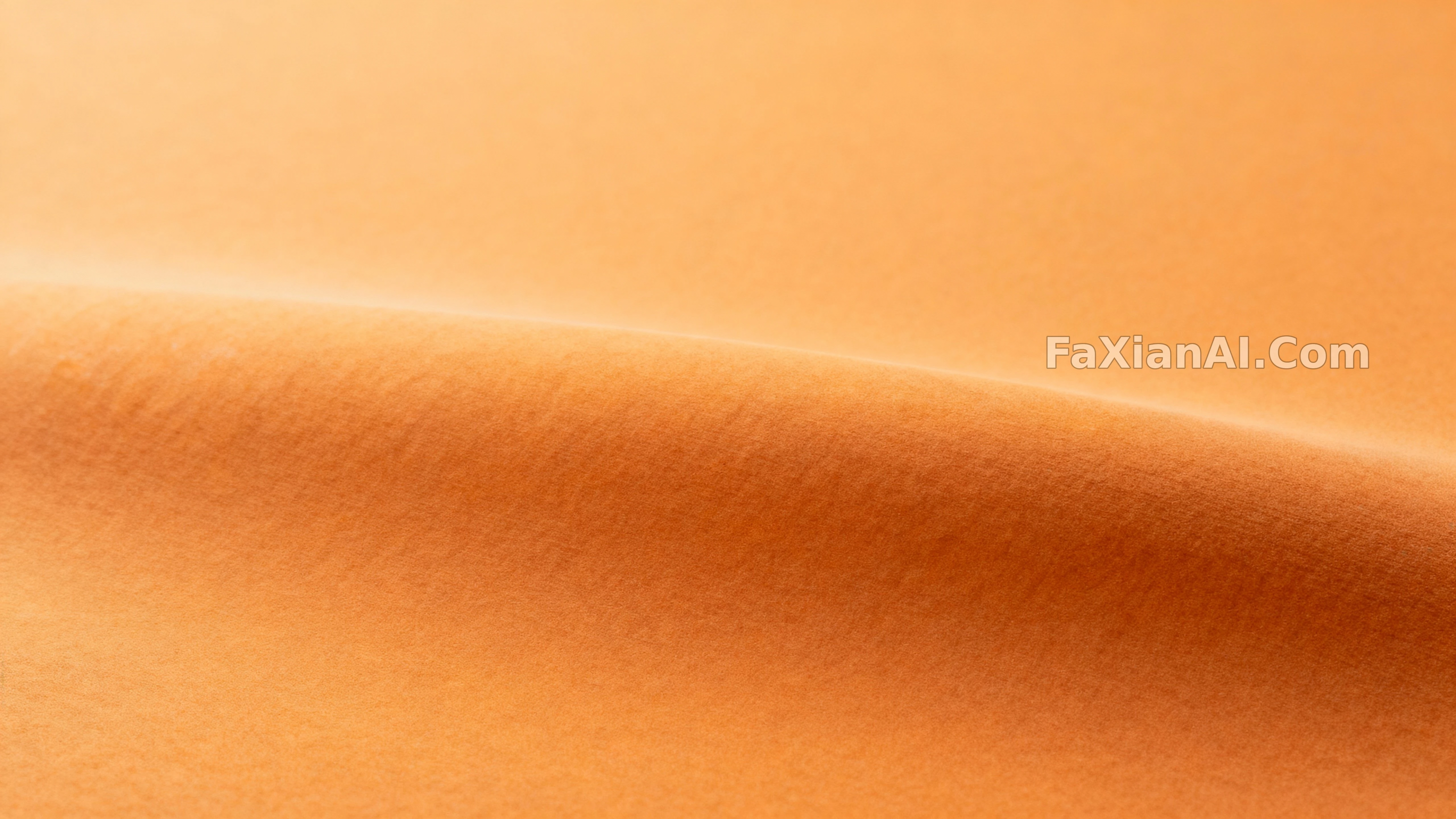
整张铺一块渐变南瓜色,边角特意留白,给文字站的位置。
✍️ 这张的价值在边缘留白——四角特意压平压匀,就是给标题文字腾位置。单色渐变看着简单,真要调的是那条'安全区'的宽度,这个思路换别的色系也能直接搬。
📋 提示词 自然语言949 字符
A soothing, modern field of pumpkin-adjacent color drifts from ochre toward burnt orange across matte planes — no literal pumpkin in sight, just faint micro-texture and the barest curvature cues hinting at volume. One plane stays in sharp focus while everything else settles into shallow relief, edges kept clean so the corners stay safe for text overlay. Lighting is even and gentle, wrapping the surface with a soft specular roll that keeps the planes separated; the grade leans into cinnamon and ochre with restrained contrast. Nothing populates the frame beyond the color itself — no props, no clutter, just maximum legibility — captured front-on with a normal lens and generous breathing room around the central swell of color. Treat it as a restrained photographic color study suited to backgrounds and hero headers: pumpkin tones, monochrome orange, minimal background, soft matte finish, commercial-wallpaper ready, with copy space built in.
📋 中文译写版 自然语言
一片让人安心的现代色块,从赭石色漂向烧橙色,铺满整个哑光平面——画面里看不到任何具体的南瓜形象,只有细微的微观质感与极淡的曲面提示暗示体积感。其中一个平面保持锐利焦点,其余部分沉入浅浮雕般的层次,边缘保持干净,以保留文字叠加的安全区。光线均匀柔和,给表面裹上一层柔和的高光滚动感,让各层次彼此分离;整体调色偏向肉桂色与赭石色,对比度收得克制。画面里除了颜色本身什么都没有——没有道具,没有杂物,只追求最大程度的可读性——采用正面视角、常规焦段拍摄,中央那团色块周围留有充裕的呼吸空间。整体视为一次克制的摄影色彩研究,适合用作背景与首图大图:南瓜色调、单色橙、极简背景、柔和哑光质感、商用壁纸级别,并自带留白区域。