This Gradient Needs Its Warmth Toned Down for Print
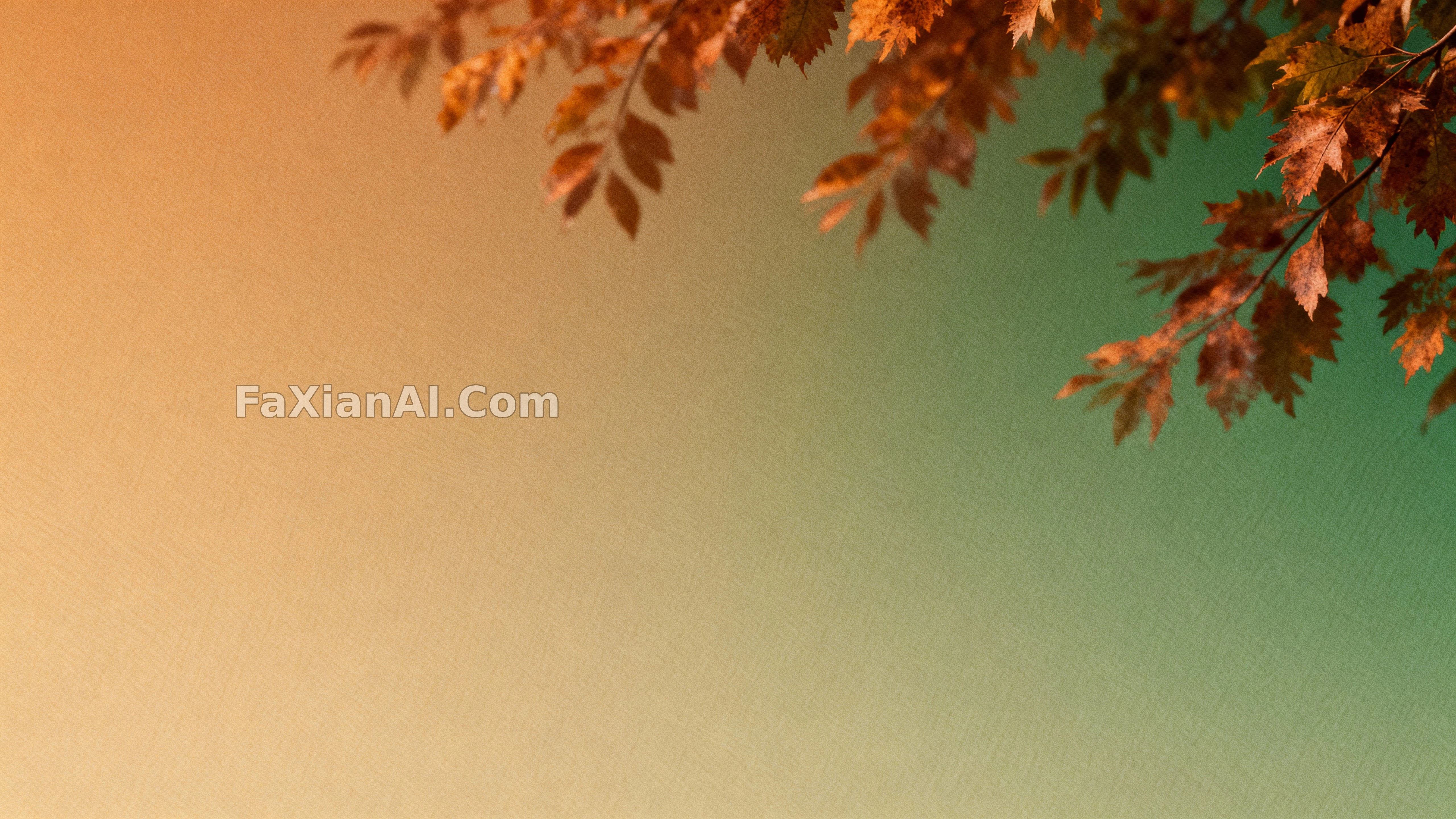
An ochre-to-forest-green gradient fills the frame with a hint of rust-red transition, space left open for copy — comfortable enough on screen is all it needs to be.
✍️ Gradients like this read as warm yellow on screen but tend to skew orange in print — keep that in mind before sending it to print and tone the warmth down first. Do not skimp on the open space either — copy needs room to breathe when it's placed on top, and getting that order wrong ruins everything downstream.
📋 Prompt Natural Language951 characters
Abstract foliage gradients flow across the frame in a serene, contemplative mood: color fields shift from amber into forest green with soft rust inflections, the surface carrying a faint paper-like tooth and restrained grain. Depth stays effectively flat to keep the background clean, focus holding uniform so edges read velvety yet legible. Light stays soft and even with a gentle wrap that lifts the midtones without harsh contrast, the grading leaning into a warm-to-cool drift with a polished tonal rolloff.
The environment is a pure field with no props, prioritizing copy space across the top and sides. Camera sits front-on with a normal field of view, generous margins and a gentle diagonal energy built in for hero headers. The style reads as photographic abstraction with editorial minimalism, suited to wallpapers and banners. Tags: autumn gradient, abstract foliage, amber rust green, minimal background, soft grain, wallpaper, copy space.