這片漸變,印出來得壓一壓暖調
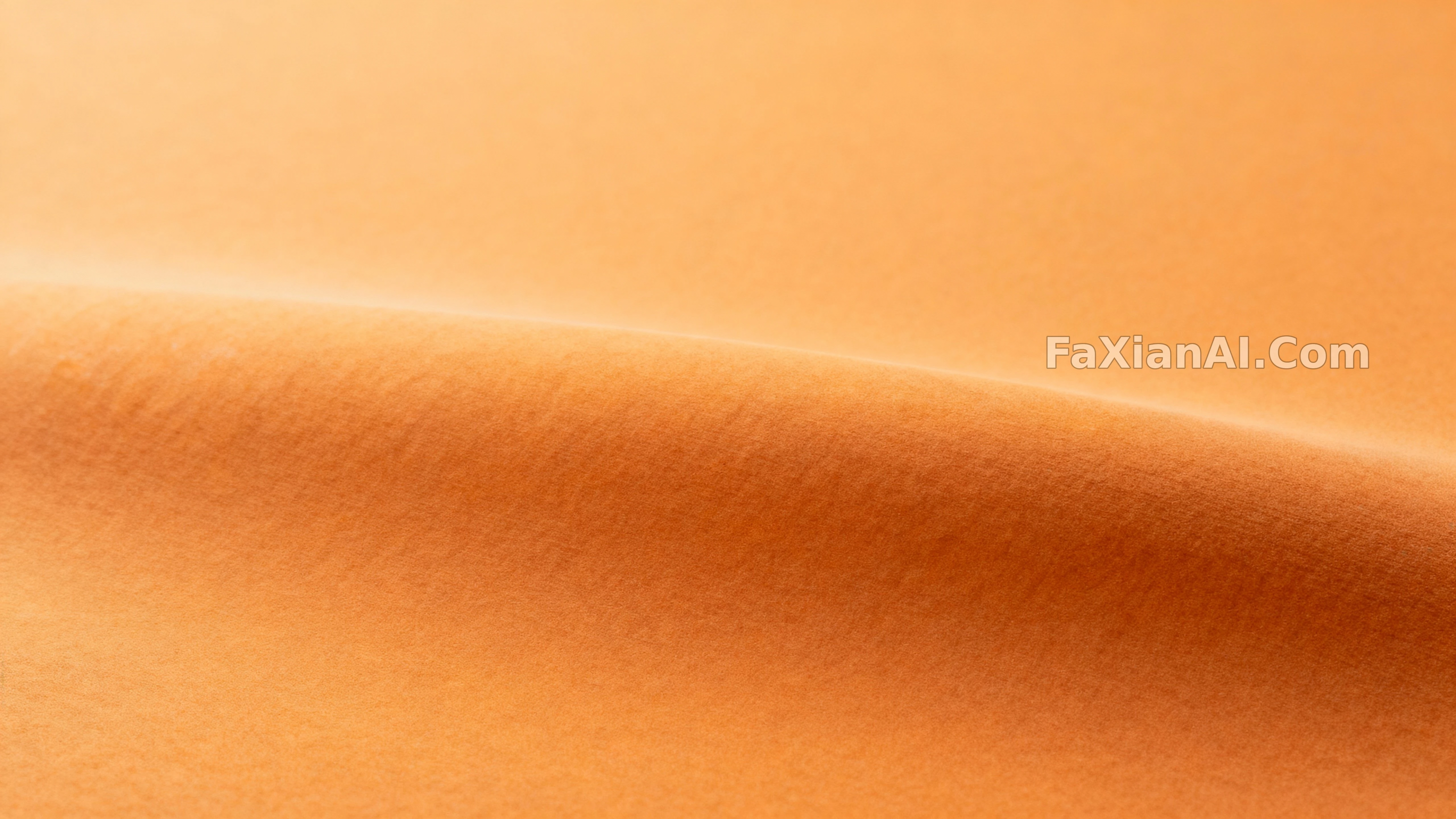
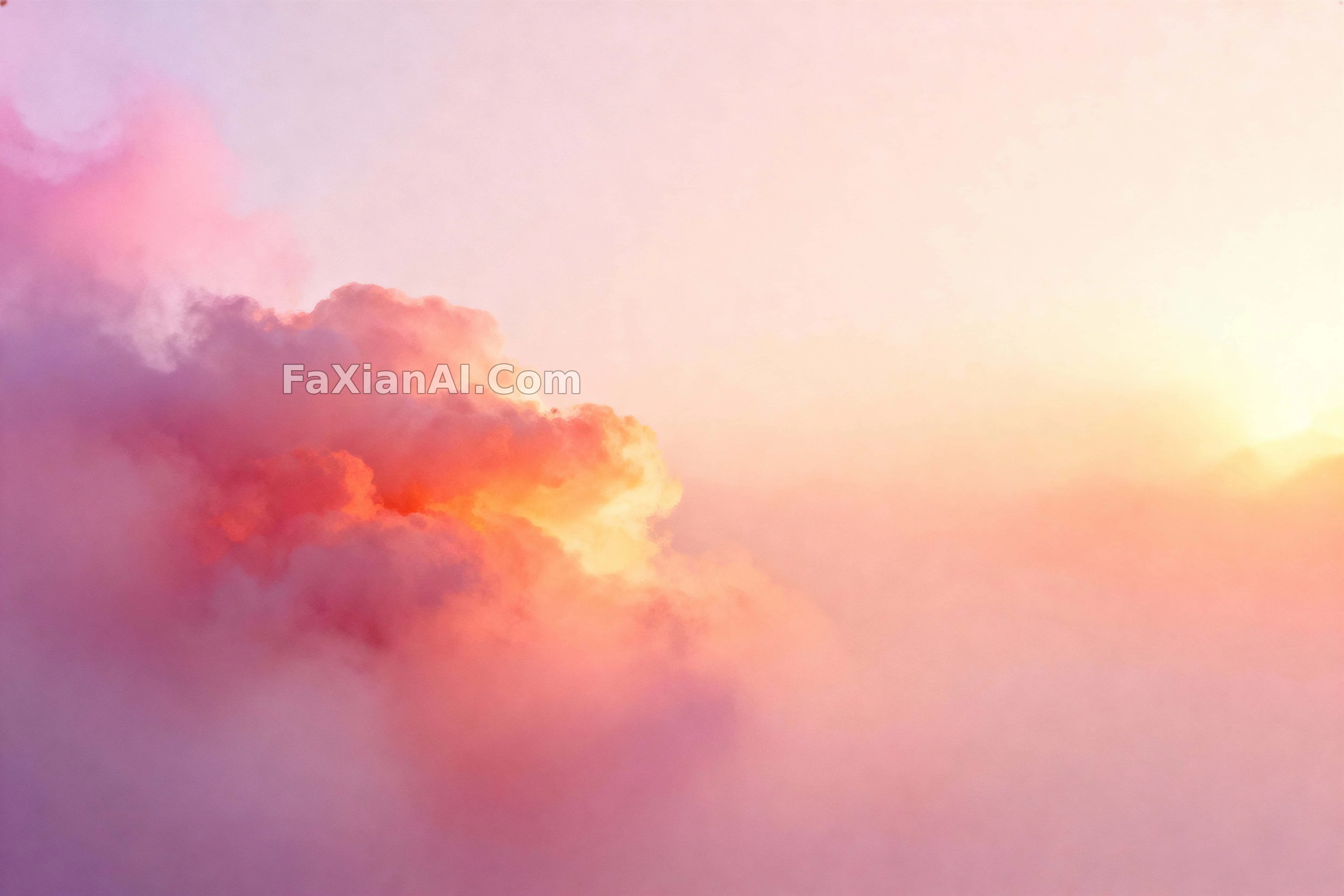
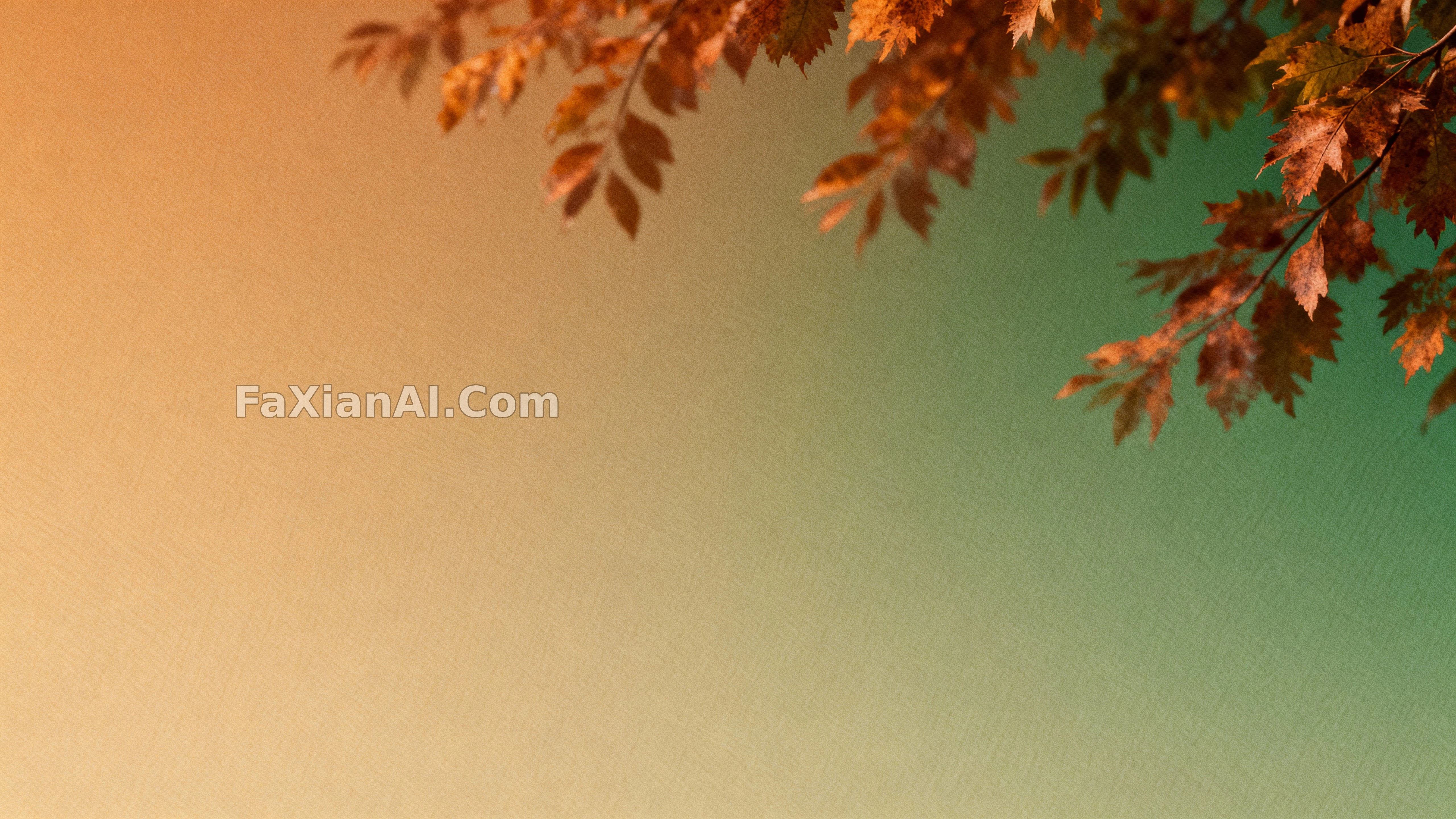
赭黃到森綠的漸變鋪滿整張,帶點鏽紅過渡,留白給文案,螢幕上看著舒服就行。
✍️ 這種漸變類的圖,螢幕上看著是暖黃,印出來容易偏橙,拿去印刷前心裡得有這根弦,先壓一壓暖調再出圖。留白那一塊千萬別省,文案壓上去才不會擠得喘不過氣,這個順序錯了後面全白搭。
📋 提示詞 自然語言951 字元
Abstract foliage gradients flow across the frame in a serene, contemplative mood: color fields shift from amber into forest green with soft rust inflections, the surface carrying a faint paper-like tooth and restrained grain. Depth stays effectively flat to keep the background clean, focus holding uniform so edges read velvety yet legible. Light stays soft and even with a gentle wrap that lifts the midtones without harsh contrast, the grading leaning into a warm-to-cool drift with a polished tonal rolloff.
The environment is a pure field with no props, prioritizing copy space across the top and sides. Camera sits front-on with a normal field of view, generous margins and a gentle diagonal energy built in for hero headers. The style reads as photographic abstraction with editorial minimalism, suited to wallpapers and banners. Tags: autumn gradient, abstract foliage, amber rust green, minimal background, soft grain, wallpaper, copy space.
📋 中文譯寫版 自然語言
抽象的葉形漸變在畫面裡流動,整體氛圍安靜沉思:色塊從琥珀色滑向森林綠,中間帶一點柔和的鏽紅轉折,表面帶著淡淡的紙紋顆粒感,剋制而不過量。景深壓得很平以保持背景乾淨,焦點統一,邊緣摸著絨軟但依舊能看清輪廓。光線柔和均勻,帶一層輕輕的包裹感把中間調提亮,不製造強對比,整體調色往暖冷過渡靠,收尾處理得很光滑。
環境是一塊純淨的畫面,不放任何道具,重點把上方和兩側留給文案位置。機位正對畫面、取常規視角,四周留足邊距,內建一點斜向的動勢感,適合當頭圖示題背景。整體風格讀作帶編輯極簡感的攝影抽象,適合做桌布和橫幅。標籤:秋季漸變、抽象葉形、琥珀鏽綠、極簡背景、柔和顆粒、桌布、文案留白。