
"How to Write Line and Negative Space: Three Kinds of Subtraction in Ripple, Sketch, and Woodcut"
A clear line drawing does not mean the more lines the better. Ripple patterns rely on changes in spacing, sketches rely on line weight and omission, and woodcuts rely on solid black and white gaps left by knife cuts. All three methods can leave large empty areas, but they organize emptiness for different reasons. First state what the lines are meant to do, then decide the density of detail.
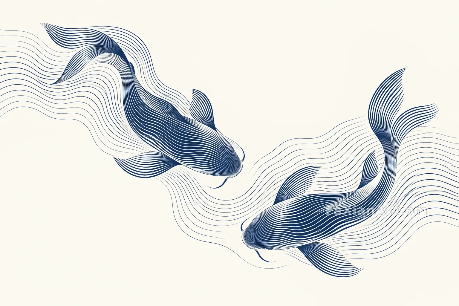
Fish in ripples emerge through density variation
The two fish are not outlined first and then filled with stripes; instead, the form gradually emerges through line spacing and direction changes. The prompt uses indigo and ivory white to control contrast and leaves readable turns at the fish head and tail. When reviewing, you can first shrink the image to card size: if the fish shape disappears completely, density or direction has not established hierarchy; if every scale is individually outlined, it may have departed from the original idea of line spacing. Local lines can be fine, but final compression must not merge several lines into a coarse color block.
Two Fish Surface Where The Ripples Turn
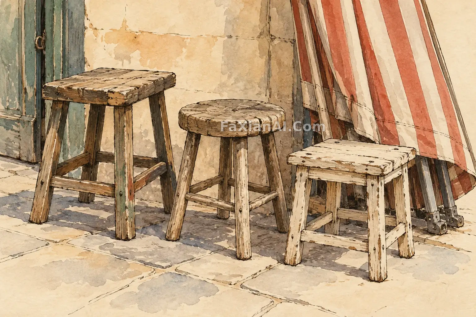
Market sketch: omit props, but not load-bearing logic
Three different wooden stools are enough to suggest the space after a market has closed; there is no need to fill in crowds and signs. Pen line weight distinguishes near and far, and a little light color explains the awning and ground shadows. Stool legs can be indicated with one or two strokes, but they must still connect to the seat and land in the same perspective. When checking, temporarily ignore the beautiful brushwork and look only at whether the stools can stand firmly and whether front-back occlusion is contradictory. The looseness of a sketch is selective omission, not deliberately drawing every straight line crooked.
Three Stools Left After The Market Disperses
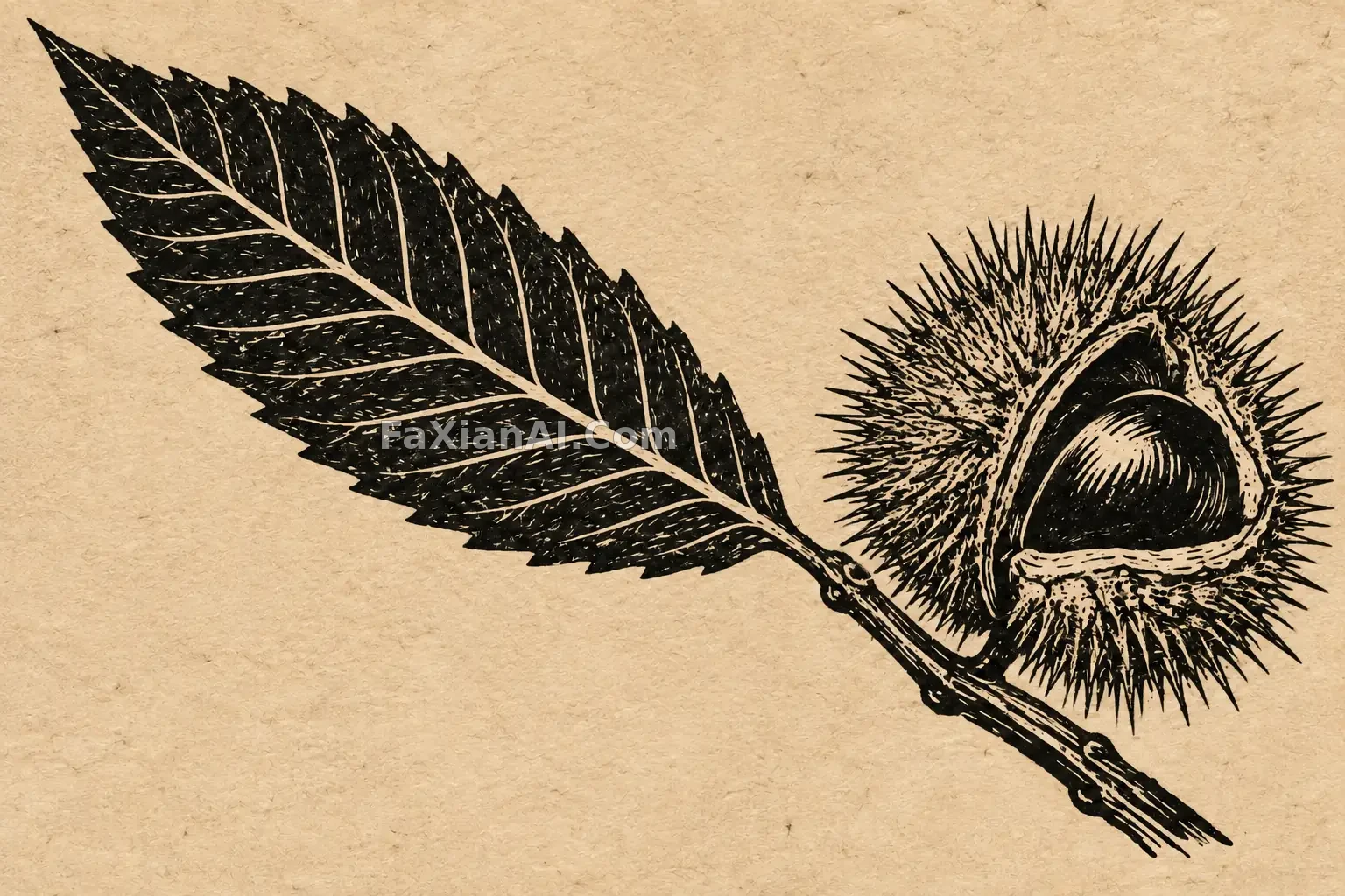
Chestnut leaf woodcut turns detail into black-and-white areas
The woodcut case keeps the leaf's main vein and the spiky husk, then uses knife cuts to leave bright narrow gaps. Its difference from pen hatching is not just line thickness: solid black blocks must participate in the composition, and white areas carry highlights and intervals. If every small vein is carved equally bright, the form is drowned by broken lines. You can first check leaf direction with fewer main veins, then add cuts around the husk. When viewing the final image, first look at the black-and-white distribution, then at whether local knife cuts have clumped into jagged edges; paper texture should be present but need not overpower the print's main subject.
Linocut Black Lines Lift A Chestnut Leaf
Change only one checkable condition at a time
Fix a leaf or shell theme and change only the task the lines perform. The ripple version writes spacing and direction, the sketch version writes line weight and omission, and the woodcut version writes solid black and white space. Each time, first shrink to check the silhouette, then zoom in to check key intersections. Compare the compressed image with the original side by side; if fine gaps disappear, adjust encoding or reduce non-key line density.
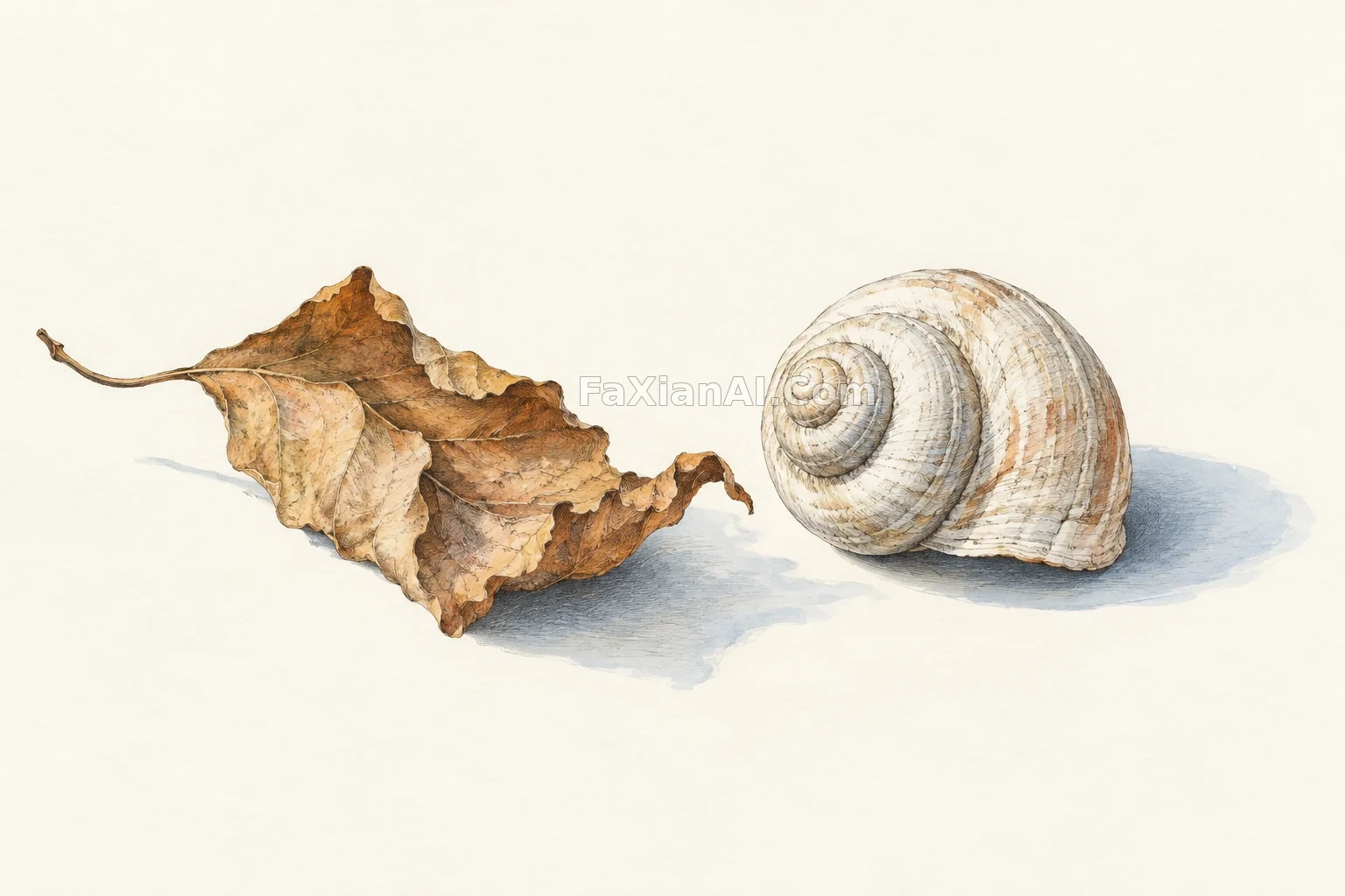
Ripple koi, market stools and the chestnut print test line spacing, line weight and black-and-white areas. The curled leaf and shell in the hero offer another way to study hatching over changing surfaces; the earlier material article helps distinguish drawn marks from physical shadows.
Further Reading on Edges and Contact Shadows
Original prompts and editorial analysis: FaxianAI