Home › Design Assets › A Bold 'HI' Speaks First, the Waves Are Just Backdrop
A Bold 'HI' Speaks First, the Waves Are Just Backdrop
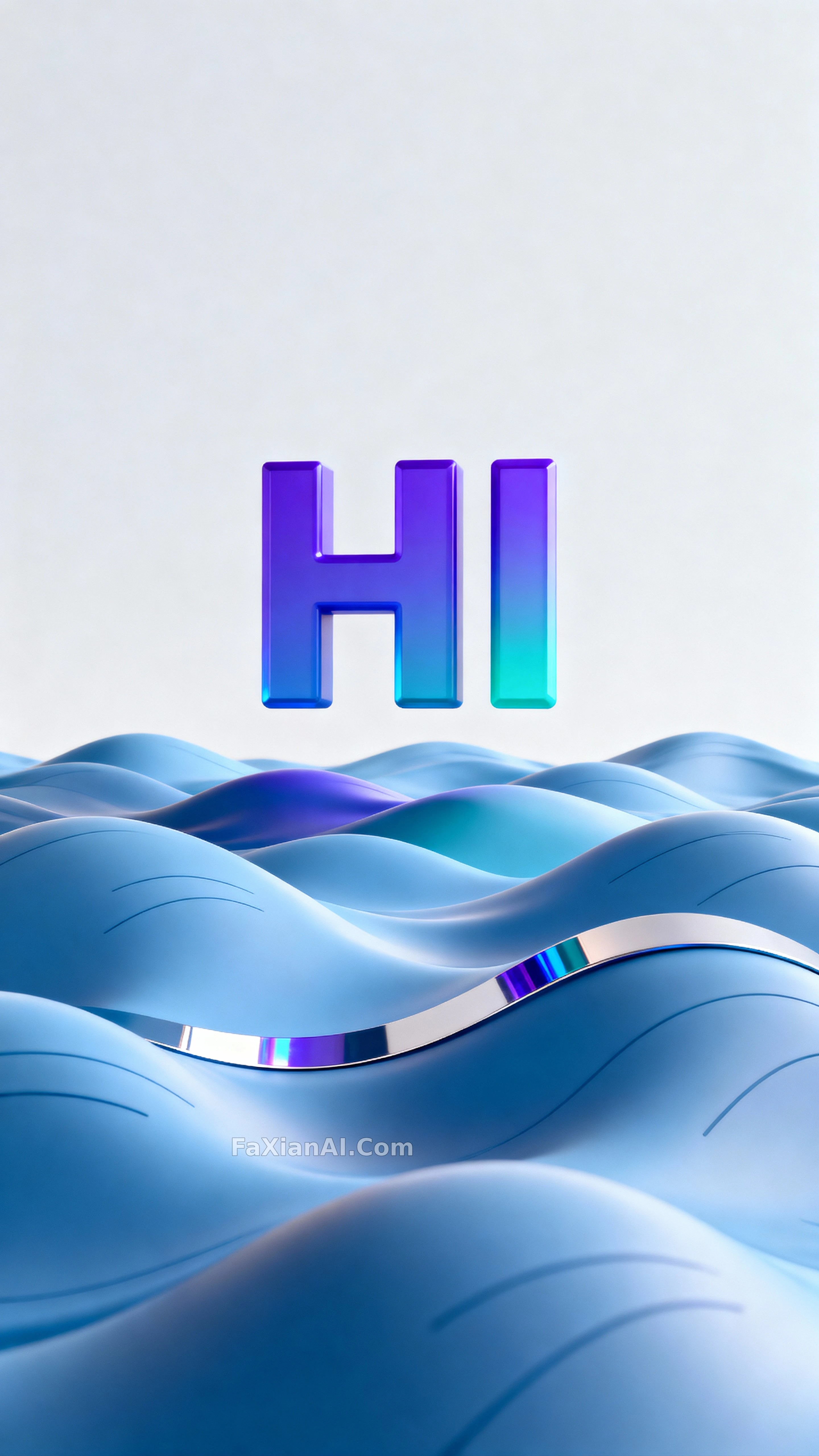
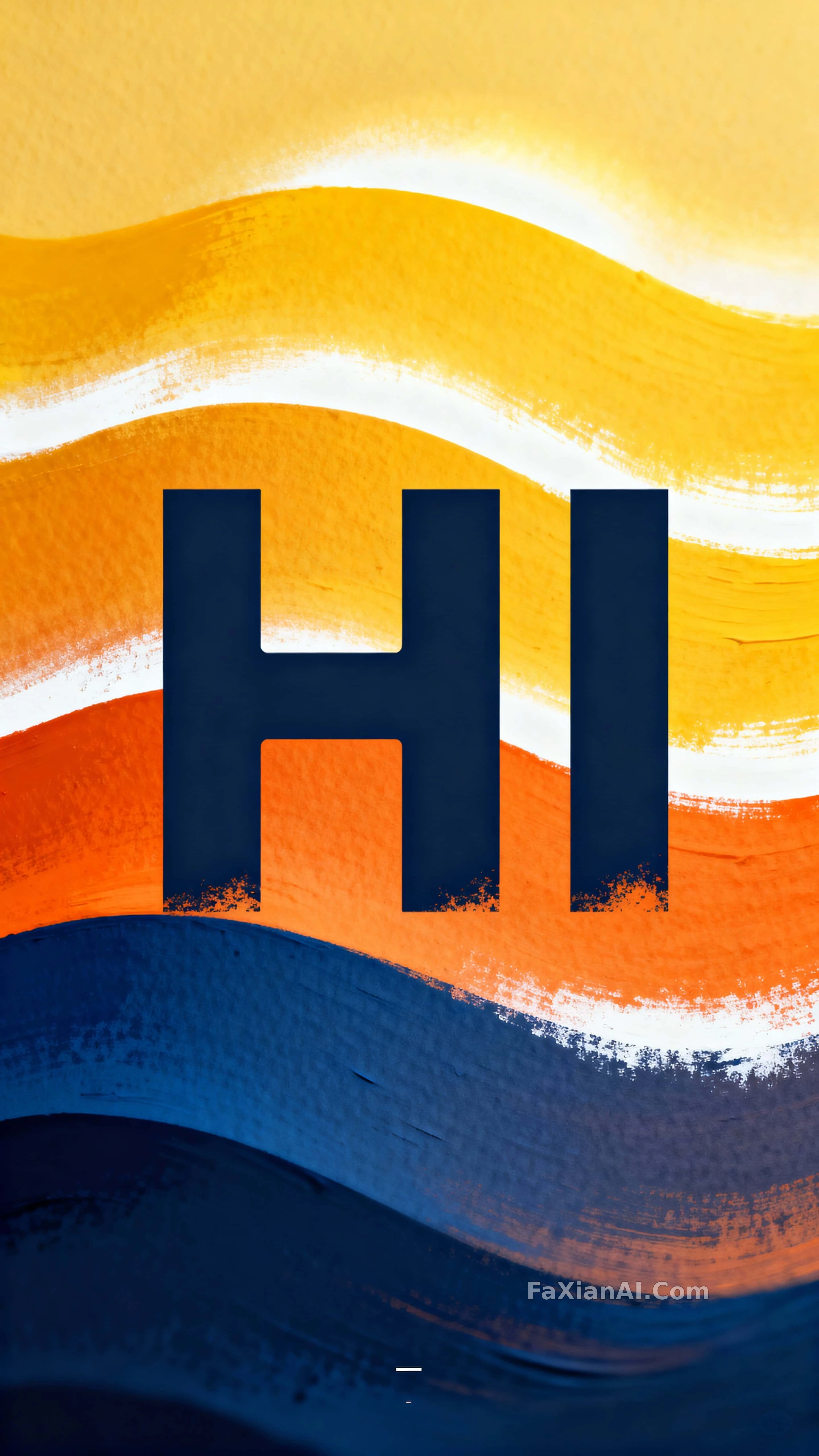
A gradient wave from cobalt to yellow lifts the letters, their edges carrying a sprayed-stencil texture — the poster feel arrives without trying.
✍️ The letters take up a third to half of the frame's height — that ratio is exactly why 'HI' can hold its own against the whole gradient wave. Color turns out to be the secondary variable.
📋 Prompt Natural Language1491 characters
Centered on the vertical plane of a 9:16 composition, a bold stencil letterform spelling "HI" reads as a confident display headline built for poster-scale impact and studio presentation. Quoted as "HI," the letters carry crisp negative cutaways and scale to roughly one third to half of the frame's height, centered with even letterspacing for strong legibility. Behind them, flowing gradient wave bands graduate from deep cobalt #0B3D91 through warm orange #F15A24 into bright warm yellow #F8E71C, with white #FFFFFF highlights building a gently glowing layered field around the type. Surfaces read as painted paper with subtle grain and occasional sprayed-edge texture along the stencil cuts to suggest tactile stencil application. Sharpest focus sits on the letter edges in the foreground, the wave bands receding at a moderate soft separation to imply depth. Even lighting adds a soft directional glow that sculpts the wave ridges and biases the colored bands warm. Keep the crop tight and vertical at a 9:16 ratio, clear top and bottom margins, centered composition, and balanced negative space above and below the headline for mobile and poster use. A single small alignment mark or registration sticker near the lower corner reads as a practical studio cue. The overall style blends clean vector illustration with tactile painted texture, suited to poster, social-story, or mobile display formats. A gentle left-to-right drift in the wave curvature implies subtle motion without blur.