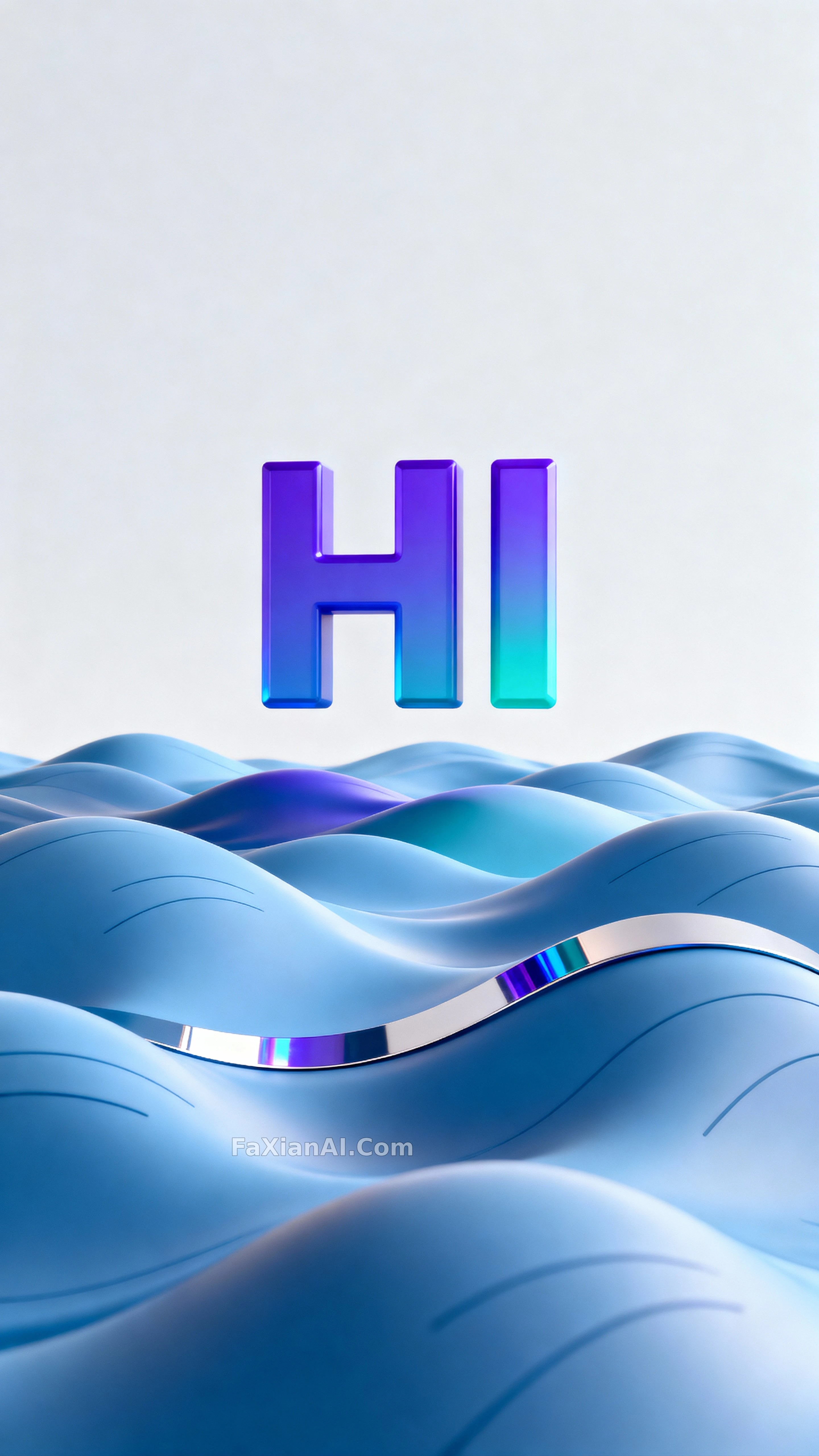
先声夺人的"HI",浪只是背景
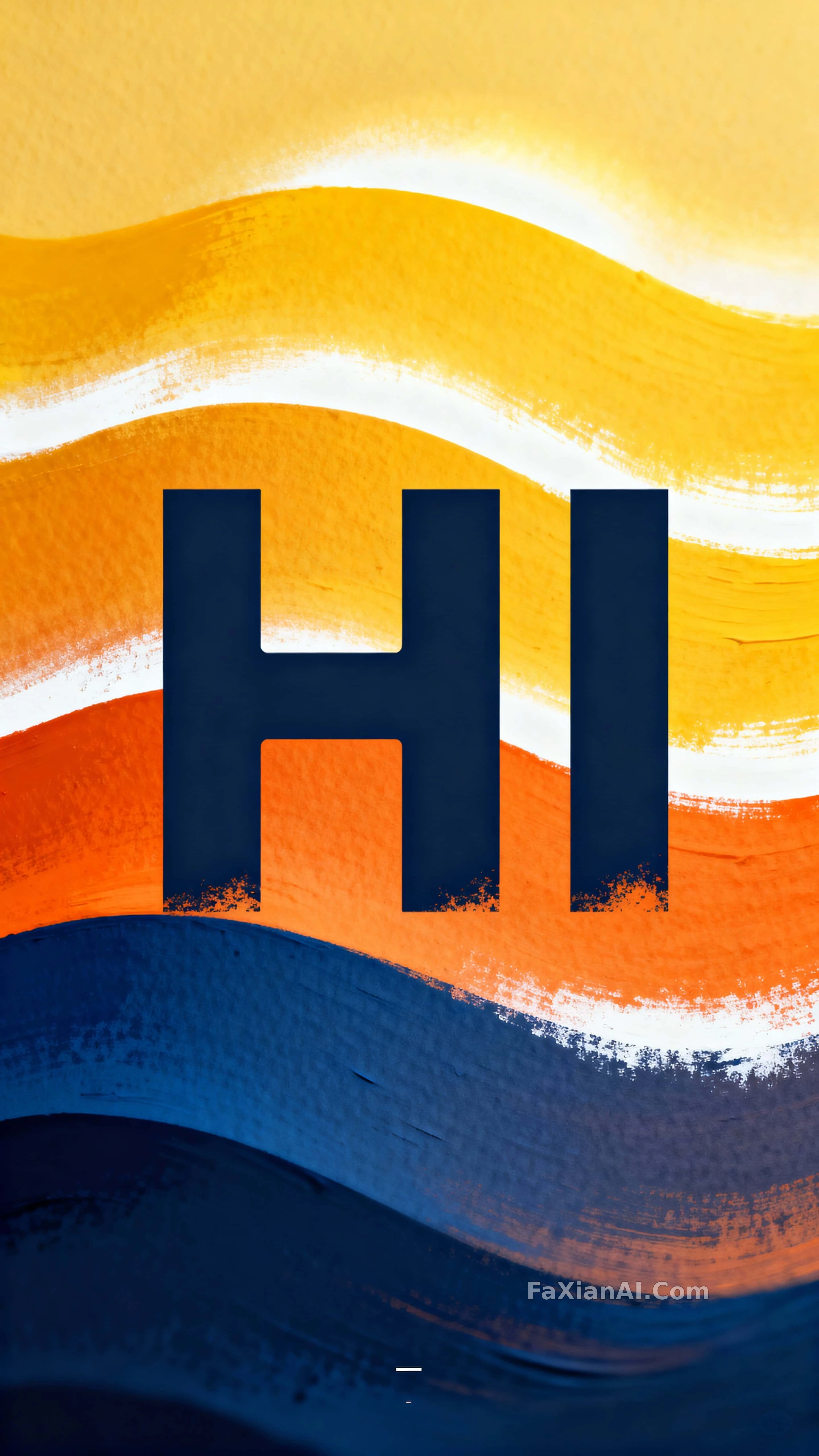
钴蓝到黄的渐变浪把字托起来,字口带喷漆边缘,海报感不用喊就出来了。
✍️ 字号占框高的三分之一到一半,这个比例才是"HI"能压得住整片渐变浪的原因,颜色反而是次要变量。
📋 提示词 自然语言1491 字符
Centered on the vertical plane of a 9:16 composition, a bold stencil letterform spelling "HI" reads as a confident display headline built for poster-scale impact and studio presentation. Quoted as "HI," the letters carry crisp negative cutaways and scale to roughly one third to half of the frame's height, centered with even letterspacing for strong legibility. Behind them, flowing gradient wave bands graduate from deep cobalt #0B3D91 through warm orange #F15A24 into bright warm yellow #F8E71C, with white #FFFFFF highlights building a gently glowing layered field around the type. Surfaces read as painted paper with subtle grain and occasional sprayed-edge texture along the stencil cuts to suggest tactile stencil application. Sharpest focus sits on the letter edges in the foreground, the wave bands receding at a moderate soft separation to imply depth. Even lighting adds a soft directional glow that sculpts the wave ridges and biases the colored bands warm. Keep the crop tight and vertical at a 9:16 ratio, clear top and bottom margins, centered composition, and balanced negative space above and below the headline for mobile and poster use. A single small alignment mark or registration sticker near the lower corner reads as a practical studio cue. The overall style blends clean vector illustration with tactile painted texture, suited to poster, social-story, or mobile display formats. A gentle left-to-right drift in the wave curvature implies subtle motion without blur.
📋 中文译写版 自然语言
在9:16竖版构图的中轴线上,一个粗体镂空字体拼出的"HI"读起来像一句自信的展示标题,专为海报级视觉冲击和影棚级呈现打造。"HI"两个字带着利落的镂空切口,字高约占画面三分之一到一半,居中排列、字距均匀以保证辨识度。背后是从深钴蓝#0B3D91经暖橙#F15A24过渡到明黄#F8E71C的流动渐变波带,配以白色#FFFFFF高光,围绕文字堆出一层柔和发光的层次感。表面读起来像带细腻纹理的画纸,镂空边缘偶有喷溅质感,暗示手工模板喷涂的触感。最清晰的焦点落在前景的字母边缘,波浪色带以适度的柔和分离感向后退去,暗示纵深。均匀的光线带来柔和的方向性光晕,塑造出波浪的起伏并让色带整体偏暖。裁切保持紧凑竖直的9:16比例,上下留有干净边距,构图居中,标题上下方留出均衡的负空间以适配移动端和海报使用。右下角附近一个小小的对位标记或校准贴纸,是一处实用的影棚提示细节。整体风格融合了干净的矢量插画与带质感的手绘涂料肌理,适用于海报、社交故事图或移动端展示格式。波浪弧线带出一丝从左到右的轻微漂移感,暗示动态但不带模糊。