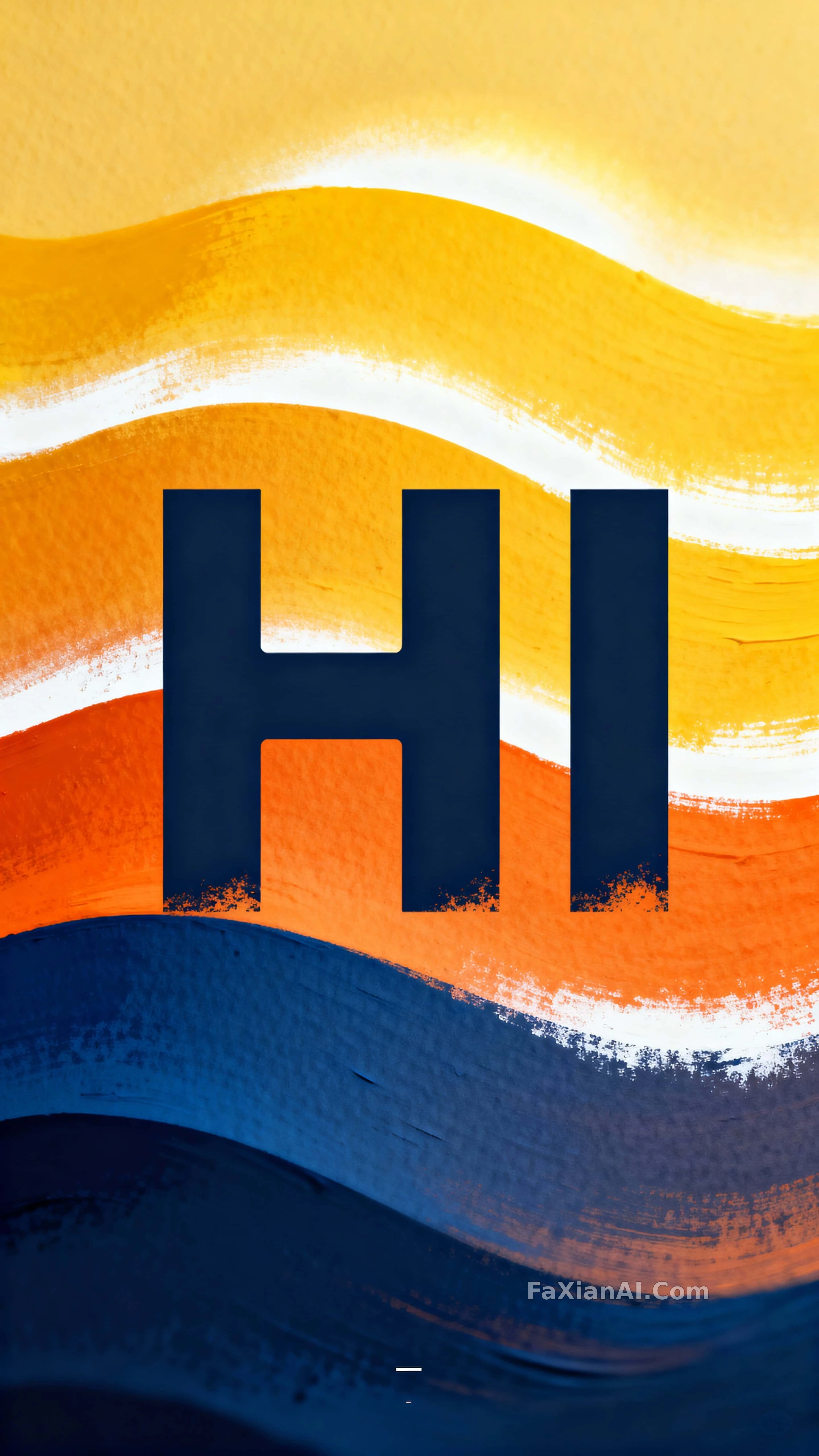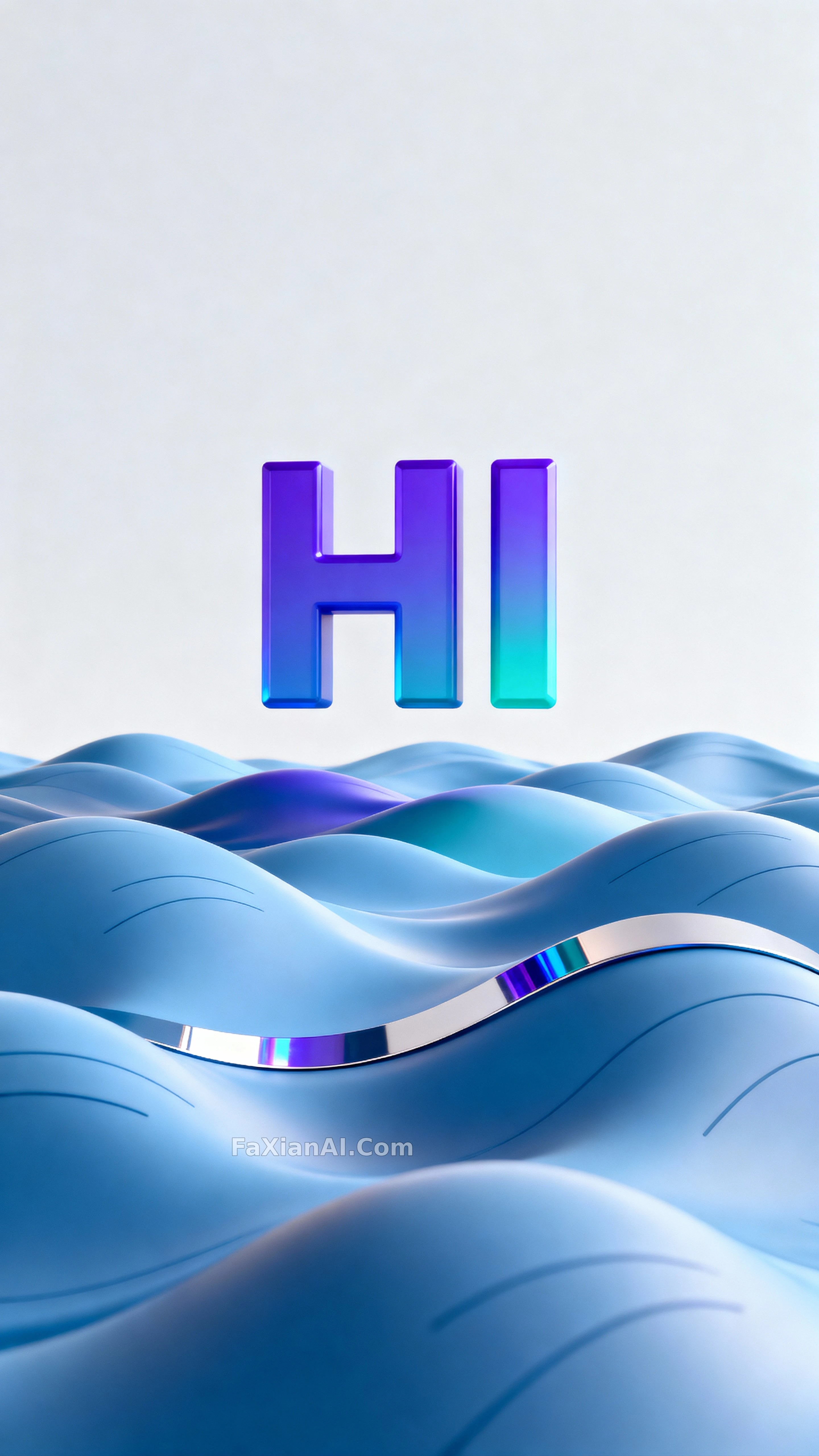
打招呼这两个字,漂在浪尖上
字体故意留宽间距,像打招呼时特意放慢的语气,配色挑的是冷调蓝紫。
✍️ 间距留宽、棱边留一点高光,这两下才是"HI"能立住的原因,浪头故意做钝就是不想抢戏。挪去玩别的字母,这套办法照样成立。
📋 提示词 自然语言1405 字符
Set inside a 9:16 vertical frame built to read as a poster or phone lock screen, a large three-dimensional letterform spelling "HI" floats calmly above an abstract sea of sculpted waves. The word "HI" stays highly legible and front-facing, sitting in the upper third to upper-middle of the crop with roomy letterspacing and subtle beveled edges that pick up color highlights. Beyond that main type, surfaces stay unlettered, wave crests simplified into smooth arcs and micro-markings that read as abstract lines. Cool blue, violet, and aqua hues — echoing #1E90FF, #6A5ACD, and #00CED1, with pale neutral highlights like #F5F7FA — give the scene gentle separation and a faint glow along the edges. Light stays soft and diffuse, laying gentle rim highlights on the type and soft shadows that hint at volume without pushing contrast. Focus stays crisp on the letterforms' front faces with moderate depth so the nearest wave ridges resolve clearly just behind the type. The composition reads tight and vertical, clean negative space above and a balanced mass of waves below, framed for a 9:16 portrait crop with centered alignment. A single reflective band across one wave crest and a faint specular streak along a letter edge suggest materiality as the only added props. Render the whole thing as polished 3D illustration, smooth gradients and minimal surface noise, so it reads as a modern graphic artwork.
📋 中文译写版 自然语言
在适合做海报或手机锁屏的9:16竖版画幅里,一个巨大的三维立体字母组合"HI"平静地悬浮在雕塑感十足的抽象波浪之上。"HI"保持高辨识度、正面朝向,位于画面上三分之一到中上位置,字距留得宽松,边缘带轻微倒角并捕捉到色彩高光。除主体文字外,其余表面保持素净无字,浪尖被简化成平滑的弧线与微小标记般的抽象线条。冷调的蓝、紫、青三色——呼应#1E90FF、#6A5ACD、#00CED1,搭配#F5F7FA的浅中性高光——让画面有柔和的层次分离与边缘微光。光线柔和弥散,给字体打上轻柔的轮廓高光,阴影提示体积感但不推高对比。焦点落在字母正面,景深适中,最近的浪脊在文字后方清晰可辨。构图紧凑而竖直,上方留出干净的负空间,下方是均衡的浪体量感,整体按9:16竖版居中构图。一道横跨某个浪尖的反光带和字母边缘的一抹高光,是唯一暗示材质感的道具。整体按精致的三维插画处理,渐变平滑、表面噪点极少,读起来像一件现代平面作品。