
Hand-Drawn Food Map Prompts: Settle Dish Size and Action Before the City
The most natural way to ask for a city food map is "draw a hand-drawn food map of Chengdu, make it cute." It does produce an image, but the dishes are too small to read while the streets are drawn with great care, and the result looks more like a tourist-attraction guide. People save this kind of picture for the dishes, so the weight of the prompt belongs on the food, with geography pushed back to serve as the base.
1. How Big Is a Dish? Write It as a Number
The line most worth copying from the Chengdu foodie map is "12 small food illustrations, each taking up about 5% of the map area." That one number controls two things at once: the dishes are big enough that you can see what's in the bowl, and twelve of them add up to about sixty percent of the page, so the base map doesn't steal the scene.
With fewer spots you can raise the share. For six or seven dishes, writing 8% to 10% is far more reliable than "make them bigger." Past fifteen spots, be careful: the illustrations jam into one mass, and it's better to split into two maps, say a "breakfast edition" and a "late-night edition."
2. Give Every Dish an Action
If you only list dish names, the model hands you a bowl of still life. The Chengdu case has the egg pancake "being flipped," the san da pao rice balls "flying toward a brass tray," and the hotpot "rolling and bubbling," and the map suddenly has steam and sound.
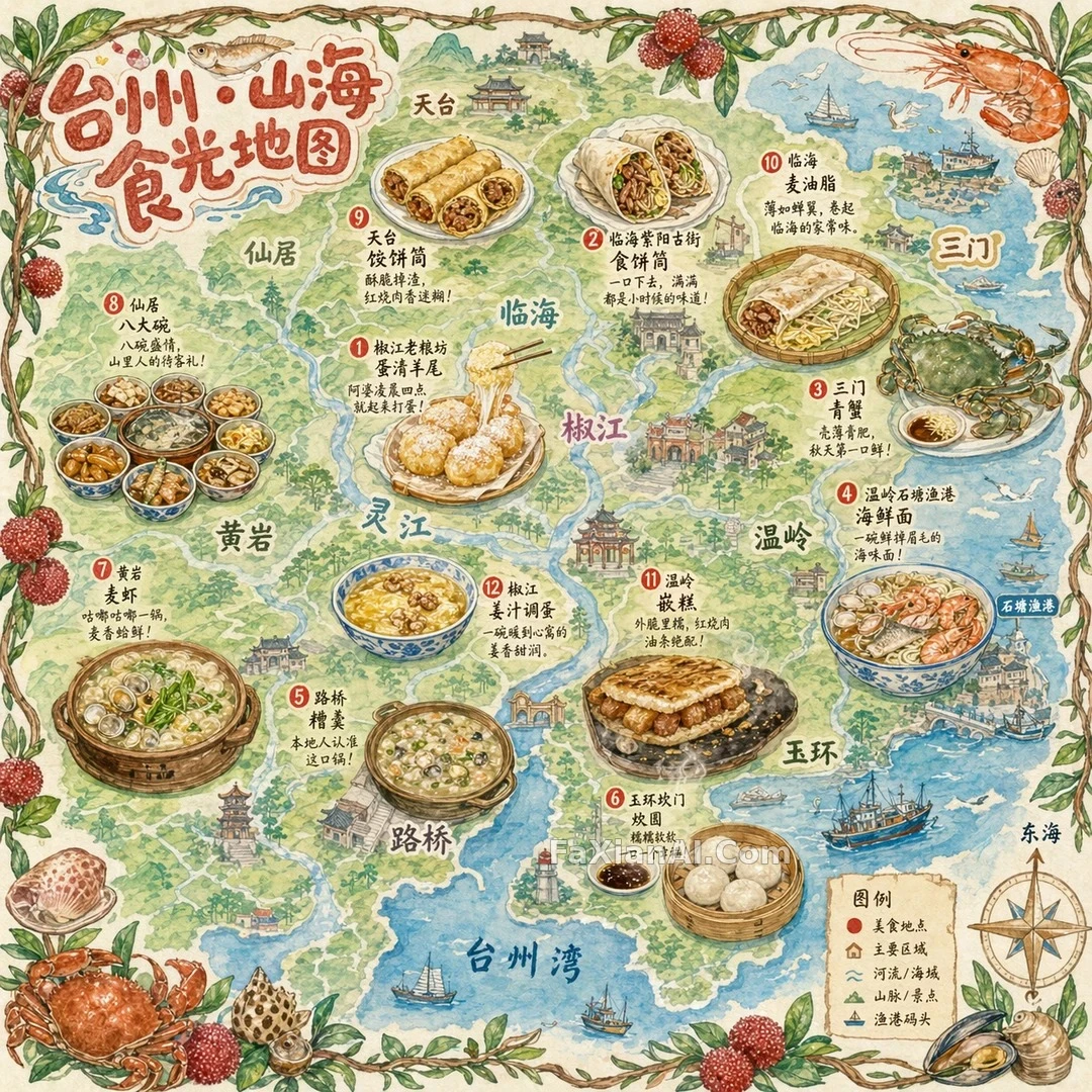
The Taizhou mountain-and-sea map takes the method further: the egg-white lamb tail "stretches into strands when chopsticks lift it," mai xia noodles are "rolling and bubbling" in a clay pot, and qian gao sizzles on an iron plate. Looking at the image above, not every one of those details is drawn accurately, but the whole is clearly livelier than a row of plated-food photos. The action doesn't need to be complicated. A verb plus a vessel is enough: a rough ceramic bowl, a bamboo tray, an iron griddle, a steamer basket. Change the vessel and you change the sense of place.
3. The Base Map Marks Only Main Roads and Landmarks
All three maps carry the same constraint on the base map: bird's-eye, simplified, no need for accurate scale. Don't drop that line. Without it, the model works hard to draw a dense road network and squeezes the illustrations into the gaps.
The Shantou map names only a few main roads and landmarks such as Xiaogongyuan, the Shiqiao bridge and Nan'ao Island. It uses a 16:9 banner because Shantou stretches along the coast and looks more at ease laid out sideways; Chengdu and Taizhou use 1:1, so the dishes can circle the center. The aspect ratio should follow the shape of the city: square for inland cities, wide for coastal or riverside ones.
Whether you need real geography depends on the use. For visual reference only, a few landmarks are enough; for print or publication, every place name and position has to be checked by hand, because the relative positions the model draws are often wrong.
4. Border and Palette Carry the City's Character
Put Chengdu and Taizhou side by side and the skeleton is almost identical; nearly all the difference is in border and palette. Chengdu is framed with chili peppers and vines, with chili red, ginger yellow and jade green as main colors; Taizhou swaps in bayberry branches, shrimp, crabs and shells and adds sea blue, so you know at a glance it's a coastal city; Shantou goes with phoenix-flower red, olive green and Nan'ao blue.
So pick two or three of the most recognizable local products for the border, then take the main colors from those products. This step costs the fewest words and works best when you change cities. If you want a completely different route, look at the volcanic island hiking map: it writes no text at all and relies on terrain and route nodes to hold the picture, which suits cases where you only want the illustration and plan to add lettering later.
5. Text: Keep It Short, and Always Check It
Text on a map is the part most likely to go wrong. The editor's note on the Shantou case says the recommendation line works best at around seven characters, for example "crisp outside, tender inside, full of the sea." The fewer the characters, the higher the chance the model gets them right, and the less the text covers the illustrations.
Even so, don't assume the text in the final image is correct. Zoom in on the small print in the three images and shop names and captions can still have wrong characters or extra strokes, while large type like the title is much steadier. A safer workflow: leave the title to the model, check the small text line by line after generation, and rewrite or cover the wrong parts with a retouching tool. For how to write text prompts, read on with how to prompt for text inside images; for laying out information with more hierarchy, the layout approach of museum infographics also helps.
A Template You Can Adapt Directly
```
Draw a hand-drawn food map themed on [city], with a watercolor-and-colored-pencil texture, aspect ratio [1:1 / 16:9], main colors taken from [three or four colors drawn from local products].
Base map: a simplified hand-drawn bird's-eye map marking only [three to five main roads or districts] and [two or three landmarks], with no need for accurate scale.
Scatter [8-12] small food illustrations across the map, each taking up about [5%] of the map area, with the shop name beside each in a handwritten font plus a recommendation line of about seven characters:
1. [place · dish name]: [vessel] holding [the dish's state or action].
2. [place · dish name]: [vessel] holding [the dish's state or action].
...
Border: a ring of hand-drawn [local plants] and [local products]. Put a hand-drawn compass and legend at the lower right, and write the title "[city] · [title]" at the upper left in round, chubby hand-lettered type.
```
Before you start, list the three dishes the city most wants to be remembered for and give them the most specific actions; the rest can be handled briefly. When people look at this kind of map, the place their eyes linger longest is always the bowl they have eaten or want to eat.