
Why the Small Details Matter More Than the Subject in an Antique Plate
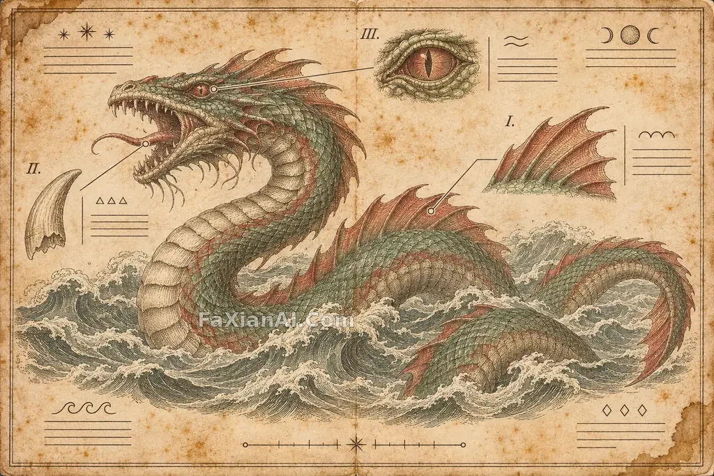
Look through enough antique plate examples on the site and a pattern emerges: the details our editors keep coming back to are rarely the main subject.
The flowers on the forget-me-not specimen card are beautifully drawn, but what makes it feel like a page from an old book are the numbered labels on the stems, the plate number at the bottom, and the pencil notes in the margins. The human-to-giraffe evolution plate works the same way: that line of Latin labeling makes the difference between a natural history book insert and an odd-looking picture.
So when writing this kind of prompt, try reversing the order: start with the page’s “archival details,” then describe the subject.
How Was This Image Printed?
Words like “vintage” and “old” tend to produce little more than a yellow filter. What does the work is the language of technique: copperplate lines, cross-hatching, hand-coloring, ink outlines with light washes. The sea serpent at the top uses copperplate engraving with faded verdigris and iron red; the giraffe plate layers delicate watercolor over fine ink lines. Once you choose the technique, you also establish the density of the lines and the range of colors.
Keep the palette restrained. The forget-me-not plate uses only cream, indigo, and green; the giraffe stays within warm browns and pale earth tones. Old prints tended to use few colors, and too many can spoil the effect.
Keep the Viewpoint Consistent and Group the Details
The evolution plate reads as a sequence because every figure is shown in a strict side view. Change the angle in one panel and the comparison breaks down. This constraint works for any plate that places similar subjects side by side. The wind-dispersed seed atlas follows the same logic, placing six plants on a single sheet.
Small detail studies are another useful device. Place little illustrations of teeth, fins, and eyes around the main image and connect them with fine leader lines. The page immediately takes on the structure of an anatomical plate.
Text: Specify It Exactly or Leave It Out
This is where things most often go wrong. Ask a model for long passages of small text and you’ll usually get letter-like gibberish that looks terrible up close. There are three ways to handle it:
1. Use only short text and specify it exactly. The forget-me-not prompt puts the title, subtitle, and plate number in quotation marks. Fewer words mean fewer opportunities for errors.
2. Explicitly request no text. Both the lichen and sapling root study and the seed atlas specify no text, relying on layout and negative space to create the feel of a plate.
3. Use abstract marks as placeholders. Replace captions with blank lines and abstract symbols, as in the sea serpent image above. You get the visual rhythm of text without the misspellings.
The castle defense manuscript calls for extensive annotations in an archaic script, which is a riskier approach. Images like that are better treated as source material; don’t expect every letter to withstand close inspection. For more ways to handle lettering, see How to Write Text into an Image Prompt.
Don’t Overwork the Paper
A crease or two, a stain near a corner, some yellowing: one or two signs of age are enough. Pile them all on and the result can look like a deliberately distressed texture overlay. A thin double-line border is an economical layout choice: it immediately frames the image as a book page. For more on infographic composition, see Museum Infographic Layouts.
Template
> A single page from a [period] natural history atlas, photographed flat. Main subject: [fictional or real species/object], rendered in [copperplate lines / ink lines and watercolor], all shown in [strict side view / orthographic projection]. Place [three] small detail studies around the subject, connected with fine leader lines. Use only [two to three faded pigments]. [Aged paper color] paper, one crease, thin double-line border. The only text reads: “[title]” and “[plate number]”; replace all other captions with blank lines.
Fictional subjects are often even better suited to this approach: with no ready-made photograph to use as a reference, the model has to draw the plate.