這種設計,印刷廠看了直搖頭
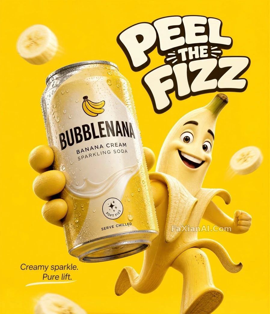
香蕉傳單亂成一鍋粥,老師傅一看就知道要返工
✍️ 這條壓根不是拍出來給人看的,是拿來當反面教材的——扭曲的手、看不清的包裝字、悶平的打光,條條都是設計事故清單。真要用,是反過來當負面提示詞抄,不是當正稿跑。
📋 提示詞 自然語言
Low-end convenience-store ad aesthetic built from a cluttered, unbalanced composition: a childish cartoon mascot with distorted limbs and awkward hands sits against a muddy yellow background, too many banana slices floating around it with a plastic-looking rubbery texture. Packaging text is crammed and unreadable, copy runs excessive, and lighting stays flat throughout — a cheap flyer design meant to look mass-printed in a hurry.
📋 中文譯寫版 自然語言
整體是低端便利店廣告美學:畫面構圖雜亂失衡,一個四肢扭曲、手部姿態彆扭的幼稚卡通吉祥物置身渾濁的黃色背景中,過多的香蕉切片漂浮四周,質感看起來像塑膠一樣廉價。包裝上的文字擁擠難辨,文案資訊量過多,打光通篇扁平——這是一張看起來像趕工批次印出來的廉價傳單設計。