Home › Design Assets › A Design Any Print Shop Would Shake Its Head At
A Design Any Print Shop Would Shake Its Head At
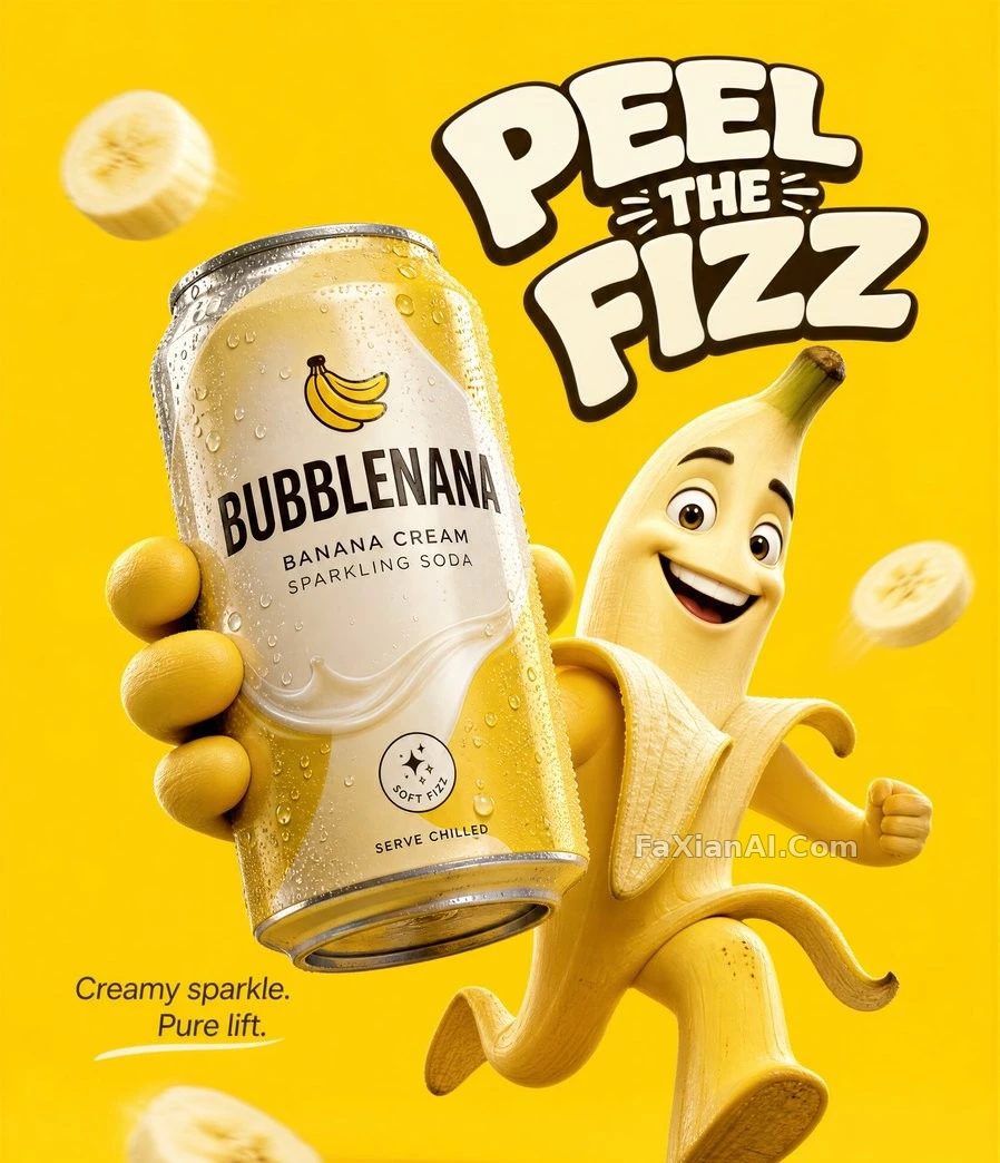
This banana flyer is a total mess — any veteran printer would clock it as a redo on sight.
✍️ This one was never meant to be shown off — it's a textbook example of what not to do: warped hands, unreadable packaging text, flat dull lighting, a checklist of design disasters. If you use it at all, copy it into a negative prompt, not run it as the final piece.
📋 Prompt Natural Language
Low-end convenience-store ad aesthetic built from a cluttered, unbalanced composition: a childish cartoon mascot with distorted limbs and awkward hands sits against a muddy yellow background, too many banana slices floating around it with a plastic-looking rubbery texture. Packaging text is crammed and unreadable, copy runs excessive, and lighting stays flat throughout — a cheap flyer design meant to look mass-printed in a hurry.