
Black-and-White Photography Prompts: Don't Stop at "black and white", Gray Tones, Light Direction and Grain Are What Count
Black-and-white photos look simple, yet the prompts for them are the easiest to write emptily. Many people just tack black and white onto the end of a sentence, and the model generates a color image as usual and then pulls the color out: a dead-white sky, a dead-black shadow, and a middle full of grays that all look alike.
Real black-and-white photography is a different language. With the color gone, the picture rests on three things: gray-tone layering, the direction of the light, and grain and tonality. The black-and-white cases on the site that come out well have almost all put their effort into these three places.
1. Gray Tones: Tell the Model "Dark Grays Must Stay Distinguishable"
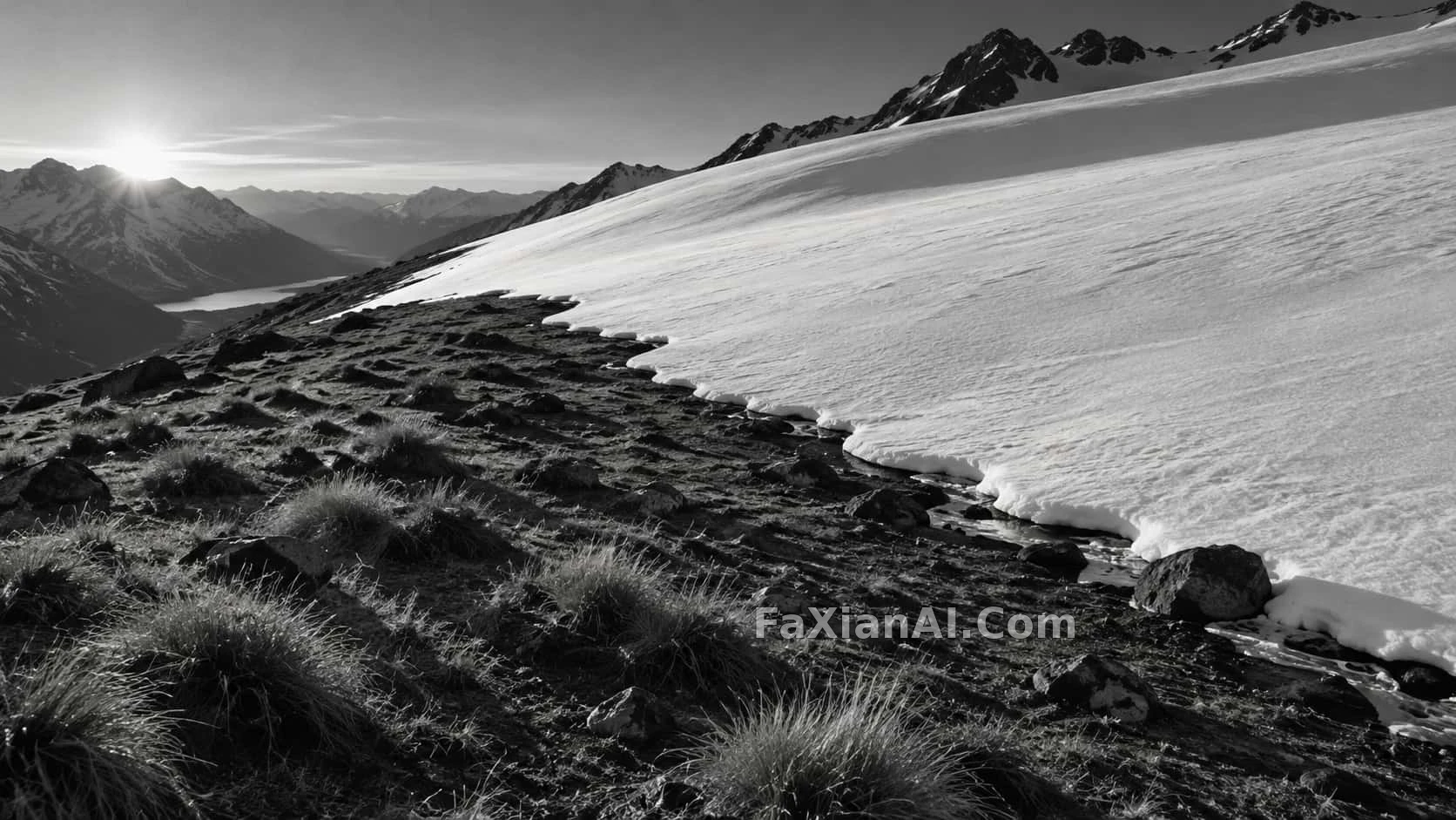
Snowline ending on dark earth is a very good model. It doesn't stop at "black and white" but writes out the tonal curve too: shadows should separate into dark grays you can tell apart, highlights should be bright but not blown, and the whole thing is a restrained silver-gelatin tone. The editor's note is blunt: the description of tonality at the end is what keeps the model from treating black and white as mere desaturation.
The silver-gelatin grain of pigeons on a rooftop gives a similar reminder: separate the layers by gray tone, and don't press the sky into pure white. An overcast sky, wet eaves, feathers and distant chimneys are each a different depth of gray, and that is what lets the pigeon pop off the background.
For wording, you can borrow photographers' phrases: rich midtones, deep but legible shadows, highlights that hold detail. You don't need to know the zone system; it's enough to let the model know "the midtones should be rich."
2. Light Direction: In a Black-and-White Photo, Light Is the Outline
A color photo can separate subject from background by color. Black and white can't; it only has light and dark. So which side the light comes from, and whether it is hard or soft, has to be written more specifically than for a color image.
The geometric light-and-shadow black-and-white photo on a wall uses strong side light to cut sharp shadow lines across the wall, the face and the body, so the real star of the whole picture is those few bands of light. A piece of cloth whose folds look like a mountain ridge goes further: there is only cloth in the frame, and single-side lighting makes every fold's ridge line and hollow read clearly. The editor's note has a very practical comparison: side light draws the layers out, while top light flattens them all.
So when writing a black-and-white image, instead of an empty phrase like dramatic lighting, write it out: side light from the left, low winter sun, window light from one side. Once the light direction is settled, the shapes come out on their own.
3. Composition: With Color Gone, Shape Has to Fill In
In a black-and-white photo, geometric shapes and lines carry extra weight.
The staircase shot looking up produces a whole geometry problem with almost no lighting technique written in. It simply puts the camera at the bottom of the stairwell, looking straight up. The repeating geometry built into multiple flights of stairs and railings is stronger in black and white than in color. The snowline entry works the same way: the three shaping elements "curve, long shadows, cold low light" are all written in, and with no color present, shape fills the gap.
The takeaway for writing prompts: for a black-and-white image, spend one more sentence on lines and shapes, such as a diagonal, a run of repeating railings or a curving snowline, and it will do more than one more style word.
4. Grain and Flaws: Give It a Few Traces of Having Been "Shot"
A perfectly clean black-and-white image easily looks like a render; add some grain and imperfection and the photographic feel gets much stronger.
The black-and-white street shots of four cities in four kinds of weather takes this to the limit: it specifies the camera and the film, asks for a horizon tilted a few degrees, a subject off-center, a foreground object cut in half by the frame, and then adds a closing line saying it is "not a render." The editor's note sums it up as getting the model to "shoot badly": those deliberate flaws are exactly where the street-photo feel comes from. For how to write a four-panel grid without it turning messy, see what to lock in multi-panel image prompts.
Grain comes in lighter and heavier writings: fine grain suits quiet landscapes and still lifes, while visible grain or pushed film suits streets and night scenes. For a period feel, you can also spell out which kind of film texture you mean; the thinking behind that is laid out in period-look prompts need evidence.
5. Portraits: What Black and White Fears Most Is Plastic Skin
The risk in a black-and-white portrait is skin smoothed so flat it looks like wax. The site's black-and-white portrait cases generally add two kinds of description: one for real texture (pores, natural lines, the detail of gray-white hair), and one for lighting (high contrast, one side lit, background pushed to black). This black-and-white kiln-fired batch gets its drama from a pure black background and a slightly low camera, with the hair and eyes kept sharp and the clothing texture drawn out layer by layer by the light.
To avoid fake faces further, see several ways to light a portrait without plastic skin.
A Black-and-White Photography Template You Can Adapt Directly
```
Black-and-white photograph of [subject], [aspect ratio: 3:2 / 16:9 / 4:5].
Light: [light direction: soft window light from the left / low winter sun from behind / hard side light],
casting [shadows: long shadows / sharp geometric shadow lines].
Composition: [lines or shapes: a diagonal staircase / a curving snowline / repeating railings],
[camera position: eye level / looking straight up / low angle].
Tonality: rich midtones, deep but legible shadows, highlights that hold detail,
silver-gelatin look, [grain: fine grain / visible grain].
[optional flaws: slightly tilted horizon, subject off-center, foreground object cut by the frame.]
Not a render, not a desaturated color photo.
```
Before you use it, work out what the "shape" of this picture is. In a black-and-white photo, light cuts the shape out, gray tones give the shape volume, and grain makes it look like a real photograph. Write all three, and the black and white won't be left with just gray.