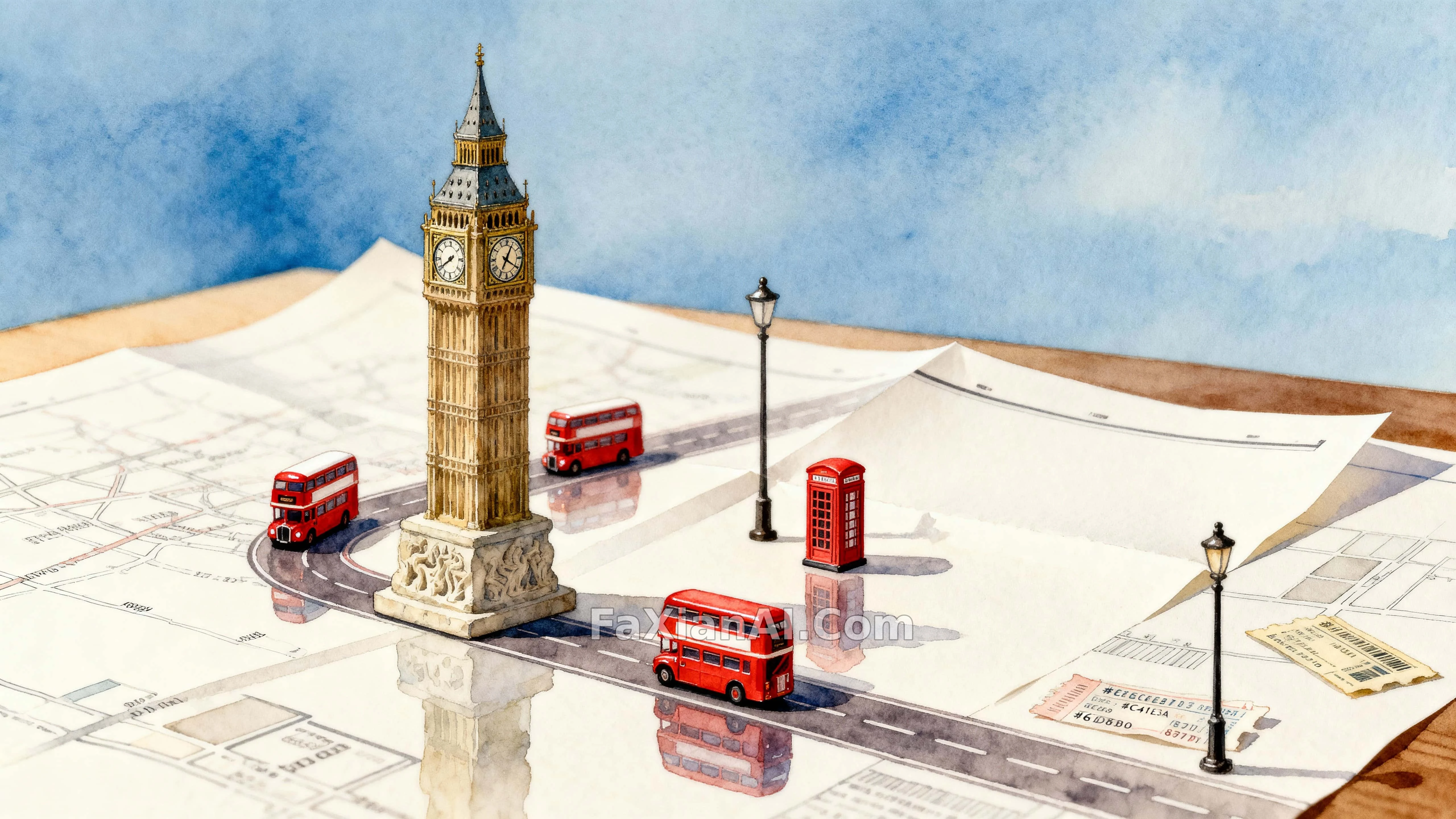
紙地圖上跑著巴士的大本鐘
這種桌面地圖場景為什麼總讓人想掏出玩具車,答案在比例尺上。
✍️ 巴士留下的反光這個細節,是讓紙這個材質成立的關鍵——沒有反光,觀眾會懷疑這是真實街景不是桌面模型。色值釘死那四個,換個飽和度整張就塌。
📋 提示詞 自然語言1157 字元
A toy-scale Big Ben anchors a tabletop map scene, whimsical but calm, with a deliberate, readable sense of scale. Tiny red double-decker buses crawl along the printed roads, leaving the faintest reflection on the paper surface — the palette holds close to #C41E3A, #E6D8B0, #8C7B6D and #6EA3D9. A few small telephone booths stand nearby as steady vertical markers, resting on smooth paper with subtly folded edges. Every surface stays clean and unlettered, so the printed roads and any map typography read simply as abstract lines and blocks. The clocktower face and the nearest bus stay crisply resolved while a shallow depth softens the midground behind them. Framed 16:9, a medium-wide eye-level view with negative space balanced along the left-right sweep. Light stays gentle and neutral — warm highlights on the paper, a soft cool-blue inflection from the sky. Materials mix matte paper, enamel-painted bus roofs, and carved stone texture on the clocktower base; a single street-lamp prop and a scattered ticket stub add scale and a hint of story. Overall, it reads like a delicate watercolor-and-gouache illustration, fine grain, careful edge control.
📋 中文譯寫版 自然語言
一座玩具尺度的大本鐘撐起整張桌面地圖場景,氛圍既俏皮又剋制,比例感被刻意做得清晰可讀。紅色雙層巴士小車沿著印刷道路爬行,在紙面上留下極淡的反光——色彩鎖定在#C41E3A、#E6D8B0、#8C7B6D、#6EA3D9這幾個色值附近。幾座小電話亭立在旁邊充當穩定的豎向視覺點,擺在帶著輕微摺痕的光滑紙面上。所有表面都保持乾淨無文字,讓印刷道路和地圖上的字型標記只讀成抽象的線條和色塊。鐘樓的表面和最近的那輛巴士保持銳利清晰,淺景深把身後的中景柔化下去。整體按16:9構圖,中距離平視視角,負空間沿左右方向均衡分佈。光線保持柔和中性——紙面上是暖高光,天空帶一點冷藍的調子。材質混用啞光紙張、琺琅質感的巴士車頂和鐘樓底座的雕刻石紋;一盞街燈道具和散落的車票殘片補充比例感和一點故事線。整體效果讀起來像一幅細膩的水彩加水粉插畫,顆粒細膩,邊緣處理講究。