Home › Design Assets › Minimalist Black-and-White Poster, Restraint Done Right
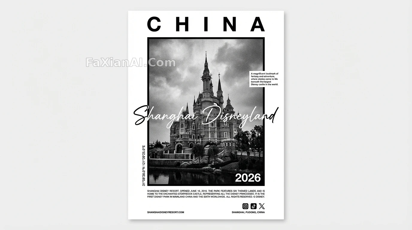
Minimalist Black-and-White Poster, Restraint Done Right
GPS coordinates, film grain, and a foil-stamped '2026' all sit inside a restrained black-and-white frame — this layout is a workout in negative space.
✍️ Negative space takes practice too: widen the letter spacing, tighten the border, and only then can the subject carry its visual weight.
📋 Prompt Numbered Sections1397 characters
[LOCATION] — a specific real-world landmark building or cityscape.
Goal: create a minimalist black-and-white editorial poster.
1. Layout & Composition
- Overall: a white vertical poster base with a rectangular picture frame embedded at the center.
- Center image: a high-contrast, cinematic black-and-white photo of [LOCATION].
- Shooting angle: low-angle framing that emphasizes the building's mass and presence.
- Texture: visible film grain restoring an authentic photographic feel.
2. Typographic Hierarchy
- Top headline: the country name, all-caps bold black sans-serif, letter-spacing widened.
- Signature overlay: the word "[LOCATION]" in a fluid, elegant white script, placed directly over the central photo, slightly bleeding past the white background's edge.
- Information labels:
- A vertical column of GPS coordinates along the left side of the photo.
- A short block of descriptive text aligned to the right of the photo.
- A large bold "2026" in the bottom-right corner of the photo.
3. Footer Details
- Content: a line of justified fine-print text along the bottom.
- Icons: minimalist social media icons (IG, TikTok, X) in the bottom-right corner.
- Labels: website URL in the bottom-left corner, physical address in the bottom-right.
4. Overall Style
- High-end fashion-magazine layout feel, Swiss minimalist design, monochrome, sharp edges, clean negative space.