Home › Design Assets › Retro Movie Poster for a Sugar-Fearing Town
Retro Movie Poster for a Sugar-Fearing Town
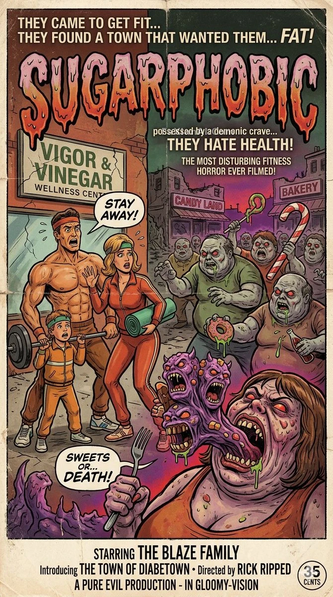
The contrast gag is what sells the poster, and the typography has to hold down that absurdity or it reads cheap
✍️ The title font's weight decides whether this reads as black comedy more than the characters' expressions do — go too heavy and it turns into farce, too light and the absurdity doesn't hold up. For this kind of contrast-driven story, restraint in the typography is the real craftsmanship.
📋 Prompt Natural Language
A retro-toned movie poster: the story follows a fitness influencer who has just moved into a small town full of overweight residents, and quickly realizes the entire town is possessed by the same demon — one that gives people a pathological craving for sugar while making them despise anything related to health and wellness. The title is roughly set as "[movie title: Sugarphobic]", the poster rendered with an old-fashioned, retro texture overall.