
Watercolor Prompts Looking Like Filters? Add Wet Edges, Bare Paper, and Pigment
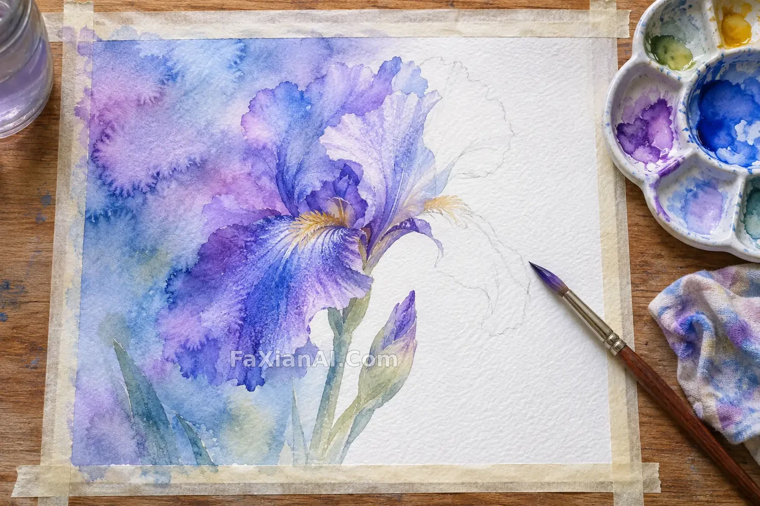
Watercolor is one of the easiest media to gloss over in a prompt: just add “watercolor” and call it done. The model will indeed give you a delicate image, but every edge is equally blurry and the color covers the paper evenly. It looks like a photo with a softening filter.
Real watercolor has qualities a filter can’t reproduce: wet and dry areas coexist, parts of the paper remain unpainted, and pigment settles into the paper’s texture. Naming those qualities in your prompt does more than piling on adjectives.
Keep Hard Edges Alongside Soft Ones
The prompt for the wet-on-wet iris is worth borrowing from. It asks for soft color bleeding at the petal edges, keeps “a few clear stem lines,” and adds that not every petal should have a hard outline. Three phrases establish what blurs and what stays clear. Make everything soft, and the petals dissolve into a cloud of mist.
The tugboat in a misty harbor takes the opposite approach: no sharp outlines, with the subject fading into the fog. It works because the tugboat is red, so its color holds its place in the pale scene. When your subject has no hard edges, make it stand out clearly through hue or value.
A practical rule: decide where you want the eye to land, keep hard edges there, and let the rest loosen up.
Specify What Stays White
Ask only for “white space,” and the model will often give you an empty background. The white sails at a mountain lake harbor are described much more precisely: the hull and sails are rendered using untouched paper. The white sails aren’t painted white; they’re the paper itself. The difference is obvious in the finished image: surrounding color defines the edges of the sails, giving them a naturally watercolor look.
The bookshop after the rain calls for “cream-colored paper showing through” and uses just one warm focal point: the light in the window. Specify the paper color, and the model’s default pure white won’t pull the whole image’s palette off course.
Paper Is a Variable of Its Own
Cold-pressed paper, cotton paper, handmade paper, old journal paper: change the surface and you change the mood. Soft pastels on handmade paper controls the paper texture, ink line weight, and degree of bleeding separately. You can adjust one without affecting the others, which makes refining an image much easier.
The fighter jet half-buried in sand dunes goes a step further, letting the paper carry part of the story: handwritten dark brown notes in the margins and a few sand stains. Those marks make it feel like a page jotted down in the field—more convincing than making the aircraft ever more precise.
Use Negative Prompts to Keep Out Line Art
Models love adding outlines to watercolor, turning it into a lightly painted illustration. The forest stream handles this directly: clear edges without contour lines, with Lines、Line Drawing、Line Illustration、Ink Sketch in the negative prompt. If pen-and-wash is exactly what you want, remove those terms and instead specify the order in which the line work and washes are applied. For general guidance on negative prompts, see the negative prompt guide. For another approach to paper and unpainted areas, see lines, texture, and negative space in printmaking.
An Editable Template
> [Subject], transparent watercolor on [cold-pressed cotton paper / cream-colored handmade paper]. Crisp edges around [key part of the subject], with the rest bleeding naturally using a wet-on-wet technique. Render [white object] using the untouched paper, leaving approximately one-third of the paper blank. Subtle pigment granulation, using only [two to three colors]. No outlines, no digital gradients.
Once the image is generated, check two things. Zoom in on the edges: are they all equally blurry? Then look at the white areas: are they paper or paint? Get those two right, and the image will have much of the character of watercolor.