
How to Write Double Exposure Prompts: the Outer Shape, What Goes Inside, and the One Spot That Must Be Sharpest
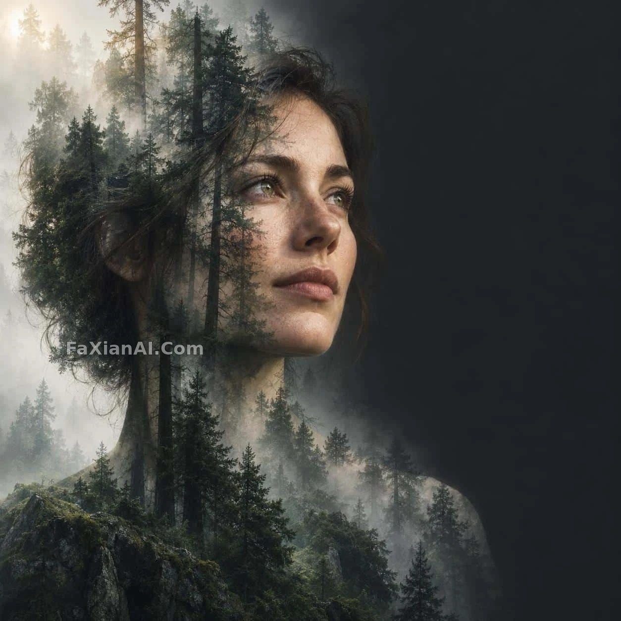
Many people write double exposure as a single line: double exposure of a woman and a forest. The result usually goes one of two ways. Either the portrait gets a translucent layer of trees over it, like a pane of glass nobody wiped properly, or the forest swallows the face and you can't tell who it is. The model isn't the problem. The prompt said "overlay them" and never said "how."
The double exposure cases on the site that come out reliably almost all settle three things: what outline the outer shape has, what goes inside it, and which spot must be the clearest. Add one more that is easy to overlook: the base color and the empty space.
1. The Outer Shape: Pick a Silhouette You Can Recognize at a Glance
Double exposure lives and dies by its outline. The simpler and more recognizable the outline, the more complicated the stuff inside it can be.
The profile is the most common shell, for a practical reason: the line of forehead, nose bridge, lips and chin still reads as "a person" even when the inside is packed with trees or a city. Fog through a conifer forest in a profile doesn't use a pure side view but a three-quarter profile, with the figure taking the left two-thirds of the frame, cropped at the upper chest, gaze lifted slightly toward the upper right. The position and crop of the outline are written this precisely because once the shell wobbles, no amount of lovely forest inside can hold the picture up.
A whole life inside one face's outline uses an old man's profile as its shell. The wrinkles and drooping eye corners of an elderly profile already carry "time," which is the same theme as the life story to be told inside. When the shell and the content say the same thing, the overlay doesn't look like two pieces of source material forced together.
When writing the shell, you can give a few constraints directly: the direction (profile / three-quarter profile / from behind), where it sits in the frame, where it is cropped, and whether the edge of the outline is a hard cut or melts into the background.
2. The Inside: Put the Scenes in Order, Don't Cram Them All In
Once the shell is set, you start filling it. The most common mistake is to write five or six scenes at once, so the model has to split its attention evenly and every patch turns to mush.
The life-stages entry is worth copying: childhood running, boyhood reading, youth chasing dreams, adulthood working, middle age brooding, old age looking back, arranged in time order. It also gives each stage a season and a kind of light, from spring to winter and from early morning to night. There are many scenes, but one main thread runs through them, so the model knows where to transition from and to. The editor's note puts it exactly: use season and light in place of words to tell the timeline.
The misty-forest profile holds only one thing: trees. Trunks run vertically up through the crown of the head, layered canopies become the volume of the hair, and the far shoulder vanishes into the mist between the trees. There is only one kind of content, but it spells out which part of the body each element maps to: trunks to the crown, canopy to the hair, mist to the edge of the shoulder. That kind of part-to-part mapping is far easier to control than a bare forest inside her silhouette.
3. The Sharp Point: One Spot in the Whole Image Must Be Clearest
Double exposure is naturally soft, because the two layers show through each other. That is exactly why one spot has to be solid, so the viewer's eye has somewhere to land.
The misty-forest profile specifically names "the near eye" as the sharpest point in the whole image, with everything else receding into the fog. The red smoke portrait with a finger at the temple goes another way: the foreground figure is completely sharp, a finger pressed to the temple, and layered into the background is his own blurred face. Its editor's note points out where the balance lies: if the background face is too solid it gives the trick away, and if it is too faint you can't tell it's a double exposure; the same goes for the density of the red smoke, since once it covers the face, the high-contrast light is wasted.
So there are two ways to give the sharp point:
- Soft shell, sharp detail: specify an eye, a corner of the mouth or a hand as the clear part;
- Sharp foreground, soft overlay: the subject is fully sharp, and the overlay layer gets lower opacity and a touch of motion blur.
Either works, but you must write one of the two in. Don't make the model guess.
4. The Transition: Let One Thing "Become" Another
There is another kind of double exposure that isn't "a scene inside a silhouette" but one object gradually turning into something else across the frame.
Meant to draw a conqueror, ended up admiring the horse is the classic: in the lower right, a tiny figure in black armor flings a crimson cape toward the upper left, and as it flies it turns into surging river water, with a hand-painted ancient battlefield layered into the river. The Fuzhou poster with a ribbon turning into a river uses the same structure, only swapping the cape for a silk ribbon and the battlefield for city landmarks.
The key to this approach is giving the direction and shape of the transition: which corner it starts from, which way it travels, and what curve it follows (both of these are S-shaped). Once the direction and curve are fixed, no matter how many scenes get layered in, the picture has a clear line of flow. To use this structure in a city poster, read on with how to write city tourism scroll poster prompts.
5. Base Color and Empty Space: Leave the Overlay Somewhere to Land
The last step is the one most often skipped: what to leave outside the shell.
The right third of the misty-forest profile is a block of charcoal-gray empty space, where the overlap of trees and face comes to rest and where room is left for title text. The life-stages poster asks for restraint overall, with empty space that carries weight, and refuses collage-style stacking. Both are saying the same thing: double exposure already carries a lot of information, and the cleaner the base, the clearer the layers come out. For deciding how much empty space to leave, see negative space in prompts.
It also helps to narrow the colors. The misty-forest entry is almost entirely gray-green plus charcoal; the life-stages poster is limited to black, white and gray, warm gold, misty blue and faded film tones. With more colors, the boundary between the two layers is hard to see.
A Double Exposure Template You Can Adapt Directly
```
Double exposure portrait, [aspect ratio: 1:1 / 2:3 / 9:16].
Outer shape: [shell: a woman's three-quarter profile / an old man's side profile],
placed in the [left two-thirds / center], cropped at [the upper chest / the neck].
Inside the silhouette: [inner scene], arranged so that
[element A] rises through the crown, [element B] forms the hair mass,
and the far shoulder dissolves into [mist / water / clouds].
Sharpest point: [the near eye / the lips / the hand]; everything else softens into the overlay.
Background: plain [charcoal / off-white / misty blue], leave the [right third / top quarter] empty.
Palette limited to [2-3 colors], subtle film grain, no hard collage edges.
```
Before you use it, decide one thing: do you want "a scene inside a silhouette," or "one thing turning into another"? For the former, put the weight on part-to-part mapping and the sharp point; for the latter, on the transition direction and curve. Pick the right structure and all that's left is swapping in material. For lighting a portrait so it doesn't look fake, read it alongside several ways to light a portrait without plastic skin.