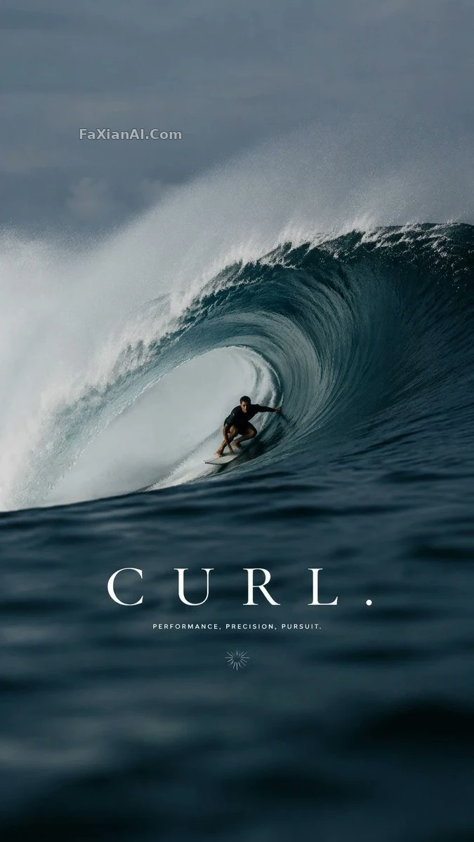
浪管裡那條線,是板和浪一起畫的
遠距離長焦從水面貼著拍,衝浪板的線條才接得上浪的弧度。
✍️ 板和浪必須是同一條曲線,這是整條簡報唯一的硬指標,別的都是裝飾。長焦貼著水面拍是為了壓扁視角,讓浪管看起來更深、更險,這招換成滑板、雪道都能用。
📋 提示詞 自然語言
A luxury surf campaign, 9:16. His board traces the exact curve of the breaking wave behind him — the whole creative brief sits on that one line, built around a young male surfer riding inside the curl of a large wave. Camera: a distant telephoto perspective taken from the water. Typography reads: "CURL." Premium water-sports editorial, 9:16.
📋 中文譯寫版 自然語言
一場奢華衝浪品牌廣告,9:16。他的衝浪板精確貼合著身後破碎海浪的弧線——整條創意簡報就壓在這一條線上,主體是一名年輕男性衝浪者正馳騁在巨浪浪管之中。鏡頭:從水面遠距離長焦拍攝。字型排版寫著:"CURL."(浪管)。高階水上運動編輯海報,9:16。