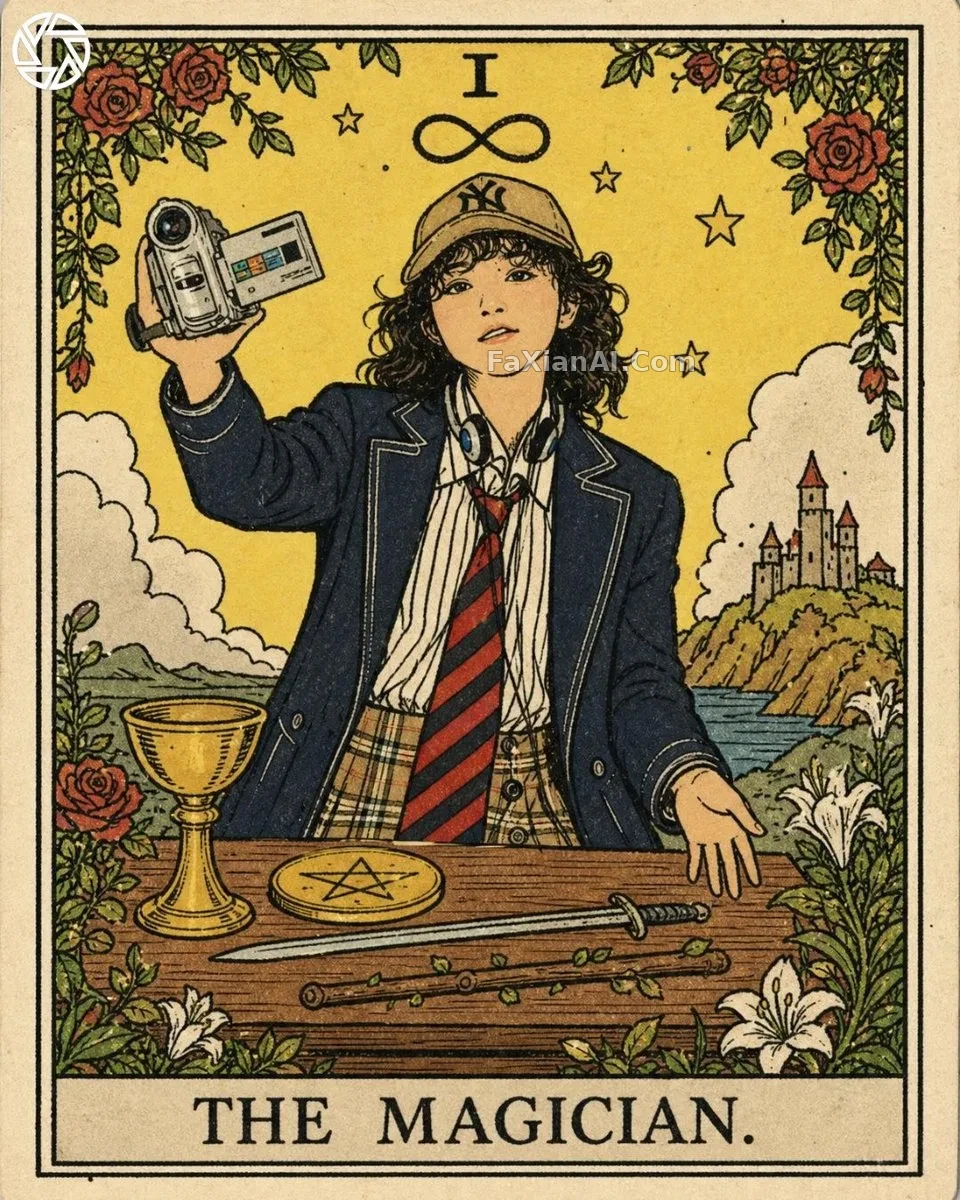
把自己畫進塔羅牌,韋特風格
線稿先行,色塊後鋪,紙感和印痕兩個變數決定成敗。
✍️ 這張卡的成敗不在人像像不像,線上寬變化和紙紋壓痕兩個變數——線條粗細不抖起來,塔羅牌味道就出不來。
📋 提示詞 自然語言
Turn the reference person into a Rider-Waite-style tarot card. Render them as a hand-drawn figure using a slightly uneven black ink line — the stroke should visibly thicken and thin with each curve — filled with flat color blocks and no shading. Surround the figure with delicate traditional tarot motifs and symbolism. Finish the whole card with a paper-grain texture and the soft indentation feel of an old-fashioned print.
📋 中文譯寫版 自然語言
把參考圖裡的人物畫成韋特風格的塔羅牌。人物用手繪感的黑色墨線勾出,線條粗細要隨轉折自然起伏,只鋪平色塊、不做明暗漸變。人物周圍點綴精緻的傳統塔羅符號元素。整張卡片要帶上紙張的顆粒質感,以及老式印刷那種微微壓痕的手感。