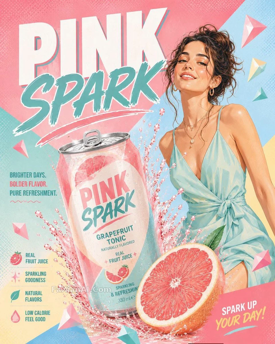
汽水罐炸裂瞬間的夏日海報
這罐汽水炸得夠猛,果肉擺得夠靠譜,一眼就是夏天廣告的調調。
✍️ 老實講,方括號那五個位置才是本體——換個人物換個口味,這套版式原封不動能再用一次。真正把廣告感撐起來的是那層半調網點,不是噴濺水花。
📋 提示詞 自然語言614 字元
Vertical 4:5 commercial poster composition built around [HUMAN] standing beside a tilted, bursting [BREW] can as a dramatic splash erupts behind it; a large sliced [FLAVOR] fruit anchors the foreground with scattered angular fragments drifting through the frame. Bold, clean display lettering spells out the title “[TITLE]” across the scene. Render everything in a pastel [PALETTE] color scheme against a bright geometric background of oversized diagonal color blocks, with crisp stylized liquid shapes, semi-flat shading, and a faint halftone texture giving it an energetic summer, product-first advertising feel.
📋 中文譯寫版 自然語言
豎版4:5商業海報構圖:[HUMAN]站在一罐傾斜、正在炸裂噴濺的[BREW]飲料罐旁,前景是一顆切開的巨大[FLAVOR]果實,周圍漂浮著稜角分明的碎片。畫面裡用粗體簡潔的展示字型寫出標題“[TITLE]”。整體採用柔和的[PALETTE]馬卡龍配色,背景是明亮幾何風格的大塊對角色塊,液體造型利落又風格化,半平面陰影疊加一層淡淡的半調網點質感,營造出充滿活力的夏日商業海報氛圍。