
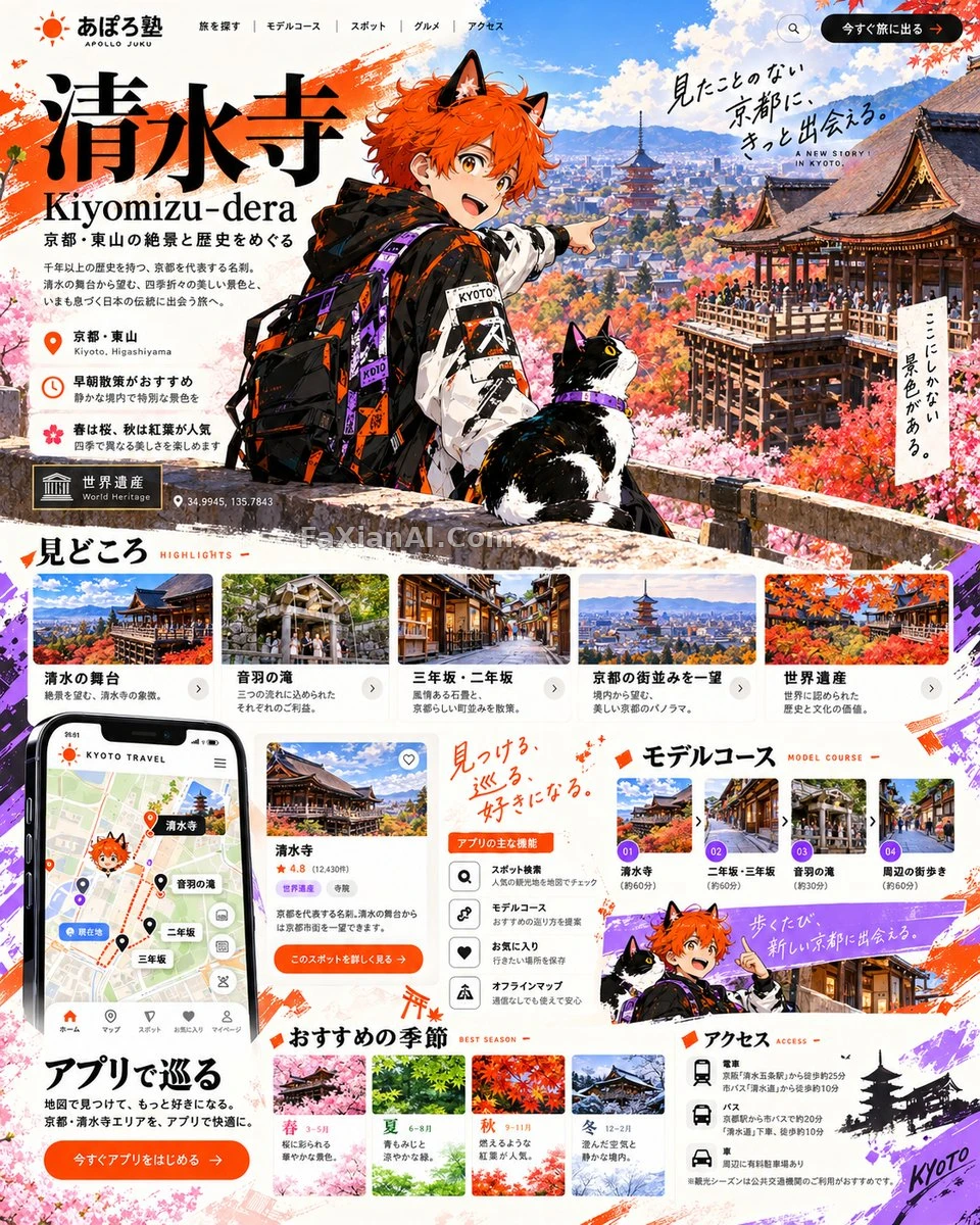
貓耳導遊帶你逛清水寺的旅遊長頁
橙發貓耳吉祥物領路,六個區塊把清水寺的看點、季節和交通排進一張豎版 LP。
寫法要點
✍️ 視線先落在吉祥物身邊的燕尾服貓上。寫法上,日文文案逐塊給定,再用一句“原樣保留”鎖死,AI 才不會改字。吉祥物鮮豔、實景照片安靜,這對反差是留給版式的。
完整提示詞
📋 提示詞 編號分段2211 字元
Goal: a dense, information-rich vertical landing page (LP) for a Kyoto travel guide centered on Kiyomizu-dera.
Canvas and look: roughly 4:5 portrait. Blend anime illustration with realistic photography on a clean white background, accented by orange and purple brushstrokes. Overall feel is modern Japanese web design: strong contrast between the colorful anime mascot and the calm real-world photos; orange (about #FF5722) with purple accents; clean sans-serif for body copy and elegant serif for headings.
Build the page top to bottom in six blocks.
1. Header bar. Left: a logo reading '[site name: ○○旅行社 TRAVEL]'. Center: menu items (Search, Model Course, Spot, Gourmet, Access). Right: an orange call-to-action button '今すぐ旅に出る'.
2. Hero. A big bold black serif title '清水寺 Kiyomizu-dera' with the subtitle '京都・東山の絶景と歴史をめぐる'. In the middle, an anime character with orange hair and cat ears, wearing a streetwear jacket printed 'KYOTO', points to the right, with a tuxedo cat beside her. Behind them is a panoramic Kyoto view with autumn leaves and pagodas. Handwritten text floats around: '見たことのない京都に、きっと出會える。' and 'ここにしかない景色がある。'. An info block reads '京都・東山', '早朝散策がおすすめ', '春は桜、秋は紅葉が人気', next to a World Heritage badge and the coordinates '34.9945, 135.7843'.
3. Highlights ('見どころ'). A row of horizontally scrolling photo cards: '清水の舞臺', '音羽の滝', '三年坂・二年坂', '京都の街並みを一望', '世界遺産'. Every card carries a photo, a title and a short description.
4. App and features. On the left, a smartphone mockup showing a map app with pins for Kiyomizu-dera, Otowa Waterfall and so on. In the center, a list titled 'アプリの主な機能' with icons for Spot Search, Model Course, Favorites and Offline Map. On the right, 'モデルコース' with numbered steps 01 to 04 and route thumbnails.
5. Seasons ('おすすめの季節'). Four blocks for Spring, Summer, Autumn and Winter, each with a matching landscape photo and a brief text.
6. Access ('アクセス'). In the bottom right, list the transport options (Train, Bus, Car) with concrete station names and walking times, plus a small pagoda silhouette and the script word 'Kyoto'.
All Japanese text must be reproduced exactly as written, including the section headers '見どころ', 'モデルコース', 'アクセス' and every place name.
📋 中文譯寫版 編號分段938 字元
目標:製作一張資訊密度很高的豎版旅遊落地頁(LP),主題是京都清水寺的旅行指南。
畫幅與外觀:約 4:5 豎版,動漫插畫與寫實攝影混搭,乾淨的白色底,點綴橙色與紫色筆刷。整體是現代日系網頁設計的氣質:彩色動漫吉祥物與寧靜的實景照片形成強烈反差;橙色(約 #FF5722)配紫色點綴;正文用乾淨的無襯線體,標題用優雅的襯線體。
頁面自上而下分六塊。
1. 頁頭欄:左側是 logo,寫著“[site name: ○○旅行社 TRAVEL]”;中間是選單項(Search、Model Course、Spot、Gourmet、Access);右側是一個橙色行動按鈕“今すぐ旅に出る”。
2. 主視覺:粗黑襯線大標題“清水寺 Kiyomizu-dera”,副標題“京都・東山の絶景と歴史をめぐる”。正中是一位橙發貓耳的動漫角色,穿著印有“KYOTO”字樣的街頭風夾克,手指向右邊,身旁蹲著一隻燕尾服貓。背景是掛著紅葉和寶塔的京都全景。周圍漂浮著手寫文字:“見たことのない京都に、きっと出會える。”和“ここにしかない景色がある。”。資訊塊寫著“京都・東山”“早朝散策がおすすめ”“春は桜、秋は紅葉が人気”,旁邊有世界遺產徽章和座標“34.9945, 135.7843”。
3. 看點(“見どころ”):一排可橫向滑動的照片卡片:“清水の舞臺”“音羽の滝”“三年坂・二年坂”“京都の街並みを一望”“世界遺産”。每張卡片包含照片、標題和簡短說明。
4. App 與功能:左邊是手機樣機,顯示帶有清水寺、音羽瀑布等標記點的地圖 App;中間是標題為“アプリの主な機能”的列表,配 Spot Search、Model Course、Favorites、Offline Map 的圖示;右邊是“モデルコース”,編號 01 到 04 的步驟配路線縮圖。
5. 推薦季節(“おすすめの季節”):春夏秋冬四個區塊,各配對應的風景照片和簡短文字。
6. 交通(“アクセス”):右下角列出交通方式(Train、Bus、Car),寫明具體車站名和步行時間,另有一個小小的寶塔剪影和花體字“Kyoto”。
所有日文必須與上文完全一致地呈現,包括“見どころ”“モデルコース”“アクセス”等區塊標題以及每個地名。
相關案例
更多 GPT Image 2 案例
全部 GPT Image 2 案例 →


相關教程
讓模型把字寫對:手寫體、標本卡與資訊圖裡的文字該怎麼下指令浮世繪提示詞:寫“ukiyo-e”不夠,要寫清這是一張印出來的畫視覺雙關提示詞:把 train of thought、deadline 這類英文習語拍成概念圖