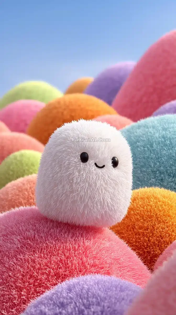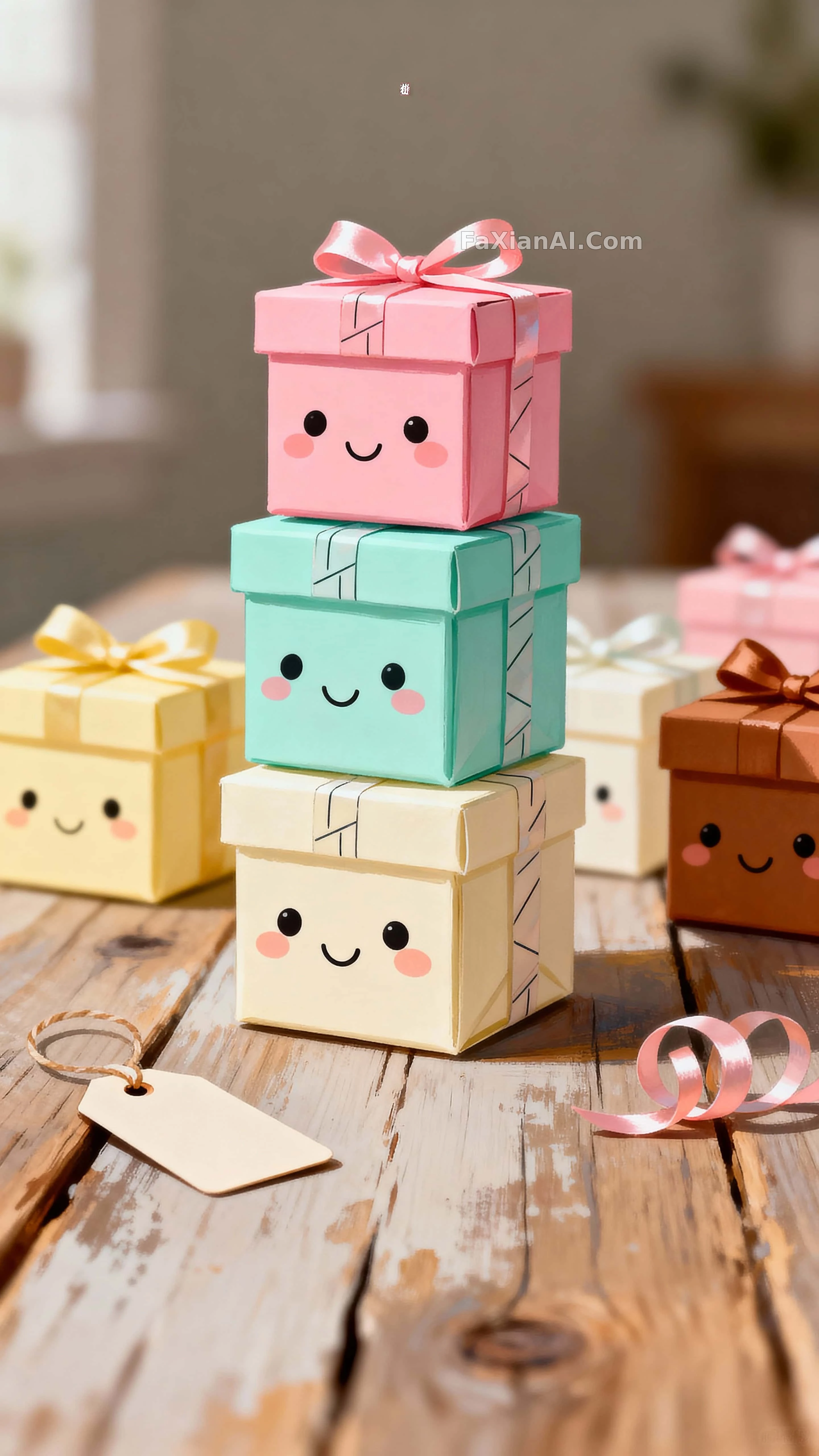
禮物盒排隊長出了笑臉
先別急著覺得可愛,看兩秒,是那種安靜的可愛。
✍️ 讓整堆禮盒不顯亂的,是背後那五個精確色號鎖住的馬卡龍色系——不是靠粉嫩兩個字堆出來的,是數值控制出來的乾淨。
📋 提示词 自然语言1171 字符
Compose a vertical 9:16 frame, tight-to-medium and shot from a slightly low eye level for an intimate, playful feel: a cluster of tiny kawaii gift boxes, each with a small smiling face turned toward the viewer, mood kept bright and cheerful. Keep every box surface clean and unlettered, only a few ribbons carrying abstract line marks for interest. Build tactile contrast between paper texture, satin ribbon, and a gently worn wooden table beneath a softly blurred backdrop. Lock the palette to pastel pink #FFC1D6, mint #CFFFE0, pale yellow #FFF2B2, warm cream #FFF7EA, and a hint of warm brown #A67C52, echoed consistently across the materials. Let soft, diffused light sculpt the rounded box faces and gently separate the stacked elements. Bring the nearest box into crisp focus, moderate depth letting the back rows melt into a pleasant blur. Keep the tallest stack centered within the 9:16 proportions, with playful negative space above for breathing room. Add a tiny gift tag and a curled loop of ribbon as subtle cues that these were just unwrapped. Style the whole piece as hand-painted illustrative realism, delicate textures throughout, calm and cozy in energy.
📋 中文译写版 自然语言
構建一幅9:16豎版構圖,緊湊到中景、略帶低機位視角,營造親密又俏皮的感覺:一簇迷你可愛禮物盒堆疊在一起,每個盒子上都有一張朝向觀眾微笑的小臉,整體氣氛明快歡快。盒子表面保持乾淨無字,只有幾條絲帶上帶著抽象線條增加趣味。用紙張質感、緞面絲帶與略帶磨損感的木桌,在柔和虛化的背景前營造出觸感上的對比。色調鎖定為粉色#FFC1D6、薄荷綠#CFFFE0、淺黃#FFF2B2、暖奶油色#FFF7EA,再點一點暖棕#A67C52,讓這些顏色在各材質間呼應統一。柔和的漫射光雕出圓潤的盒面形狀,並讓堆疊的元素之間產生輕柔的分離感。最近處的盒面對焦清晰,中等景深讓後排漸漸融入舒適的虛化。9:16比例中讓最高的一疊居中,上方留出俏皮的負空間供呼吸。加一個小小的禮物吊牌和一段捲曲的絲帶,暗示這堆禮物剛剛被拆開過。整體風格呈現手繪插畫感的寫實質地,細膩紋理,情緒安靜而溫馨。