折進信紙裡的萬裡長城
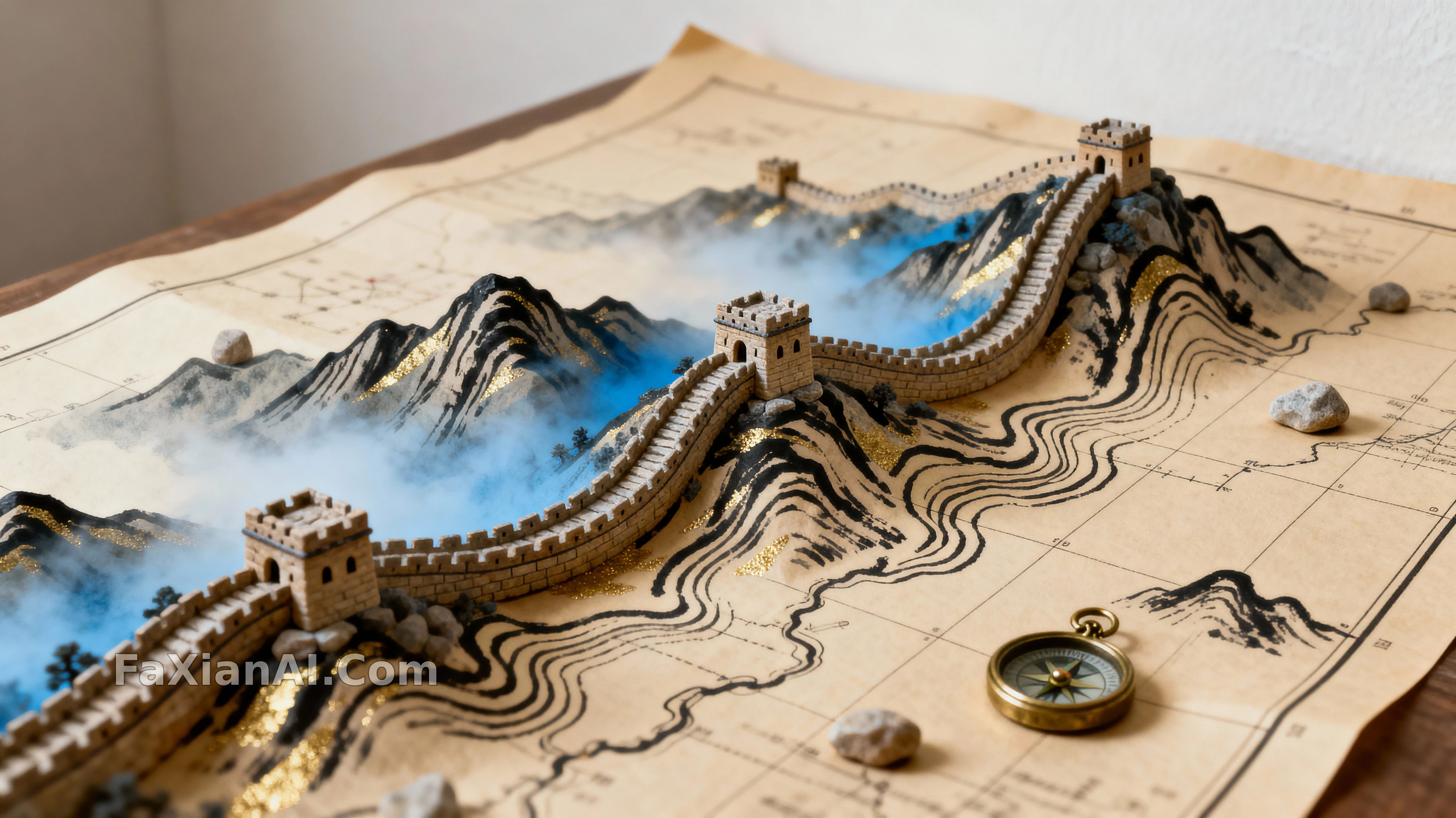
巴掌大的地圖紙上,長城彎得跟真事兒一樣,越看越上頭。
✍️ 真讓這張地圖活起來的不是長城線條,是那枚黃銅指南針掛件——沒有它,比例感全靠猜。給微縮景觀加一件寫實小道具,是比堆細節更管用的省心招。
📋 提示詞 自然語言1150 字元
Compose a 16:9 medium-wide shot from a slightly raised eye level, letting a miniature Great Wall cut diagonally across a printed map so the inked rampart line rises and dips past tiny stone watchtowers, implying a sprawling landscape shrunk to toy scale. Render the map ground as warm beige paper carrying crisp black ink strokes and faint gold glints, while a cool blue haze drifts between the small peaks. Keep every surface unmarked — no legible labels, just abstract shape-marks and a whisper of grid lines on the paper — so attention stays on wall and terrain. Three tactile materials should read clearly under soft illumination: grainy paper, matte inked contours, and hand-carved stone. Hold shallow focus on the closest towers and paper grain while letting the farther ridges melt into gentle blur, building a sense of receding depth. Bias the palette toward a calm, neutral-cool tone so the warm paper and gold flecks glow against the misty blue passages. Leave generous negative space at the map's edges to preserve the sense of scale, and tuck a small brass compass charm into the scene as a quiet human touch that grounds the cartography.
📋 中文譯寫版 自然語言
用16:9中廣構圖,從略微抬高的視角切入:一條微縮長城沿著印刷地圖蜿蜒穿行,牆體線條隨小巧的石砌敵樓起伏,營造出被壓縮排玩具尺度的遼闊地貌感。地圖底色是暖米黃紙張,配著乾脆的黑色墨線與淡淡的金色微光,冷藍色霧氣則在小山巒間遊走。所有表面保持無字跡——沒有可辨認的文字,只有抽象的形狀標記與隱約的網格暗示——讓視覺焦點始終落在長城與地形上。柔光下需要清晰呈現三種質感:顆粒紙張、啞光墨線輪廓、手工雕刻的石料。近處的敵樓與紙張紋理保持淺景深清晰,遠處山脊則融入柔和虛化,營造縱深的層次感。整體色調偏向冷靜的中性冷調,讓暖色紙張與金色碎光在朦朧藍霧中凸顯出來。地圖邊緣留出充裕的留白以強化尺度感,並在畫面中放入一枚黃銅指南針掛件作為點睛的人文小物。