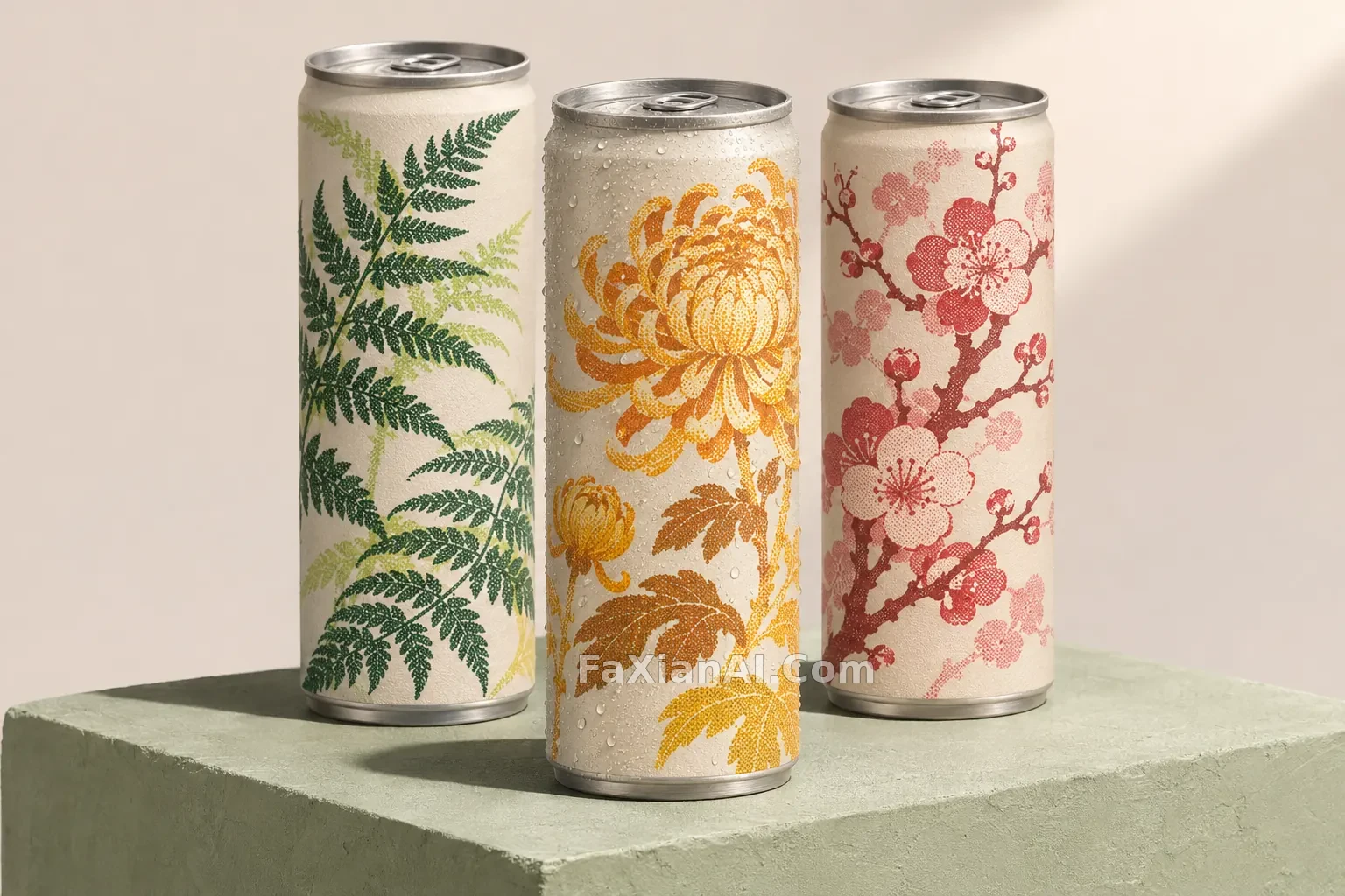
三隻孔版植物紋飲料罐
不靠文字和標誌,只用圖案把一套罐子區分開。
寫法要點
✍️ 包裝圖最難的是文字,這條幹脆全部去掉,靠孔版圖案分出口味。冷凝水只給中間一隻,主次就有了,三隻都掛水會顯得假。
完整提示詞
📋 提示詞 自然語言603 字元
Studio packaging concept for three slim matte aluminum beverage cans standing in a staggered row on a pale sage plaster plinth. Each can wears a different two-color risograph botanical pattern wrapped around the body: fern in forest green, chrysanthemum in ochre, and plum blossom in dusty red, with visible halftone grain and slight overprint. Brushed silver lids and rims, realistic condensation only on the middle can, soft directional light from upper right with one crisp contact shadow, background of warm off-white. No text, no letters, no logos, no barcodes, no brand marks anywhere on the cans.
📋 中文譯寫版 自然語言
三隻細長啞光鋁製飲料罐錯落站在淺鼠尾草綠灰泥臺上的棚拍包裝概念。每隻罐身環繞不同的雙色孔版植物圖案:森林綠蕨葉、赭黃菊花、暗紅梅花,有可見網點顆粒和輕微疊印。銀色拉絲罐蓋和罐沿,只有中間一隻帶真實冷凝水,右上方柔和定向光配一道清晰接觸陰影,背景暖白。罐身沒有任何文字、字母、標誌、條碼和品牌。