
Sports Action Prompts: Keep the Subject Sharp, Blur the Background
When people write sports scenes, the first instinct is usually to pile "dynamic," "fast," and "motion blur" into the prompt. The result tends to go one of two ways: either the whole image blurs into mush, subject and background smeared together, or everything comes out tack-sharp, looking like a posed freeze-frame with no sense of speed at all.
The sports prompts on the site that actually hold up all follow the same approach: first state what has to stay sharp, then say what's allowed to blur. A sense of speed comes from the contrast between sharp and blurred, not from adjectives.
1. Blur needs to be assigned, not requested in bulk
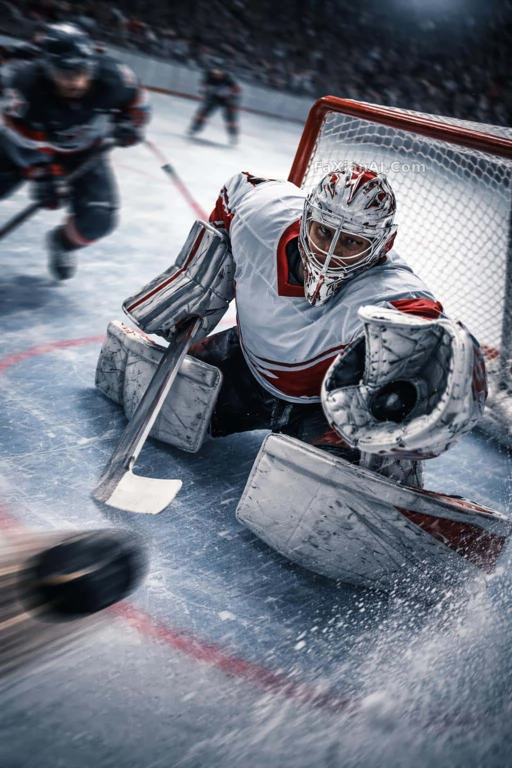
The hockey goalie diving save prompt is the most clear-cut about it: mask and upper body stay sharp, the puck's trail and the surrounding players get stretched into directional streaks, and then it adds one more line — "only the goalie himself stays in sharp focus."
That extra line matters. Write just "motion blur" and the model doesn't know who to blur — it often smears out the subject's hands and feet along with everything else. Split it into "who stays sharp" and "who blurs" and the image immediately gains depth.
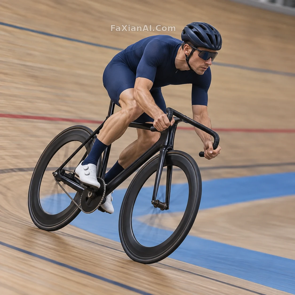
The photographer tracking a cyclist prompt phrases it differently: it names the action — "photographer panning" — then adds "background streaked with motion blur, subject in sharp focus." Panning itself already defines the relationship between sharp and blurred, and the model's grasp of this photography term is fairly reliable.
The transferable move: break it into four parts — subject, sharp area, what blurs, and the direction of the blur. Specifying a direction like "horizontal" or "directional streaks" gives you more control than just writing "blur."
2. Camera angle decides which way the speed reads
Same sport, different camera angle, and the source of the speed changes.
The hockey prompt picks a high angle from rinkside: looking down lets the ice, the goal, and the goalie's diving posture all fit into frame together, so the direction of the save reads at a glance.
The velodrome corner cyclist prompt uses a straight side profile. Side-on is the best angle for reading the frame's triangle and the roundness of both wheels, and the prompt spells out "accurate frame triangle, both wheels perfectly round" — bicycles are one of the structures the model gets wrong most often, and that one line does more work than ten extra speed words.
The fisheye skateboard jump poster takes a completely different route: an extreme low angle right off the ground plus a fisheye lens, blowing up the front foot's shoe in the foreground until it dominates the frame, while the face shrinks into the background. No motion blur here — the sense of speed comes from perspective distortion instead. That approach suits street and streetwear-style posters, not sports photos that need to read clearly as action.
3. Don't put the brightest light on the face
The hockey prompt has one more easy-to-miss line: keep the arena's brightest lights off the mask area, and leave a darker patch of background behind the head, so the silhouette reads clearly.
Sports photo backgrounds are often full of stadium lighting, and if the brightest point lands near the head, the subject blends into the background's hot spots and the outline gets muddy. Push the brightest light somewhere else in the frame, and the subject pops on its own.
The same idea shows up in a family running on the beach: faces stay in sharp focus, the blur trails off into the waves and behind them, and the wet sand and splashing water are written in fine detail. The realism doesn't come from a description like "happy smiles" — it comes from beads of sweat, wind-tossed curls, and splashing water. Details like that are only visible in the areas that stay sharp.
4. Write the pose as in-progress, not as a finished result
In the prompts that work well, the action is always written as happening right now: the goalie is "diving for the save," the cyclist is "leaning into the corner mid-turn," the family is "running along the water's edge, kicking up spray."
Write it as "the goalie made the save" or "the cyclist won the race" instead, and the model tends to give you a pose where the action is already over — standing, arms raised, celebrating — and the sense of speed disappears.
It's the same logic as writing "the sauce is being poured" in a food shot — see the breakdown of that "half-second" in the four variables of a food prompt.
5. A checklist you can start editing from right away
Go through this list item by item when writing a sports action prompt:
1. State the aspect ratio first: sports verticals commonly use 2:3, horizontal panning shots commonly use 3:2 or 16:9 (for where in the prompt the ratio is most effective, see which line to put the aspect ratio in).
2. Who has to stay sharp: the face, the hands, and where the equipment meets the body.
3. What's allowed to blur: the background, opponents, the ball or puck's trail — and spell out the direction.
4. Camera angle: high angle for the overall picture, side-on for structure, a low angle right off the ground for exaggerated perspective.
5. Light: keep the brightest light off the head, and darken the background behind it.
6. Write the action in progress.
7. For equipment the model tends to get wrong structurally — bicycles, rackets, skates — add a separate line saying "structurally accurate."
Worth comparing against the site's low-angle horseback beach portrait too: it hands the sense of speed to a billowing gown and flying mane rather than to blur — a good fit when you want a fashion feel without the image going soft.