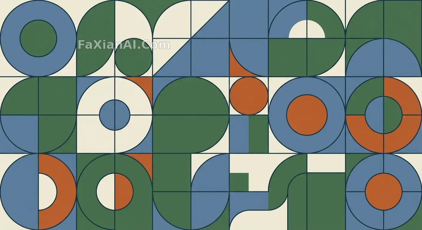
一組向量圖形的留白與秩序
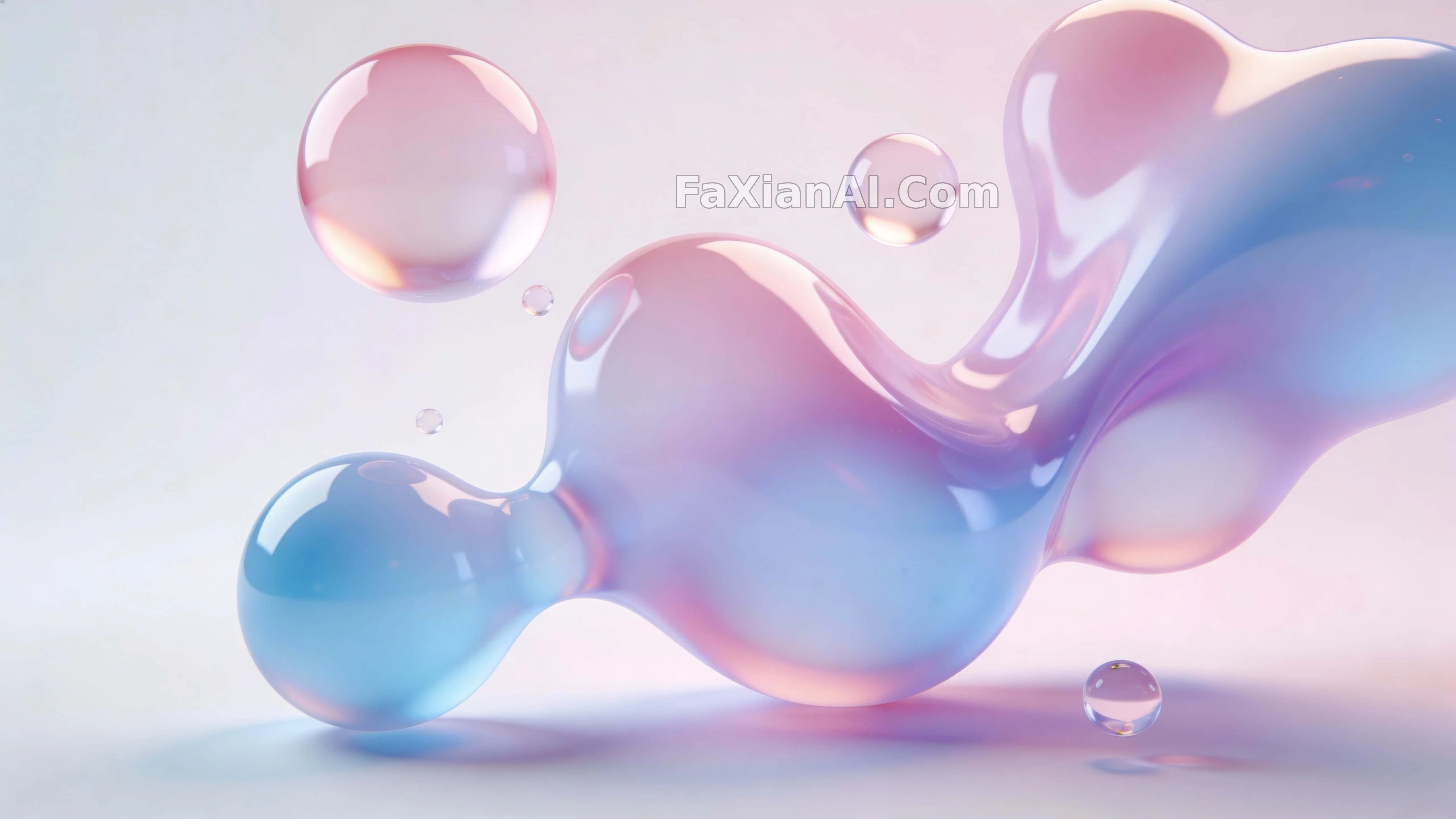
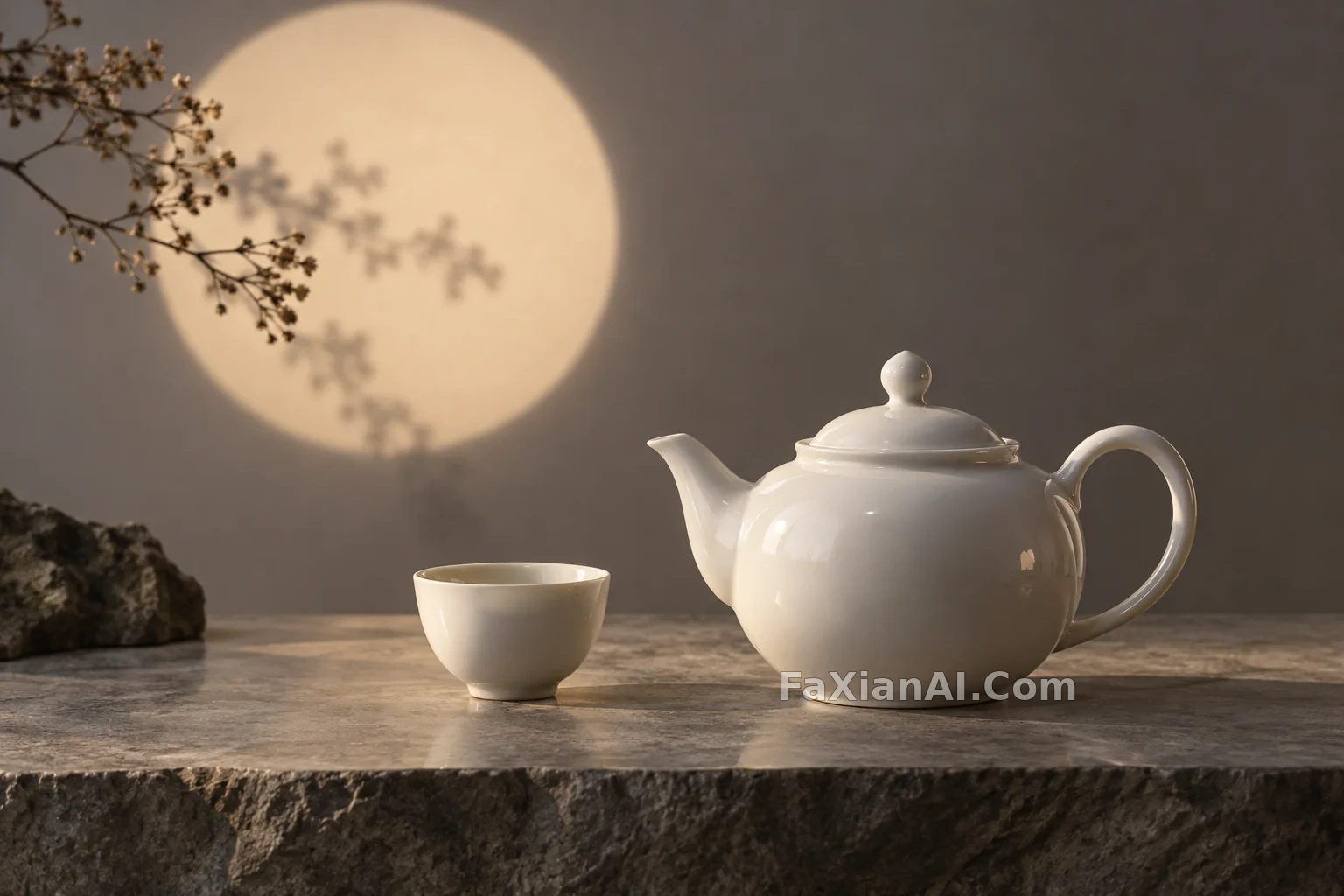
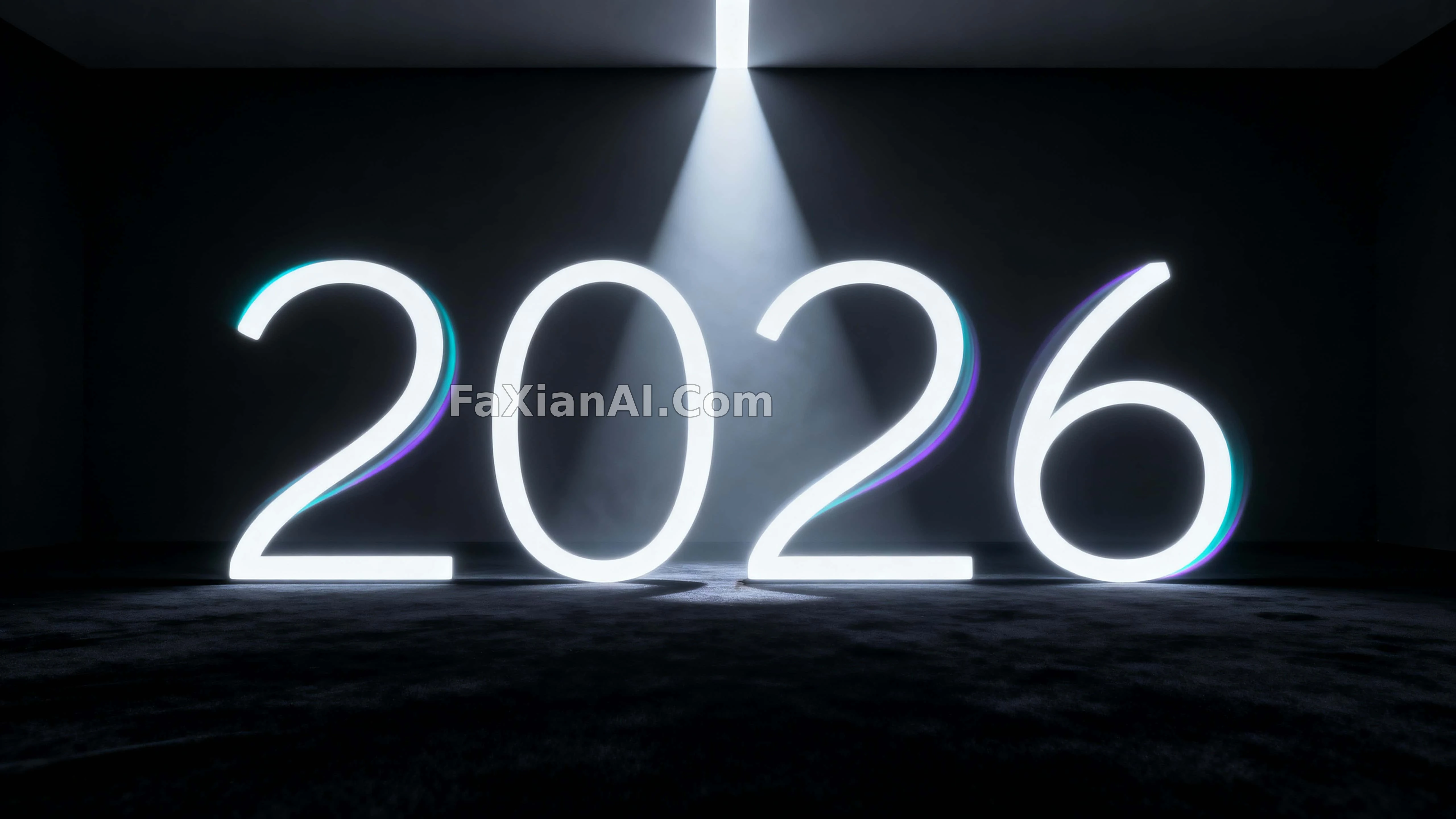
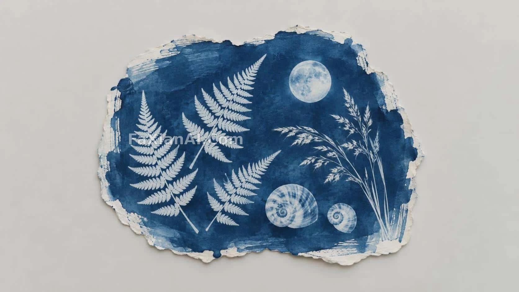
曲線剋制,色不過五種,像品牌手冊裡挑出來的範例。
✍️ 真正的門檻不在配色而在描邊粗細——粗細一旦不統一,'系統感'三個字立刻穿幫。留白比例其實是留給後續擴充套件用的,不是審美選擇。
📋 提示詞 自然語言
A restrained set of flat vector illustrations, built from layered geometric shapes with clean, deliberate curves. Keep the stroke weight consistent across every element and hold the palette to a small, harmonious range. Spacing and alignment should read as engineered rather than accidental — the kind of scalable, systemized look you'd expect from a mature brand's illustration library.
📋 中文譯寫版 自然語言
做一組剋制的扁平向量插畫,用分層的幾何形狀搭建,曲線要乾淨利落。所有元素的描邊粗細保持統一,配色控制在一個小而和諧的範圍內。間距與對齊要看起來是設計過的、不是隨手放的——那種成熟品牌插畫庫才有的可擴充套件、系統化的調調。