一组矢量图形的留白与秩序
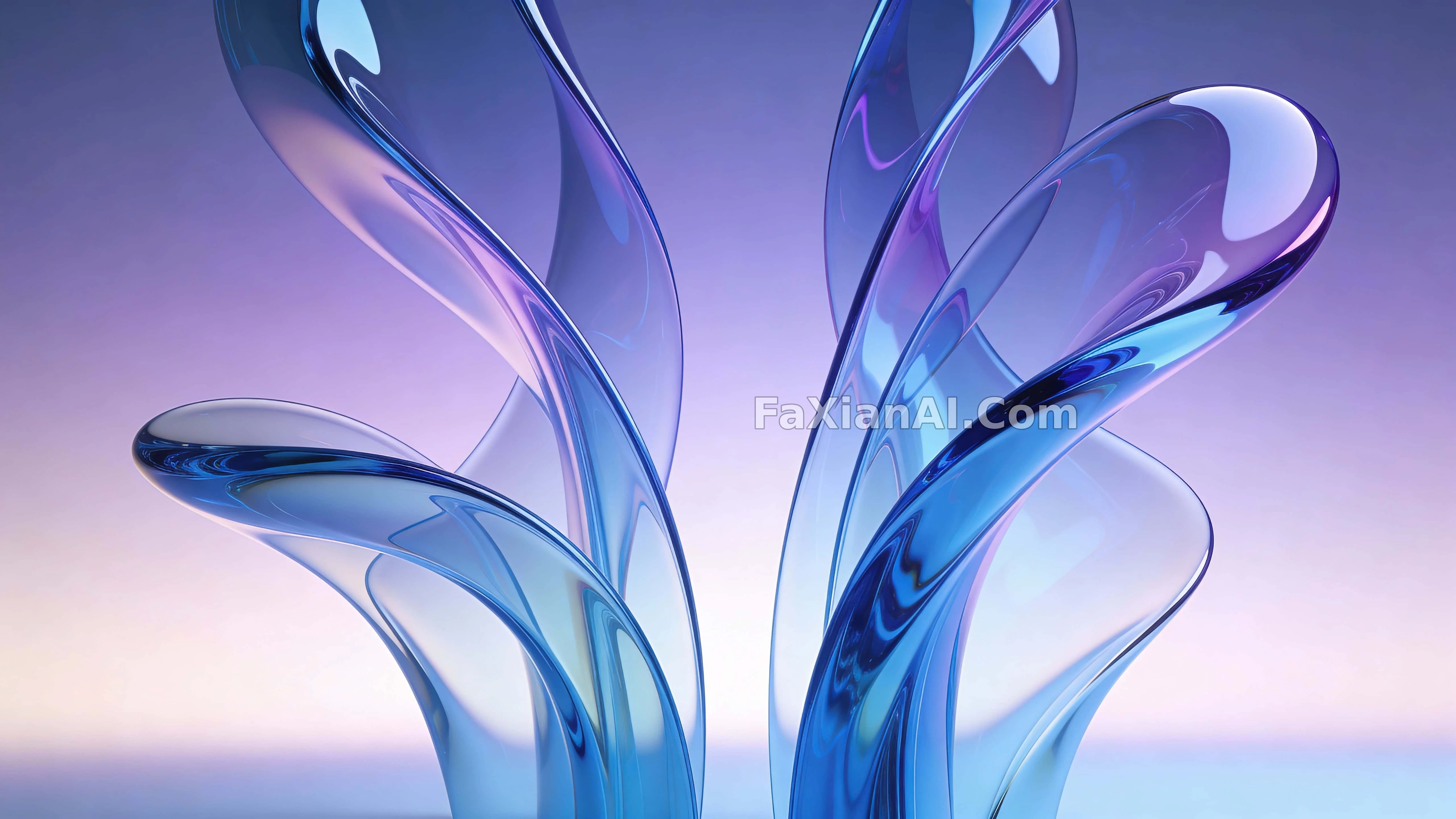
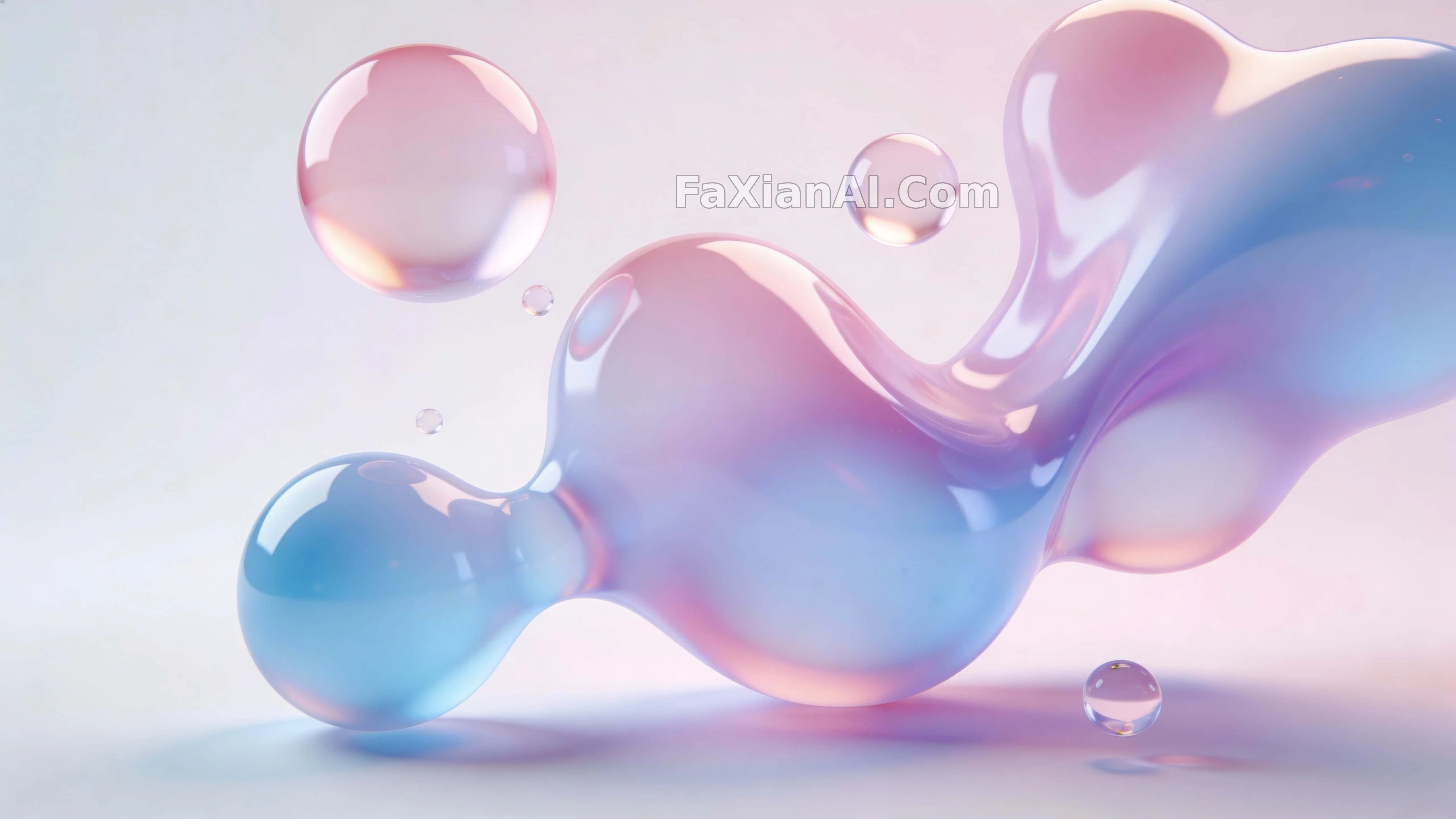
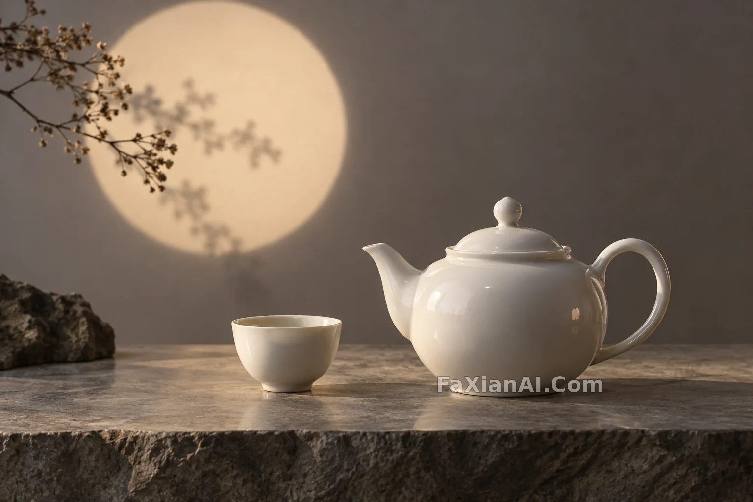
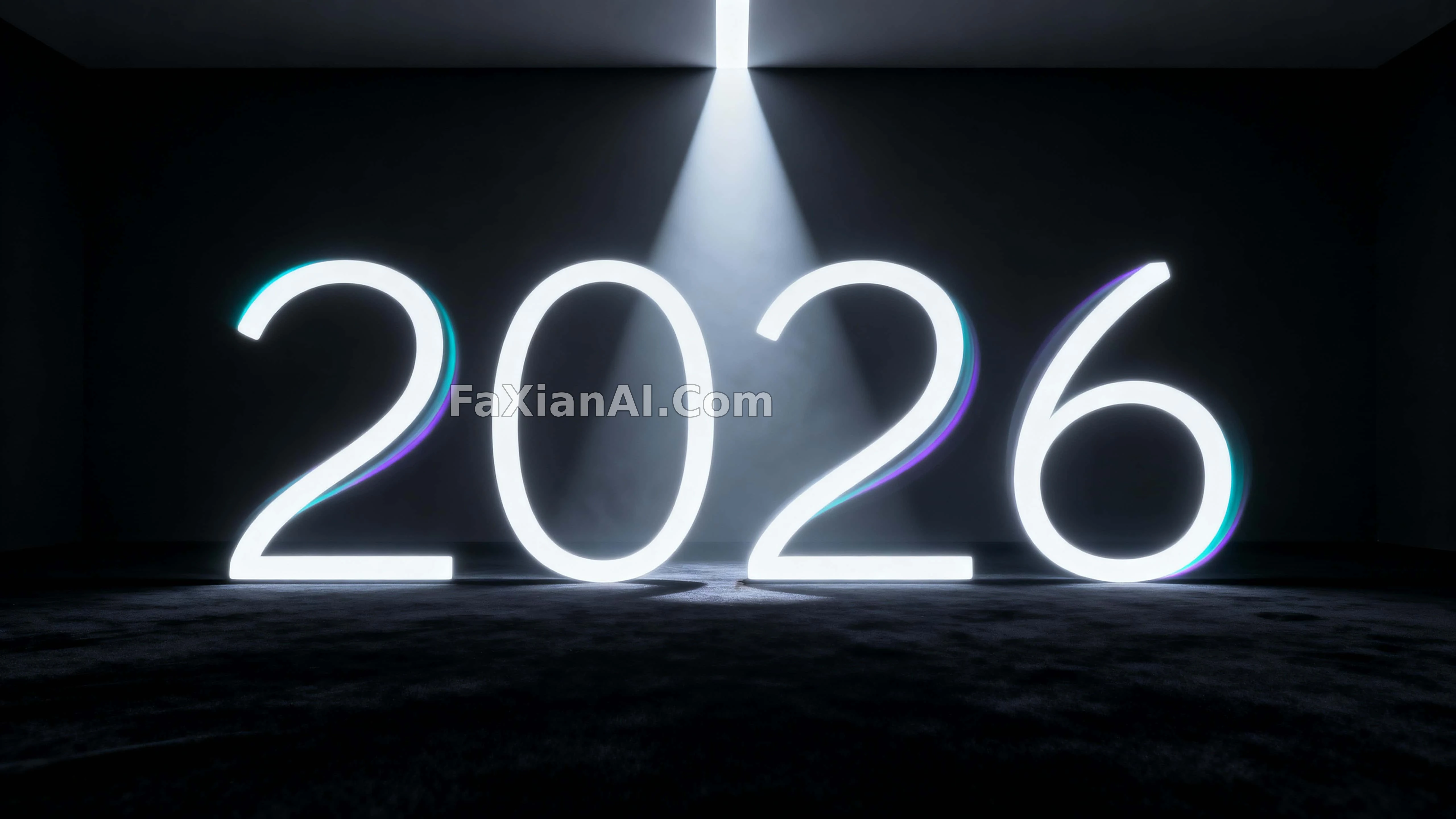
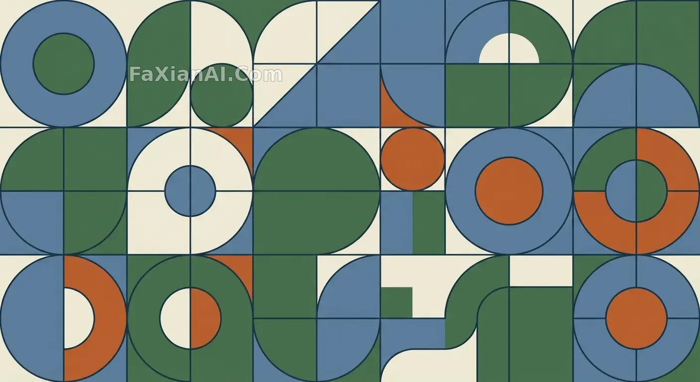
曲线克制,色不过五种,像品牌手册里挑出来的范例。
✍️ 真正的门槛不在配色而在描边粗细——粗细一旦不统一,'系统感'三个字立刻穿帮。留白比例其实是留给后续扩展用的,不是审美选择。
📋 提示词 自然语言
A restrained set of flat vector illustrations, built from layered geometric shapes with clean, deliberate curves. Keep the stroke weight consistent across every element and hold the palette to a small, harmonious range. Spacing and alignment should read as engineered rather than accidental — the kind of scalable, systemized look you'd expect from a mature brand's illustration library.
📋 中文译写版 自然语言
做一组克制的扁平矢量插画,用分层的几何形状搭建,曲线要干净利落。所有元素的描边粗细保持统一,配色控制在一个小而和谐的范围内。间距与对齐要看起来是设计过的、不是随手放的——那种成熟品牌插画库才有的可扩展、系统化的调调。