Home › Style Transfer › Order and Whitespace in a Vector Icon Set
Order and Whitespace in a Vector Icon Set
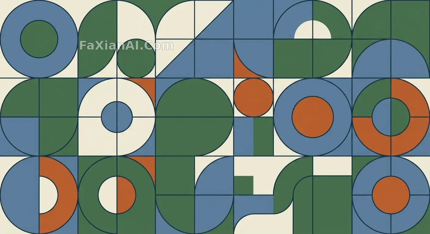
Restrained curves, a palette capped at five colors — the kind of set you'd pull straight from a brand guideline.
✍️ The real difficulty isn't the color palette, it's stroke consistency — the moment the weights drift, the whole 'systemized' claim falls apart. That extra whitespace isn't an aesthetic choice either; it's headroom for the set to keep growing.
📋 Prompt Natural Language
A restrained set of flat vector illustrations, built from layered geometric shapes with clean, deliberate curves. Keep the stroke weight consistent across every element and hold the palette to a small, harmonious range. Spacing and alignment should read as engineered rather than accidental — the kind of scalable, systemized look you'd expect from a mature brand's illustration library.