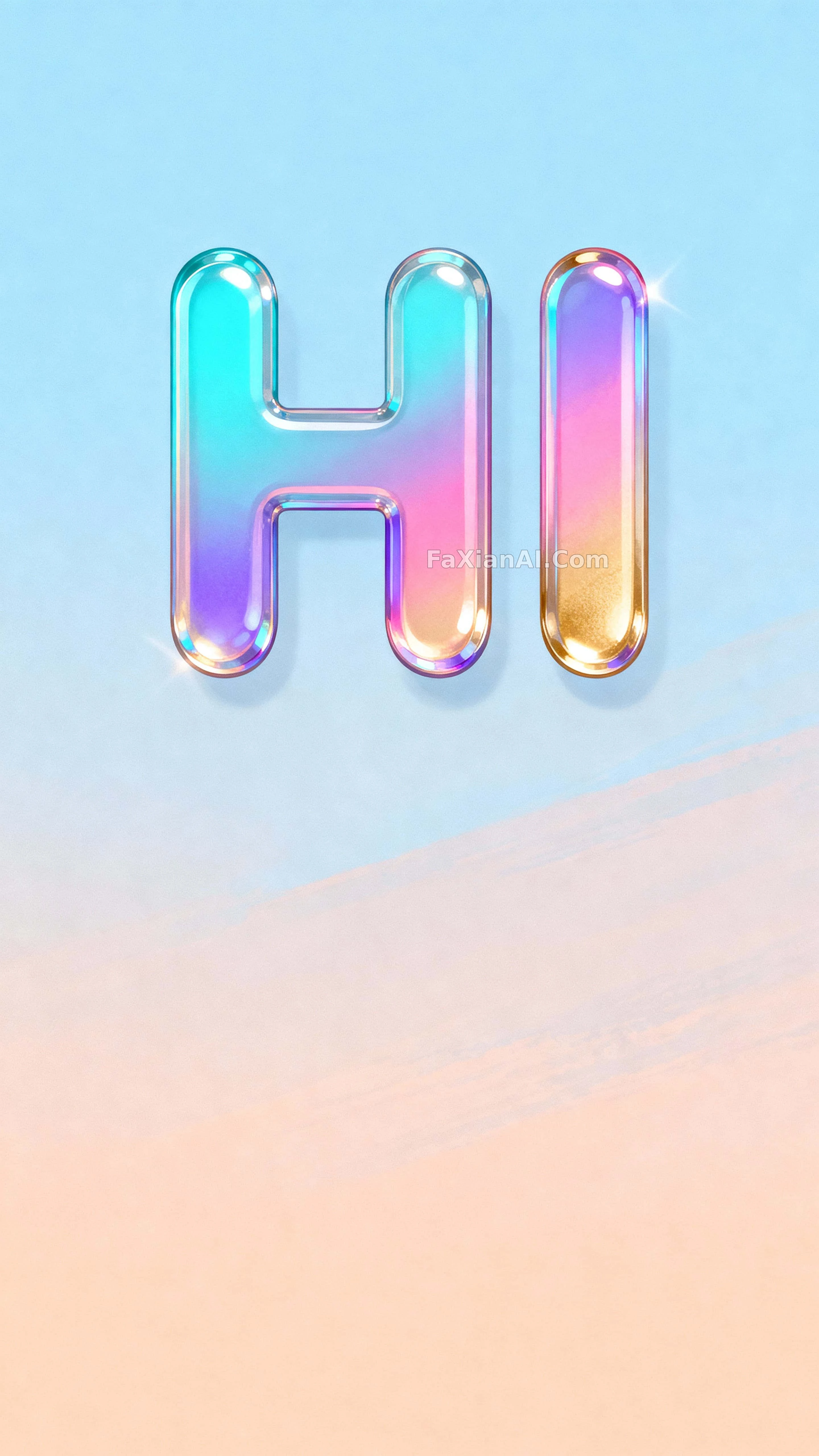
今天的手賬封面,配這個彩虹HI剛好
亮片感的HI飄在漸變天空裡,貼故事背景剛剛好,留白也給文案讓了位。
✍️ 兩個字母能立住全靠間距和粗細,字距一鬆、筆畫一圓,才扛得住那麼多顏色疊加不糊成一團。留白留在下面而不是上面,是給文案讓路的老套路了。
📋 提示詞 自然語言1549 字元
A 9:16 vertical composition built for social-story display: the two-letter word 'HI' hangs as a suspended emblem across the upper two-thirds of the frame, centered and slightly elevated, with generous letter spacing and bold rounded strokes that read clearly at a glance. Behind it, the sky runs a soft, calm gradient from cool dawn blue into warm peach — unobtrusive enough to give the holographic letterforms clean separation. The letter surfaces shift through a sequined holographic finish: cyan #6EE7F9, pink #FF8CDA, violet #8A7BFF and warm gold #FFD36E, layered with a subtle pearlescent sheen and smooth reflective facets that read as real depth. Materials read as a smooth polymer gloss on the letters against a softly brushed matte gradient behind them, with a faint glasslike rim glow tracing the letter edges. Even, soft lighting carries a subtle directional luster across the facets, sculpting gentle highlights against shadowed planes for contrast. Focus stays crisp on the letters' front face at a moderate depth — edges and texture fully resolved — while the sky gradient stays softly graduated behind. The crop sits tight: the top of the letters nearly touches the upper safe margin, while the lower stems leave breathing room for a caption or logo. Clean negative space surrounds the word, and the centered, slightly elevated viewpoint keeps the whole thing feeling intimate and balanced. Style: a polished digital illustration with crisp, vector-like edges and painterly iridescent texture, built for vertical social-media display.
📋 中文譯寫版 自然語言
這是一張為社媒故事欄打造的9:16豎版構圖:“HI”這兩個字母像懸浮的徽標一樣佔據畫面上三分之二,居中且略微上移,字距寬鬆,筆畫圓潤粗壯,一眼就能讀清。背景的天空是一道平靜的漸變,從冷調的黎明藍過渡到暖調的桃色——不搶戲,正好襯出全息字母的乾淨輪廓。字母表面像撒了亮片一樣流轉著全息色彩:青色#6EE7F9、粉色#FF8CDA、紫色#8A7BFF與暖金色#FFD36E,疊著一層淡淡的珠光和順滑的反光切面,讀出真實的立體深度。材質上,字母是順滑的聚合物光澤,背景是柔和刷制的啞光漸變,字母邊緣還勾著一圈近乎玻璃質感的輪廓光。均勻柔和的打光帶著細微的方向性光澤掃過切面,在陰影面與高光面之間雕出溫和對比。焦點穩穩落在字母正面,景深適中,邊緣和紋理都清晰可辨,天空漸變則保持柔和的層次退到後面。構圖收得很緊:字母頂端幾乎貼到安全邊距上沿,下方筆畫留出呼吸空間,方便放文案或者logo。文字四周留有乾淨的負空間,居中並略微上移的視角讓整體顯得親密而平衡。風格是一張打磨過的數字插畫:邊緣乾淨得像向量圖,又帶著繪畫感的珠光質感,專為豎版社媒場景而生。