菱形之間,留出的那點呼吸
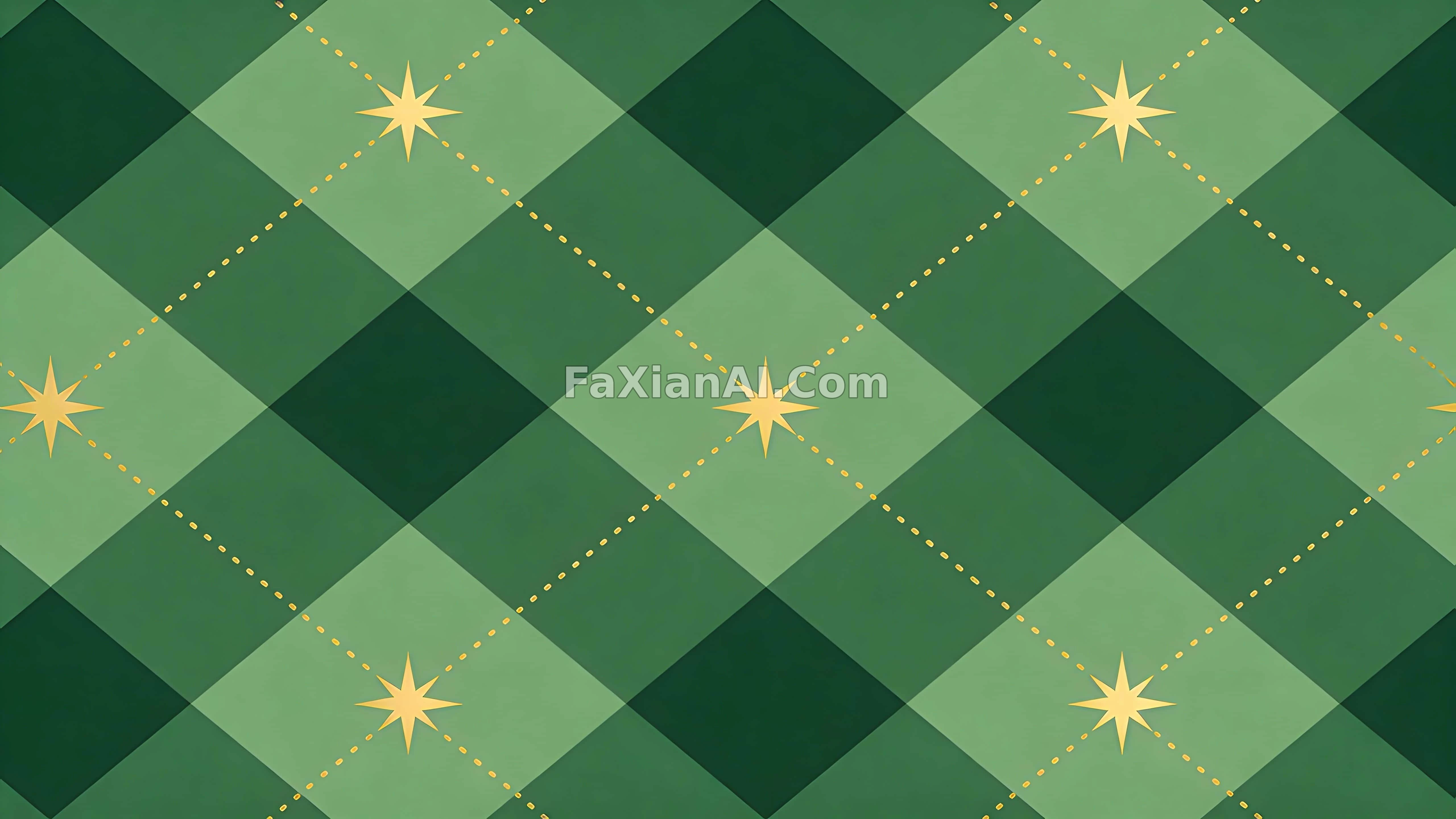
菱形間距刻意放寬,圖案密度這件事,剋制比華麗更難。
✍️ 菱形之間特意留了空隙,密度壓低了,圖案才不會悶。重複圖案這類東西,比例和間距才是決定質感的變數,金色只是提示,不是主角。
📋 提示詞 自然語言
Flat vector artwork in a decorative wallpaper style,
built as a perfectly repeating seamless tile,
centered on a large-diamond argyle pattern with generous clear spacing between shapes,
layered in forest green tones,
thin gold dotted lines running diagonally through the grid,
minimal gold star accents scattered across it,
no gradients anywhere,
no text anywhere
📋 中文譯寫版 自然語言
扁平向量畫風的裝飾桌布圖案,
做成完美無縫的平鋪瓷磚,
核心是大尺寸菱形千鳥格紋樣,菱形之間留出充足的間距,
色調分層在森林綠的幾個層次裡,
細細的金色虛線沿對角線穿過整個網格,
再點綴幾顆剋制的金色小星星,
全程不使用漸變,
也不出現任何文字