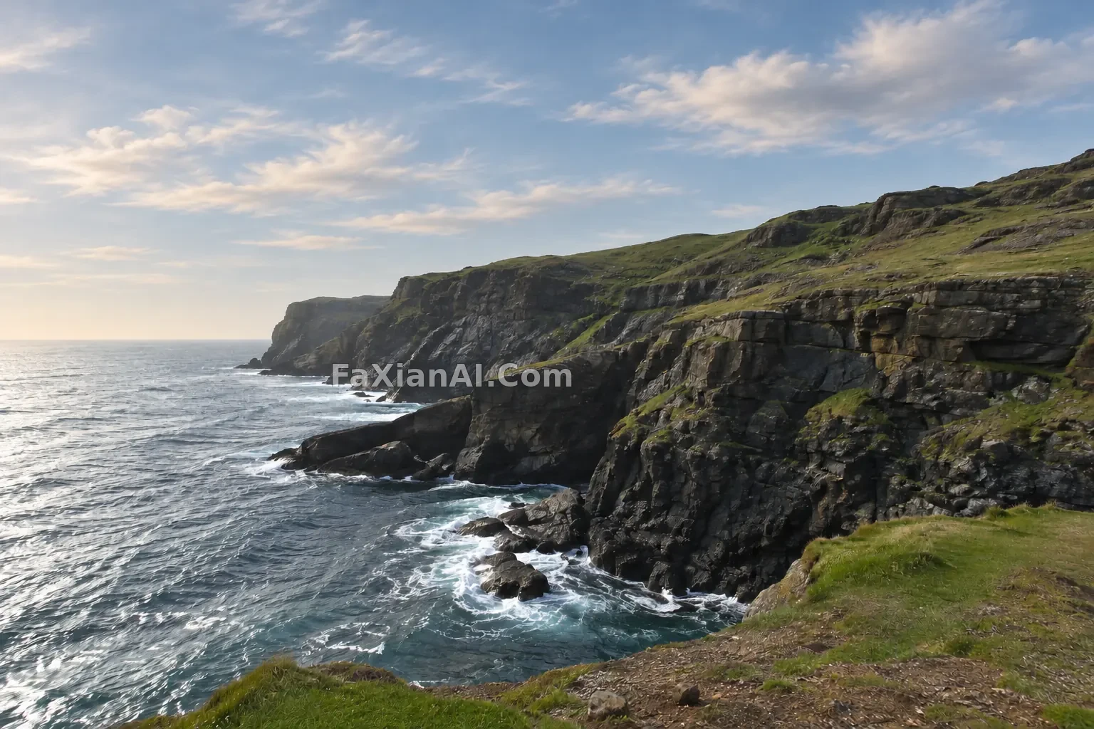
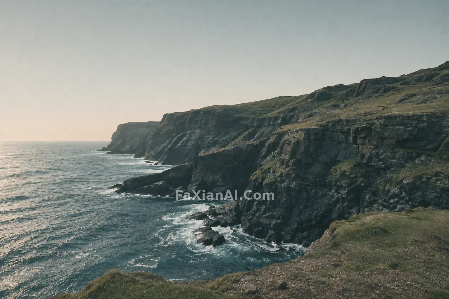
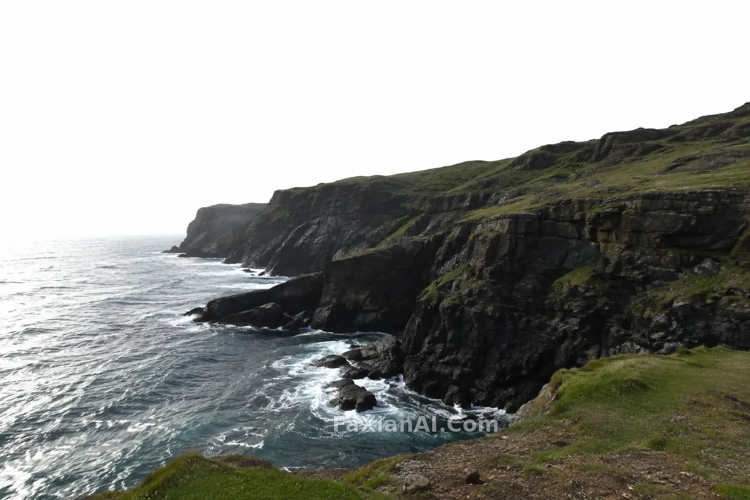
海岸懸崖調成低飽和電影色
整體壓低飽和,陰影偏冷、高光偏暖,構圖與內容一律不動。
寫法要點
✍️ 調色像烘焙曲線:前調壓飽和,中段冷陰影,尾韻留一點暖高光。三段分別寫,比一句“電影感”管用得多。最後補一句“不增減任何物體”,免得它順手加雲。
完整提示詞
📋 提示詞 自然語言
Color grade the uploaded coastal cliff photo into a low-saturation cinematic look: desaturated greens and blues, slightly cool teal shadows, gently warm highlights, soft contrast with lifted blacks, and subtle film grain. Recover some tone in the pale overexposed sky without adding clouds or changing its shape. Do not move, add or remove any object; keep the cliff, sea, grass and composition identical. No logos, no text, no watermark.
📋 中文譯寫版 自然語言
把上傳的海岸懸崖照片調成低飽和的電影色調:綠色和藍色降低飽和,陰影略偏冷青,高光輕微偏暖,對比柔和、黑位微微抬起,帶一點細膩的膠片顆粒。讓過曝發白的天空找回一些層次,但不要加雲,也不要改變天空的形狀。不移動、不新增、不刪除任何物體,懸崖、海、草地和構圖保持一致。不要標誌,不要文字,不要水印。