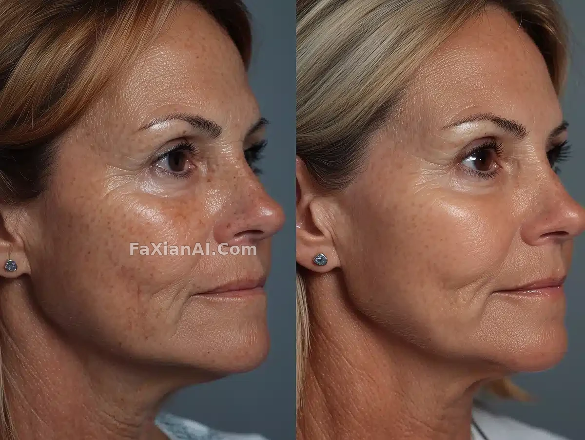
左邊澀右邊回甘,這張對比圖分層挺準
左臉粗糙帶斑,右臉細膩均勻,柔光把反差萃得很乾淨。
✍️ 對比圖的門道在光線要一致——左右兩半用同一種柔光,反差才可信,不然像PS貼圖。手機拍攝這個設定也是關鍵詞,太精緻的棚拍質感反而顯假。
📋 提示詞 自然語言784 字元
A before-and-after transformation of age-spot treatment, shown as a close-up comparison of a mid-age woman's face. On the left: deep wrinkles, visible pores, a prominent dark-brown age spot on her cheek, skin textured with sun damage, pigmentation and fine lines. On the right: a significant improvement -- smoother skin, more even tone, reduced wrinkles, no visible age spots. Lighting is soft and clinical throughout, clearly emphasizing the contrast between the two sides. Include her entire face along with hair and shoulder, not a tight close-up, and have her looking toward the right side; the left half of the frame is the before, the right half is the after. Shoot it like a mobile phone photo in an at-home setup -- no blurry background, but the background should stay clean.
📋 中文譯寫版 自然語言
呈現祛斑護理的前後對比,聚焦一位中年女性面部的特寫對照。左側:深紋、毛孔清晰可見、臉頰上一塊明顯的深棕色斑,皮膚帶有日曬損傷、色素沉著與細紋的質感。右側:顯著改善——肌膚更光滑、膚色更均勻、皺紋減少、斑點消失。全程用柔和的臨床感光線,清楚地襯出兩側的反差。要露出完整的臉部連同頭髮與肩膀,不是貼臉特寫,讓她面朝右側;畫面左半是治療前,右半是治療後。拍攝手法要像手機隨手拍的居家場景——背景不能虛化,但要保持乾淨。