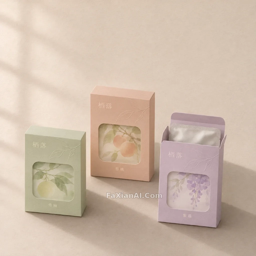
三款面膜盒的系列包装展示
同一系列的三款面膜盒错落排开,用柔和色块区分口味,台面干净克制。
写法要点
✍️ 老底子的雪花膏铁盒,讲究一眼认得出是哪一路。系列包装也是这个理:颜色换,版式不换,品名只留两个字。提示词里把“什么不动”交代清楚,比写“什么在变”要紧。
完整提示词
📋 提示词 自然语言703 字符
Square packaging design presentation of three rectangular sheet-mask boxes from one fictional series called “栖落”, standing at slightly different heights on a pale oatmeal paper backdrop. Each box is a matte uncoated carton with a rounded-corner window die-cut, one in pale sage, one in dusty apricot and one in soft lilac, with a thin embossed leaf line illustration, a small pale wordmark “栖落” and a one-word flavour tag “青柚”, “杏桃” or “紫藤”, and no other text. One box is open with a folded foil sachet peeking out. Overhead 20-degree angle, 85mm lens, big soft window light from the left with gentle long shadows, generous empty space at the top. No real logos, no other text, no barcode, no watermark.
📋 中文译写版 自然语言
方形包装设计展示图:同一个虚构系列“栖落”的三款长方形面膜盒,高低略有错落,立在浅燕麦色纸质背景上。盒子是哑光无涂层卡纸,带圆角开窗刀模,三款分别是浅鼠尾草绿、灰杏色和柔紫色,正面有浅浅的压纹叶片线稿,一个小号浅色字标“栖落”,以及一个单词口味标签“青柚”“杏桃”“紫藤”,没有其他文字。其中一盒打开,露出一角折好的铝箔袋。机位接近俯拍并倾斜 20 度,85mm 镜头,左侧一大片柔和窗光带出轻长的阴影,顶部留出大片空白。无真实标识、无其他文字、无条形码、无水印。