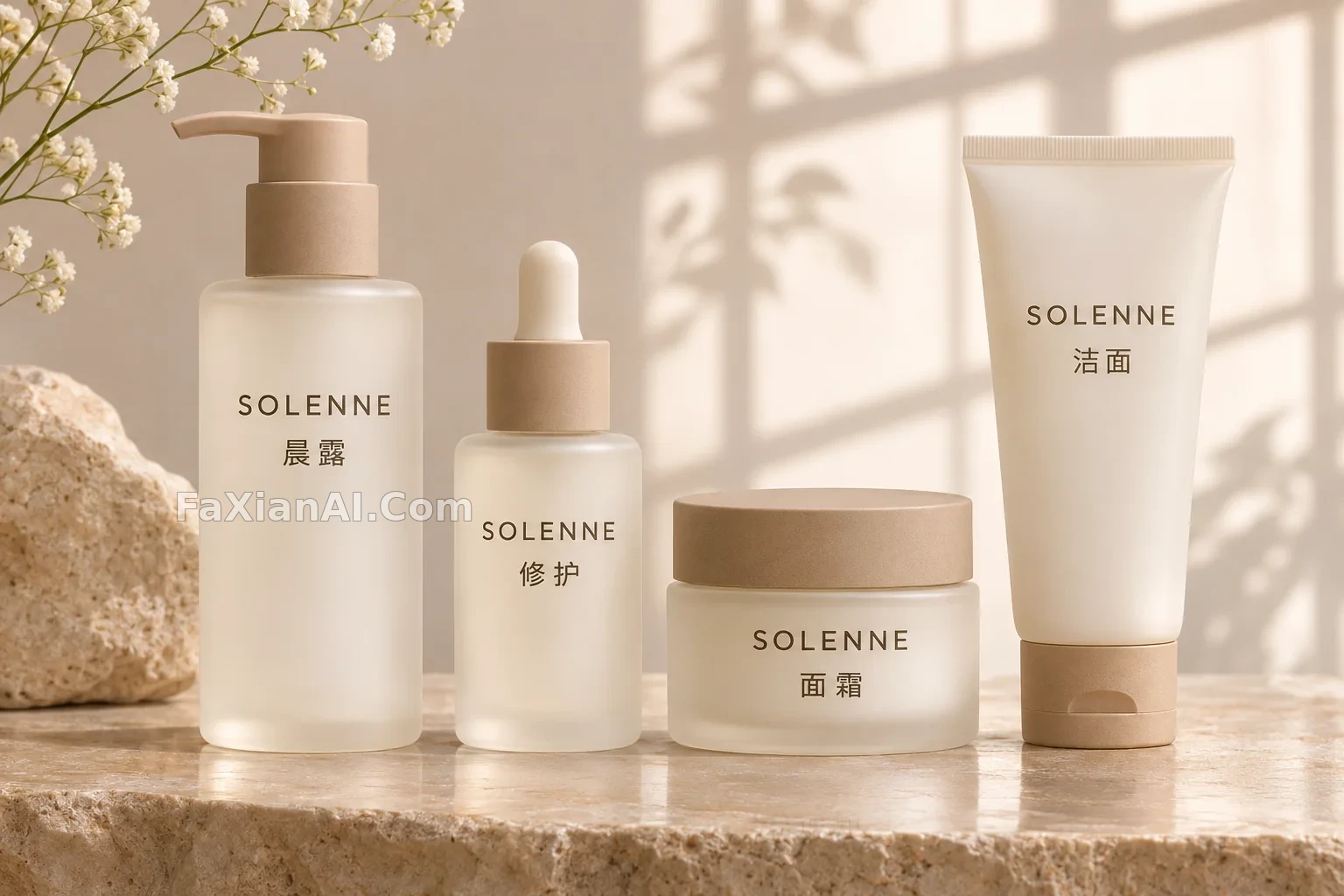
四件护肤品的同一套标签
瓶身形状各不相同,字体和层级要统一,这才像一个品牌。
写法要点
✍️ 把每件产品对应的文字写清楚,否则模型可能把标签混用。虚构品牌名要先查一下,别撞上真实商标,这也是做概念稿时容易忽略的一步。
完整提示词
📋 提示词 自然语言
Studio shot of a four-piece skincare set for an invented brand: a pump bottle, a dropper bottle, a jar and a tube in frosted ivory with matte sand-colored caps, on a warm stone surface. Each label uses the same minimal type system: top line “SOLENNE”; second line exactly “晨露” on the pump bottle, “修护” on the dropper bottle, “面霜” on the jar, and “洁面” on the tube. All label text is sharp, level and follows each container's curve. Soft large window light, gentle reflections. No other text, no real brand marks.
📋 中文译写版 自然语言
虚构品牌的四件套护肤品棚拍:泵瓶、滴管瓶、面霜罐和软管,磨砂象牙色配哑光沙色盖,放在暖色石台上。标签用同一套极简字体:第一行“SOLENNE”;第二行分别是泵瓶“晨露”、滴管瓶“修护”、面霜罐“面霜”、软管“洁面”。文字清晰水平,贴合容器弧度。大面积柔和窗光,轻微反射。不要其他文字和真实品牌标识。