故意画丑,丑出反差感
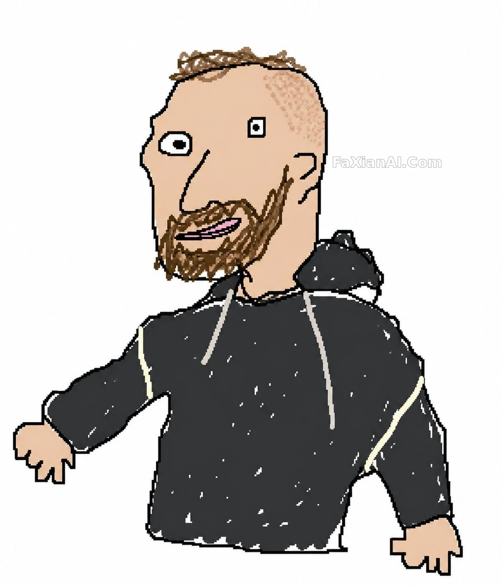
鼠标手绘复刻原图,故意保留那股像素级劣质感
✍️ 丑不是意外,是唯一目标。白底、鼠标线、错位对齐——三个变量凑齐了,劣质感才够真实。较真反而输了。
📋 提示词 自然语言
Take the attached image and redraw it as clumsily as possible — scribbled, wobbly, deliberately pathetic, the way someone would drag a mouse around in the most basic paint program without any care. Put it on a [background color: white] background. Aim for that off-register effect where it roughly matches the original but stays confused and misaligned, with intentionally bad pixel-by-pixel quality. The exact result doesn't matter — just draw it however it comes out.
📋 中文译写版 自然语言
把上传的图片重新画得尽可能笨拙——线条抖、涂得潦草、要多惨不忍睹有多惨,就像有人用鼠标在最基础的画图软件里随手拖出来的。背景用[背景色: 白色]。追求那种和原图大致对得上、但处处错位跑偏的效果,像素级的粗糙感是故意的。最后画成什么样都行,别较真。