
Let the Materials Speak for Themselves: Prompting for Glaze, Linen, and Metal
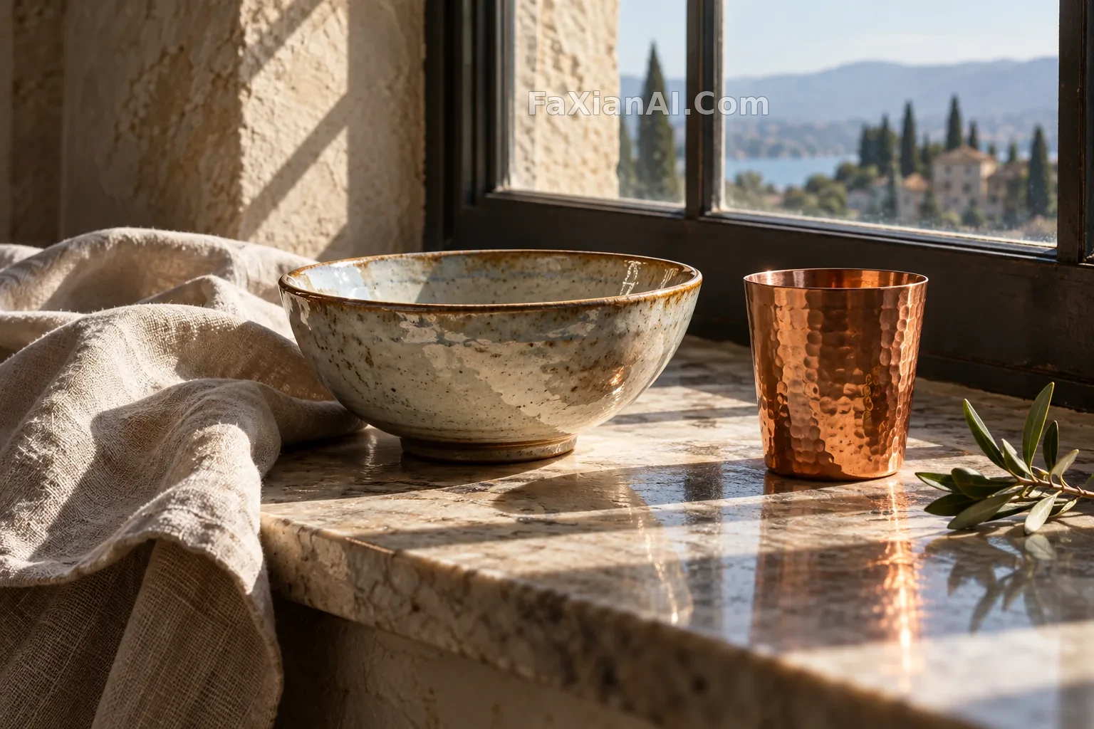
Many still-life prompts are packed with material names, yet the image looks as if it has been uniformly brushed with plastic. The reason is often not that the model does not know what porcelain is, but that every material is asked to be equally bright, smooth, and sharp. To make them separate, you first need to decide where the light comes from, then write how different surfaces respond to that beam.
One beam of light, several different edges
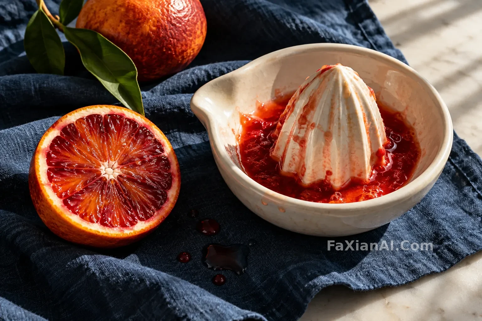
The cobalt-blue tea caddy under raking light places fine crazing in grazing light. It shares the same material basis as this batch's blood-orange porcelain juicer, but the focus is different: the tea caddy is suited to seeing micro-cracks in the glaze, while the juicer needs the juice in the grooves and the hard, bright porcelain ridges to read clearly. Copying the same "soft-light product photography" will erase this difference.
Linen needs a wider, slower transition between light and dark. You can write folded cloth, weave texture, and shadows sinking along the creases, but do not push every fiber to be as sharp as the subject. The role of the cloth is to provide tactile feel and support, not to compete for focus.
Metal and glass cannot share one kind of highlight
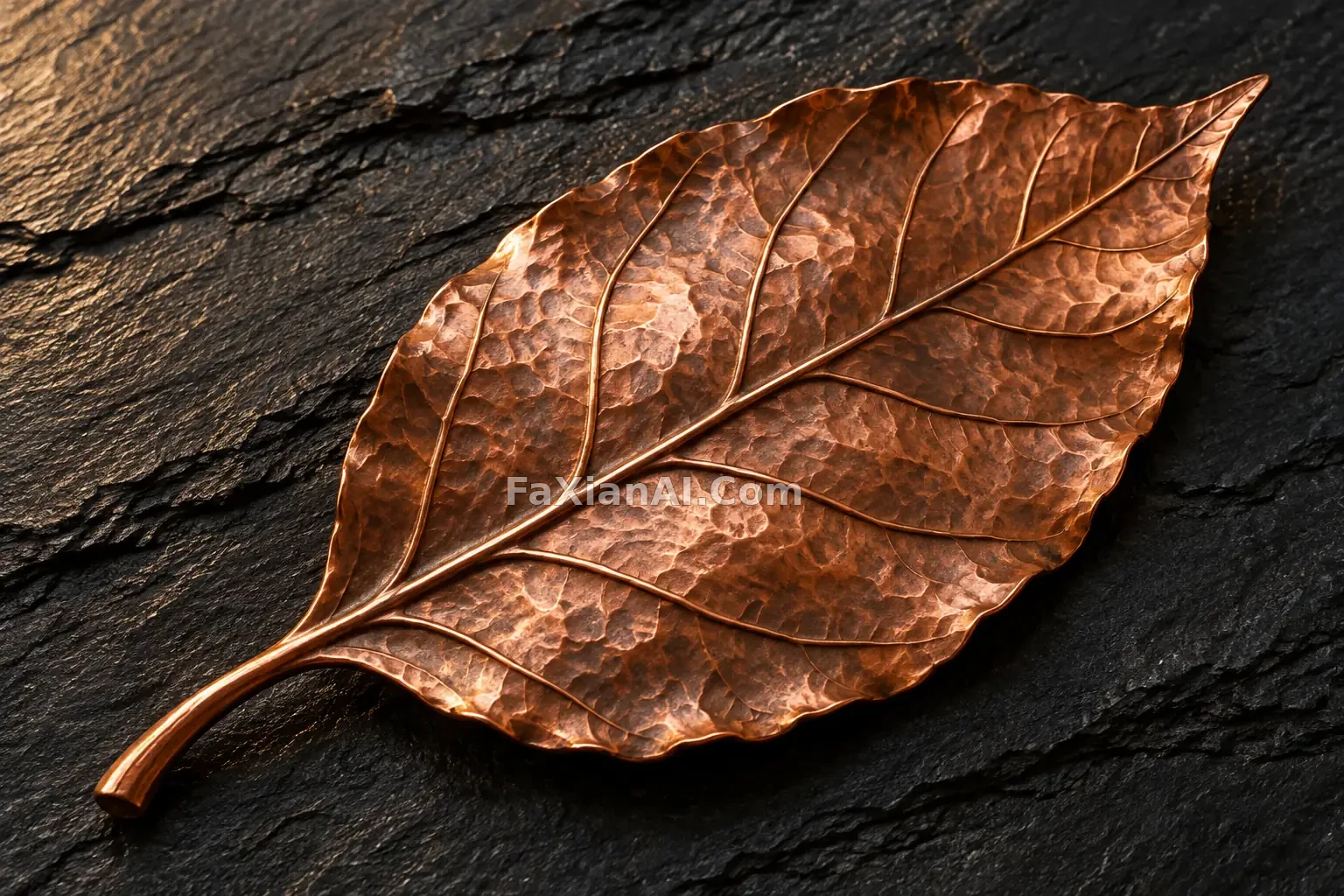
The warm-cold glass pear builds volume through transmission and internal color; the embossed copper leaf places highlights on the raised hammered texture and leaf veins. The former needs the relationship between edges, refraction, and background; the latter needs undulation and a low-reflection support. Summarize both as "shiny," and the details lose direction.
You can start by writing a structure like this: subject and surface state, supporting material, light source direction, the contact point that most needs to be clear. When revising, change only one variable, for example switch the side window to lower raking light, and observe how the glaze and metal edges change.
When to reduce detail
Macro does not mean the entire frame is equally clear. Evenly distributed detail makes the tabletop look like a material sample book. Keep one most definite texture, and let other areas recede in turn; this is usually more useful than continuing to stack high-resolution words. When the composition is still unstable, you can first read how negative space enters the prompt, then decide how much space the cloth and background occupy.
Finally, check whether highlights follow the form, whether different materials have different edges, and whether the bottom truly touches the tabletop. Generated images can help explore lighting, but they cannot replace the real material and color calibration of the product.