留白佔了三成,才是這張海報的主語
柚子皮做包裝是噱頭,中間那片空白才是這張構圖真正想教你的東西。
✍️ 這張的結構像分段文章:左段起,中段留白轉折,右段收。40%、30%、30%的版面比例不是隨手定的,是給'間'留出呼吸的空間。真要臨摹的是這個留白邏輯,不是柚子皮質感本身。
📋 提示詞 自然語言1781 字元
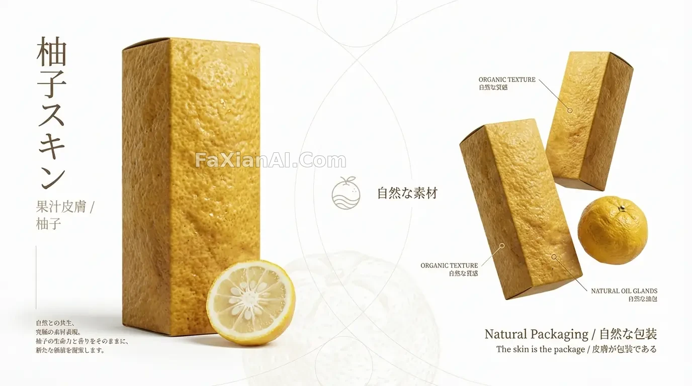
High-end Japanese product poster, 16:9 landscape, editorial layout built around a yuzu-citrus-skin packaging concept with layered visual storytelling.
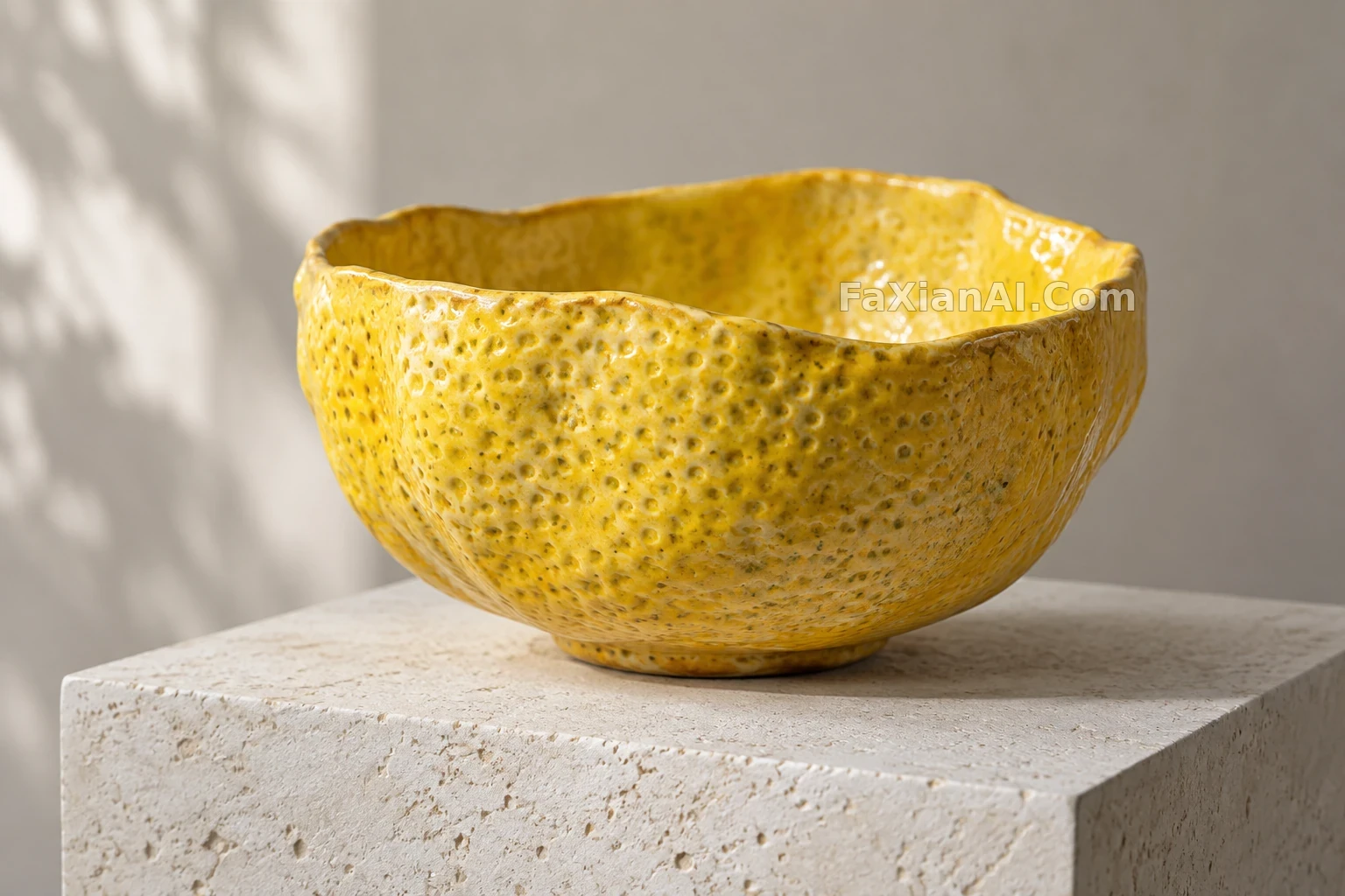
Left third of the canvas (about 40%) carries the hero shot: one tall yuzu-juice-skin package under dramatic soft light, its surface an ultra-realistic yuzu-peel texture — golden-yellow, bumpy, dimpled, with visible oil glands, reading exactly like real citrus rind stretched taut over the container. Beneath it, a halved fresh yuzu reveals pale creamy flesh and seeds. Vertical Japanese type reads 柚子スキン (Yuzu Skin) in a slim gothic face, with 果汁皮膚 / 柚子 as a refined subtitle, plus a short line of design-philosophy copy in Japanese.
Middle band (roughly 30%) is deliberate emptiness — generous white space in the spirit of Ma (間), just a few delicate thin-line geometric marks, floating type reading 自然な素材 (natural materials), a restrained brand mark, and a barely-there yuzu-texture pattern ghosted into the background.
Right third (about 30%) arranges two more yuzu-skin packages at varied heights and angles beside one whole fresh yuzu with its natural gold skin, paired with the type Natural Packaging / 自然な包裝 and the line The skin is the package / 皮膚が包裝である, with callout details pointing at the textured peel.
Design language: abundant negative space, asymmetric balance, wabi-sabi restraint, a Muji/Noritake-grade editorial minimalism. Palette stays within golden yuzu tones, pure white ground, and a pale-yellow lift from the flesh. Shoot it as soft diffused studio photography, macro-sharp on the peel texture, fully photoreal. Non-negotiable: the yuzu skin must read as genuinely organic — real bumps, real oil glands, rough natural surface, never plastic. Deliver at 16:9, gallery-grade Japanese product poster quality.
📋 中文譯寫版 自然語言
高階日系產品海報,16:9橫版,圍繞柚子果皮包裝概念做分層視覺敘事的編輯排版。
畫面左三分之一(約40%)是主視覺:一支豎立的柚子果汁皮膚包裝在戲劇性柔光下,表面是超寫實的柚子皮質感——金黃、凹凸、帶毛孔感的油腺,像真實柚子皮緊繃包裹在容器上。下方是一個切開的新鮮柚子,露出淡黃色果肉和籽。豎排日文寫著柚子スキン(Yuzu Skin),字型纖細,副標題為果汁皮膚/柚子,配一小段日文設計理念文字。
中段(約30%)是刻意的留白——大量'間'式空白,幾筆細線幾何元素,飄浮文字自然な素材(天然材質),一個剋制的品牌標,以及背景裡幾乎看不見的柚子紋理暗紋。
右三分之一(約30%)擺放另外兩支不同高度角度的柚子皮包裝,旁邊放一整顆帶天然金皮的新鮮柚子,配文字Natural Packaging/自然な包裝,以及標語The skin is the package/皮膚が包裝である,細節標註指向果皮質感。
設計語言:大量留白、非對稱平衡、侘寂式剋制,接近無印良品/則武級別的編輯極簡。色板鎖定金黃柚色、純白底色,果肉帶出的淺黃點綴。拍攝採用柔和漫射影棚光,果皮質感做到微距級銳利,全程寫實渲染。硬性要求:柚子皮必須讀出真實有機感——真實凹凸、真實油腺、粗糙自然表面,絕不能像塑膠。最終以16:9交付,畫廊級日系產品海報品質。