Home › Design Assets › The Empty Third Is What This Poster Is Really About
The Empty Third Is What This Poster Is Really About
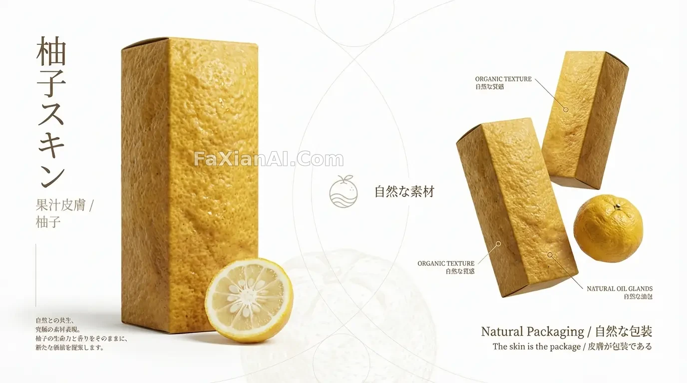
The yuzu-peel packaging is the hook, but the empty middle band is what this composition is really trying to teach.
✍️ The structure reads like a paragraph with clear beats: the left section opens, the middle section pauses with empty space, the right section closes. The 40/30/30 layout ratio isn't arbitrary — it's there to give Ma (間) room to breathe. What's actually worth copying here is the logic of that emptiness, not the yuzu-peel texture itself.
📋 Prompt Natural Language1781 characters
High-end Japanese product poster, 16:9 landscape, editorial layout built around a yuzu-citrus-skin packaging concept with layered visual storytelling.
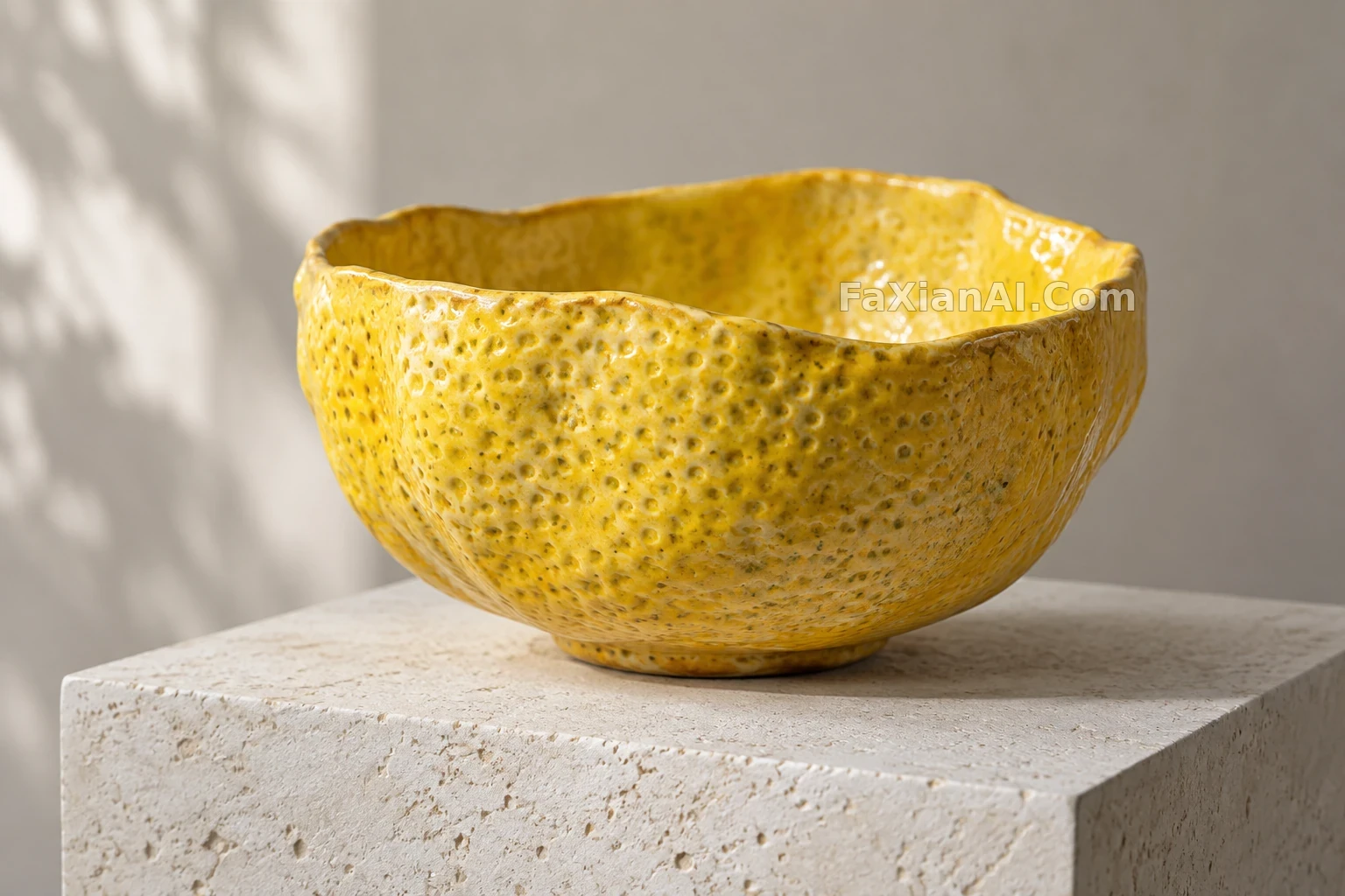
Left third of the canvas (about 40%) carries the hero shot: one tall yuzu-juice-skin package under dramatic soft light, its surface an ultra-realistic yuzu-peel texture — golden-yellow, bumpy, dimpled, with visible oil glands, reading exactly like real citrus rind stretched taut over the container. Beneath it, a halved fresh yuzu reveals pale creamy flesh and seeds. Vertical Japanese type reads 柚子スキン (Yuzu Skin) in a slim gothic face, with 果汁皮膚 / 柚子 as a refined subtitle, plus a short line of design-philosophy copy in Japanese.
Middle band (roughly 30%) is deliberate emptiness — generous white space in the spirit of Ma (間), just a few delicate thin-line geometric marks, floating type reading 自然な素材 (natural materials), a restrained brand mark, and a barely-there yuzu-texture pattern ghosted into the background.
Right third (about 30%) arranges two more yuzu-skin packages at varied heights and angles beside one whole fresh yuzu with its natural gold skin, paired with the type Natural Packaging / 自然な包装 and the line The skin is the package / 皮膚が包装である, with callout details pointing at the textured peel.
Design language: abundant negative space, asymmetric balance, wabi-sabi restraint, a Muji/Noritake-grade editorial minimalism. Palette stays within golden yuzu tones, pure white ground, and a pale-yellow lift from the flesh. Shoot it as soft diffused studio photography, macro-sharp on the peel texture, fully photoreal. Non-negotiable: the yuzu skin must read as genuinely organic — real bumps, real oil glands, rough natural surface, never plastic. Deliver at 16:9, gallery-grade Japanese product poster quality.