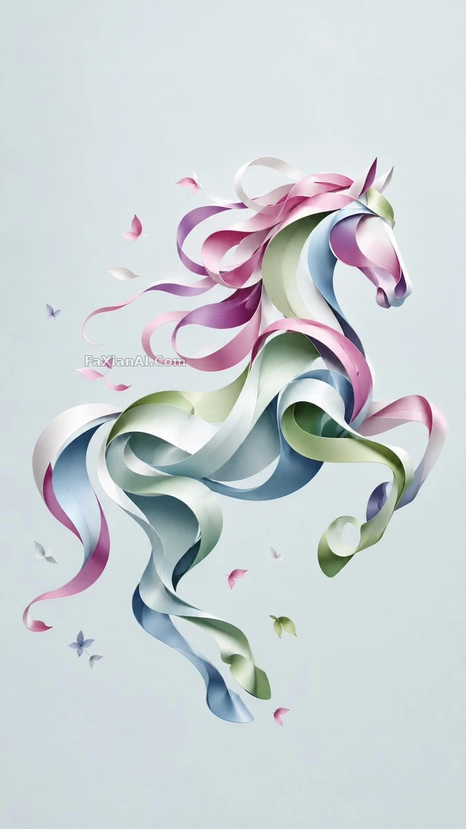
一條絲帶彎出品牌感的留白
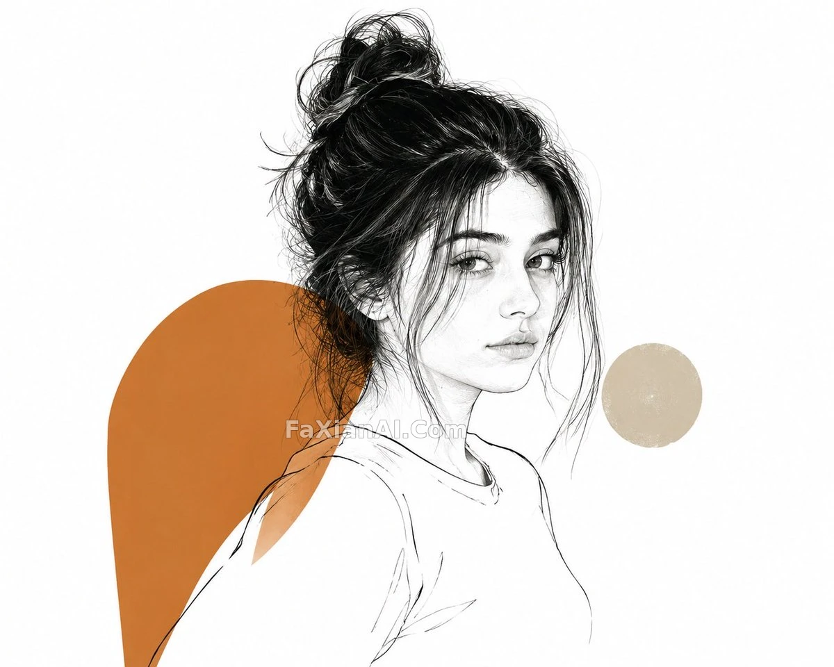
曲線代替筆觸,一條絲帶的彎折就撐起了整張海報級的剋制美感。
✍️ 這條本質是個可替換模板——把方括號裡的配色和參考圖換掉,同一條絲帶結構能套出無數個品牌視覺,負空間留得多,反而比塞滿細節更顯高階。
📋 提示詞 自然語言
An elegant abstract illustration built from a single ribbon-like form, its continuous curve implying both movement and volume through subtle dimensional shading. Composition is centered, negative space handled gracefully, restrained [color palette: pick your palette here] carrying a premium brand-art sophistication rather than busy detail. Base the ribbon's flow on [reference image: your uploaded photo] if provided. [aspect ratio: 9:16]
📋 中文譯寫版 自然語言
極簡優雅的抽象插畫,由一整條如絲帶般連續彎折的形態構成,曲線本身就在暗示運動感和體積感,靠細膩的層次陰影撐出立體感。構圖居中,留白處理得體,色調收得剋制——[配色方案:在此選擇你的配色],追求的是高階品牌視覺那種考究的簡約感而非堆砌細節。絲帶的走勢可以參考[參考圖片:你上傳的照片](如有提供)。[畫面比例:9:16]